Are You a Beginner, Intermediate, or Pro Colorist? Find Out!
In today’s tutorial, I’m going to show you the 3 stages every single colorist goes through in their color grading journey.
Beginner
The beginner colorist has limited knowledge, struggles with exposure and balancing, tends to make global changes, and often expects multiple rounds of revisions before getting the final look.
Intermediate
The intermediate colorist understands scopes quite well, is good at exposure and balance, but may lack a bit of imagination when it comes to creating unique looks. At this stage, the intermediate colorist typically works on projects like corporate videos and documentaries.
Professional
The professional colorist excels at exposure, balance, and shot matching. They focus on telling the story and think like a cinematographer or director, meticulously crafting every single frame. These colorists become irreplaceable because of their attention to detail and ability to enhance the narrative visually.
Now, let’s move on to the tutorial section, starting with the beginner colorist stage.
Beginner
Let’s say our beginner knows how to set up the IDT (Input Device Transform) and ODT (Output Device Transform) nodes for conversion, as well as how to set up the Scopes properly.
The next step our beginners typically take is to pick a LUT to apply to the footage.
The colors look awful, and we can verify this using QT Charts, which is a great tool for quality controlling and monitoring the image. It helps us assess the color balance and make sure everything is within the desired range.
Let’s turn on False Color in QT Charts, and we can see that everything is over-saturated and too intense—the colors are too bold and need adjustment to bring them back into balance.
Now, if I turn on the Saturation False Color in QT Charts, you can clearly see that everything is sitting above the 1.0 zone, which is not broadcast safe. This means we need to pull back the saturation to ensure it falls within acceptable limits for broadcast standards.
The next thing beginners often try is to bring up the opacity of the LUT, but this doesn’t work because it strips away the essence and intended look of the LUT. Don’t do that—it diminishes the effect and defeats the purpose of applying the LUT in the first place.
Let’s go to our False Color and see what happened after making those adjustments. We’ll be able to check how the changes have impacted the exposure and saturation across the image.
The image looks much worse now! The changes made by adjusting the opacity of the LUT have made the colors more chaotic, and the exposure is even more out of balance. We need to reset and approach the adjustments more carefully.
Now, what they often do is go to the Balance node and use Lift, Gamma, and Gain to balance the footage, but they don’t have a proper technique, so the adjustments end up being uneven. Then, they apply Cineon to their conversion node, making it even worse by introducing further color distortions and not enhancing the image in a controlled way.
This is too much and goes beyond what’s needed for a Rec.709 conversion. The adjustments have pushed the colors and exposure too far, creating an unnatural and overly intense look. We need to dial things back to make it broadcast-safe and visually appealing.
Our beginners tend to overcomplicate things when it comes to shot matching, but they don’t have the hard skills to properly control the image. They lack the foundation needed to make precise adjustments that ensure a cohesive, balanced look across the shots.
Intermediate
At this stage, you don’t want to break any rules—you want to approach everything properly. With the knowledge you’ve gained so far, you’re now able to properly balance and expose your footage using the right parameters.
In the HDR Palette, under Global, the intermediate colorist will set the proper exposure to ensure the image has the correct brightness and contrast without overexposing or crushing the details.
We’re now protecting the image, ensuring that all the adjustments are enhancing the footage rather than compromising it. Everything looks good, and we’re definitely heading in the right direction!
Next, the intermediate colorist will pop the image by using custom curves and enabling the Editable Spline. This allows for more precise control over the tonal range and enhances the image without overdoing it.
Then, they will control the saturation to ensure everything stays balanced. The goal is to be proper and avoid exaggerating any colors. This ensures that nothing becomes oversaturated or clipped, keeping the image looking natural and well-controlled.
Next, they will balance the image further and then create a shape using the polygon tool. After that, they’ll track the shape to ensure it follows the subject or area of interest throughout the shot.
This is the result, and it looks great—well-balanced, with controlled saturation and seamless tracking, creating a polished and professional look.
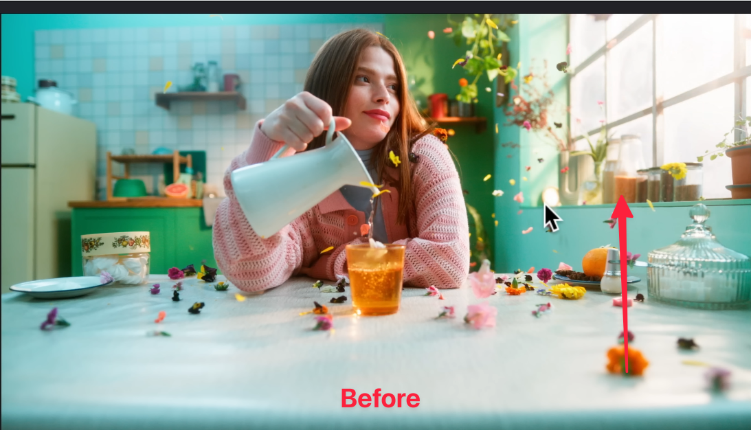
This is the difference between a beginner colorist and an intermediate colorist. The beginner's focus was on creating a cinematic look as quickly as possible, but they lacked the necessary skills to protect the image. In contrast, the intermediate colorist takes the time to balance the footage properly, control saturation, and ensure the image remains intact without compromising quality.
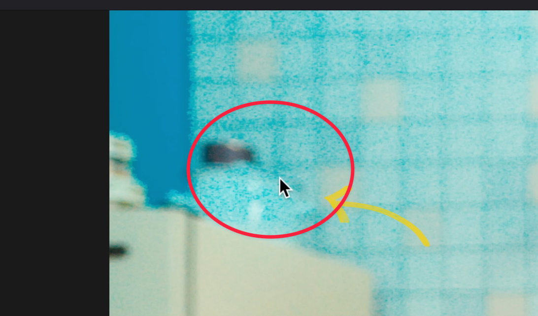
In our Intermediate version, the image looks clean, with great exposure and an ideal amount of highlights. There is no grain or artifacts, as the intermediate colorist avoids these issues to maintain a polished and professional look. Their focus is on keeping the image clean and smooth, ensuring that every adjustment enhances the overall quality without introducing any unwanted elements.
Professional
Now, in the professional stage, you become a painter with all the hard skills necessary to get exactly the look you want. Most of the time, you'll use power tools to fine-tune and perfect your work.
I’m going to show you the tools I use, but feel free to use whatever look-building tools you prefer. The same principles will apply, and I’ll take you through my thought process step by step.
The first step is to create a Balance node and change it to Linear Gamma for a more natural starting point and flexibility when making adjustments.
In Linear Gamma color space, changes are very uniform, which is perfect for shot matching as it maintains consistency across all adjustments.
Next, I’m going to go to my Gain, which actually becomes your Global Offset in the HDR palette when using Linear Gamma color space.
I’ll pull the Gain down to control the overall brightness and balance the image.
Now, I’m going to apply QT Charts to my node tree. This DCTL allows me to quality control and monitor my image, ensuring everything stays within the desired parameters.
Let’s turn on False Color in QT Charts to see where the image is sitting in terms of exposure and saturation, helping us assess whether any adjustments are needed.
I know that I want some pop in my image, so I’m going to focus on my skin tones. I want to keep the skin tones in the Mid to +3 levels to ensure they stay vibrant and balanced without being overexposed.
I can play around with the Gain and bring it down slightly, then park it around this level to achieve the desired exposure and contrast for the image.
This is looking great, and the image appears pretty neutral, so I’m not going to mess with the balance at this stage. The foundation is solid, and we can move forward with other adjustments.
Now, I want to drop another QT Charts and name it QT Pre Charts. This will help us monitor the image more accurately before making any further adjustments.
Create another node and apply another DCTL, which is my QT Look DNA. This is where the look will be created. You can use any look-building tool you prefer, but this is the tool I’ll use to achieve the desired aesthetic.
In QT Look DNA, I’m going to turn on Show Curves and change the Color Space Preset to Kodak 2383. This gives us a beautiful rendition of the 2383 look. By turning on Show Curves, we can see exactly how the tool builds the color, giving us the punch, warmth, and separation we need in the image.
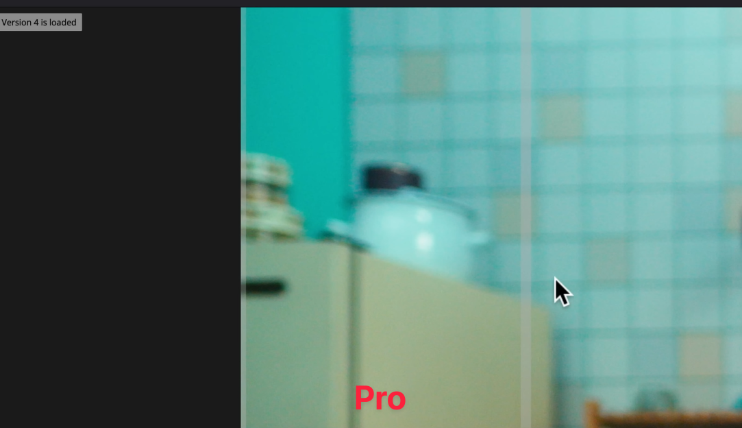
Let’s compare the beginner’s 2383 and pro’s 2383 at this stage. We’ll see how the pro approach adds more depth, balance, and nuance compared to the beginner’s simpler method.
Now, let’s go further and make some additional changes to our Pro version using QT Look DNA. We’ll refine the look to bring out more details, contrast, and vibrancy while keeping the overall image natural and cinematic.
The next step is applying QT Skin Juice Mixer. This DCTL's main purpose is to create a sophisticated color separation, going beyond just making your skin tones pop. It ensures that all colors in the image are balanced and harmonized while giving special attention to the skin tones.
After making some adjustments to our QT Skin Juice Mixer, we’ve created this gorgeous look—with refined color separation, vibrant skin tones, and a balanced, cinematic feel.
Now, I can create another node and apply the QT Saturation Control onto it. This tool lets you control saturation based on Low, Mid, and High Sat. It uses a much more sophisticated Spherical saturation model compared to the traditional HSV model, giving us more precision and flexibility in adjusting the saturation across different tonal ranges.
Let’s play around with some of these parameters and observe how the changes affect our image. We’ll fine-tune the Low, Mid, and High Sat settings to achieve the perfect balance and enhance the overall look.
This is where we ended up after applying QT Saturation Control—a well-balanced image with refined saturation levels, giving the shot more depth and vibrancy without overdoing it.
Now, I want to apply another DCTL, which is the QT Color Compressor. This will help us fine-tune the color balance and create a more cohesive and polished look across the entire image.
The point of using the QT Color Compressor is to take any color that is closer to the selected hue and then gradually bring all other colors closer to it, creating a more unified and harmonious color palette across the image.
Here are the results after using QT Color Compressor—the colors are now more cohesive, with the hues harmonized across the image, giving it a polished and unified look.
Now, we can create a shape, just like our intermediate did, to bring the exposure down in specific areas. After that, we’ll track it to ensure the adjustments stay consistent throughout the shot.
Now, we can add a Defocus Background effect to blur the background, helping to emphasize the subject and create a more cinematic, professional look.
Next, apply the Film Look Creator effect. Turn off vignette, halation, and bloom, but enable the grain and set it to 35mm for a classic, textured film aesthetic that adds realism and depth to the image.
Then, add QT Halation to introduce a subtle glow around the highlights, giving the image a more cinematic, film-like quality and enhancing the overall aesthetic.
Select the Super 16 preset in QT Halation to achieve a more vintage, soft halation effect that’s characteristic of older film stocks. This will add a unique glow to the highlights, further enhancing the cinematic look.
Now, it’s time to compare our 3 different versions—each representing different stages of the color grading process:
Beginner version – focusing on quick fixes and broad adjustments.
Intermediate version – more precise balancing and exposure control.
Professional version – fully refined, cinematic look with all the necessary adjustments and tools applied for a polished result.
Let’s see how far we've come!
You can also watch this tutorial on YouTube to get a better understanding of the workflow and see the process in action.
Feeling inspired but need professional help with your project? Contact us for expert color grading services that bring your vision to life.


