Stop Ruining Your Grades with Incorrect Black Levels
Today, we’re going to cover the following topics:
How to bring popular photo color grading techniques into DaVinci Resolve
The best budget monitor for color grading
Where to set your black levels when exporting SDR content
How to bring popular photo color grading techniques into DaVinci Resolve
Here’s the shot we’ll be working on.
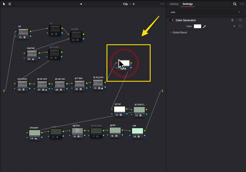
Drop a Color Generator onto the node
Next, select the red color.
The next step is to right-click on the node, go to Composite Mode, and select Softlight
This functionality allows you to apply composite modes directly to individual nodes without needing layer mixers.
Next, under Qualifier - HSL, soften the Luminance and adjust the Low Key to reach the desired point.
Now, let’s take a look at the effect we’ve just created.
We’re only affecting the highlights with this adjustment.
Now, let’s create another node and select a darker color like blue—this will serve as our split toning.
We’ve selected red for the highlights and now blue for the shadows, achieving a balanced, cinematic color contrast.
Let’s create a High Soft adjustment, set it to around 25, and bring it down to achieve the desired effect.
Next, reduce the intensity of the color generator nodes for both blue and red by half. This gives us more flexibility and room to fine-tune the overall look.
Let’s check the results using this method.
This approach is a great technique to consider for achieving split toning, adding depth and style to your image.
The best budget monitor for color grading
One of you asked about a color-accurate monitor in the €1,000 price range.
For this example, I chose the Asus ProArt PA32UCR-K.
The reason I picked this monitor is that you can find used units for around $1,000, which helps you stay within budget while still getting a professional-grade display.
Let’s break down the key specs that matter most as a colorist:
Size: 32 inches
Resolution: 4K
Color Gamut: 100% sRGB
Peak Brightness: 1,000 nits
Color Accuracy: Delta E around 2
While this monitor is great for HDR viewing, it’s not fully suitable for grading HDR content at a professional level.
Additionally, it comes with an X-Rite i1 Pro color calibrator, which is valued at around $200 on its own—a great bonus.
So, this would be my top recommendation for a budget-friendly color grading monitor.
Where to set your black levels when exporting SDR content
Another great question from my YouTube community is about black levels for an SDR release:
"Where should I set my black levels when outputting SDR?"
Let’s take a look at some professional examples. In this shot from Joker, the black levels are essentially touching the zero level on the graph.
The result is an image with strong contrast that feels rich and cinematic—a perfect balance for an engaging visual.
The most important factor when setting your black levels is the platform or medium where the content will be viewed.
If it's for theaters, or a controlled release like Netflix, HBO, or Blu-ray Disc, you have the freedom to set the black levels exactly how you want.
However, if the content is for YouTube or online streaming, you need to be more cautious—this is where black levels can make a significant difference in viewer experience.
Let’s take a look at Asteroid City. This example is a stark contrast to Joker. The black levels in this scene sit around 128—they’re not even black; they’re blue. This artistic choice creates a different mood and feel, showing how flexible black levels can be depending on the desired aesthetic.
When it comes to color grading, it’s not about strict rules like "it needs to be this or that"—it’s about what you choose to commit to and staying consistent with that choice.
Color grading is more about consistency rather than following a rigid formula, as it's ultimately subjective.
Now, let’s look at our example—a music video that most people will watch on YouTube.
In this case, the black levels are set pretty close to the bottom. Why?
Because if I lift the black levels too much, I’ll introduce macro-blocking and artifacts, which can lead to banding in the darker areas. YouTube’s compression can exaggerate these issues, so keeping the bottom end tight helps avoid these problems and ensures a cleaner result.
So, let’s fix that. I’ll go into QT Look DNA, navigate to Black Nits Y, and gently lift it up to adjust the black levels while keeping them clean and avoiding artifacts.
I can pull the black levels up to around 128 to create a vibe similar to Asteroid City, which gives the image a unique and cool aesthetic.
However, since this is a music video intended for YouTube, this adjustment is likely to cause banding due to YouTube’s compression—and that’s simply not acceptable for a polished final product.
My recommendation is to keep the black levels around the 40 mark for a balanced look that avoids banding.
Next, click on the settings icon near the Waveform to adjust your display options for better monitoring.
Turn on Show Reference Levels and set the Low value to 40. This will create a new reference line, helping you consistently monitor and maintain your black levels at the desired point.
Now, you can adjust Black Nits Y in QT Look DNA and set your black levels to around 40, aligning them with the reference level we just created.
Feeling inspired but need professional help with your project?
Contact us for expert color grading services that bring your vision to life.


