Learn the Most Employable Look as a Colorist
If you want to make money as a colorist, mastering the clean white look is essential.
Today, I’ll show you the most common method to achieve this look, along with my preferred approach—so let’s dive in!
Common Method
I’ve converted the footage from Log to Rec.709.
Next, I’ll create the following nodes in my Node Tree:
Balance
HSL Curves
YRGB
QT Charts
This setup will help us fine-tune the adjustments and achieve the clean white look efficiently.
Let’s start by balancing our shot.
It’s clear that there’s a lot of warmth in the image, so we’ll need to reduce that to create a more neutral and clean base.
If we examine the Waveform, it’s obvious that the shot contains warm tones.
Our goal is to make the image appear neutral white to the eye, and then verify the adjustment using the Vectorscope. Once that’s done, the final step is to monitor the results using QT Charts for accuracy and balance.
I’m going to right-click on the Balance node and change the Gamma to Linear.
The Linear color space operates in XYZ space, where all adjustments are applied uniformly. This is particularly beneficial for shot matching, as it ensures consistency across all scenes and minimizes color shifts.
Here, I’m going to adjust the Temperature and Tint to neutralize the warmth and achieve a clean, balanced look.
I’ll monitor the colorized Waveform and Vectorscope while adjusting the Temperature and Tint, making small tweaks until I find a clean and neutral balance point.
Now, take a look at the results—notice how clean and neutral the image looks after the adjustments!
In Linear Color Space, the Gain functions like the Global Offset in the HDR Palette, meaning it behaves as if you’re adjusting exposure by stops in-camera.
I’ve slightly pulled the Gain down and continued fine-tuning the Temperature and Tint. Now, the image looks fantastic—the Vectorscope shows balanced hues, and the Waveform confirms a well-distributed tonal range.
Here’s the final result after all the adjustments—clean, balanced, and professional-looking.
Now, let’s move to the YRGB node.
Under Curves - Custom, lock the 18% grey by clicking on her skin. This ensures that any further adjustments won’t affect the skin tones, preserving their natural balance while you make changes to the rest of the image.
The issue here is that when we push the adjustment, unwanted colors start to appear, and that’s something we want to avoid for a clean look.
To resolve this issue, unlink the icon (unchain it), giving you independent control over the color channels. This allows for more precise adjustments without introducing unwanted colors.
Now, when I grab the white curve and push it, the saturation remains stable, ensuring the image stays clean and balanced.
Now we can fine-tune the curves to achieve the desired look. The contrast and balance are looking good, but the saturation needs some additional adjustments to get it just right.
Now, we can enhance the saturation in our image.
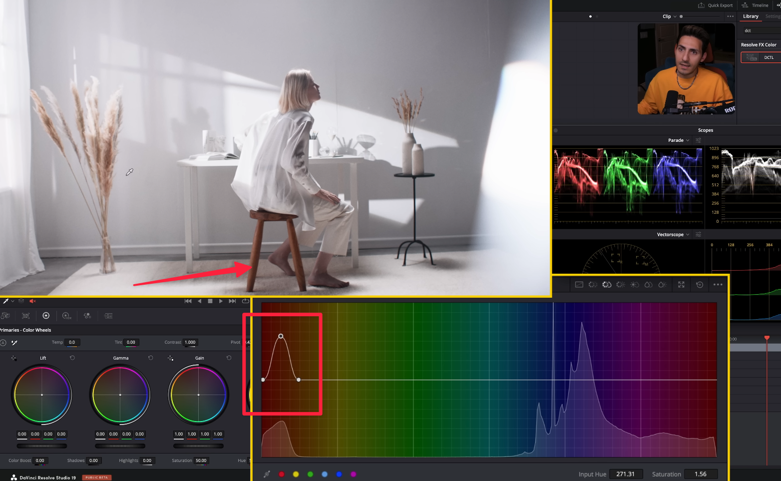
To do this, we’ll use the HSL Curves, select a specific point where we want to boost the saturation, and then make the necessary adjustments to add saturation smoothly.
Next, we’ll go to Luma vs Saturation and reduce the saturation in the highlights.
By creating a curve like this, we can selectively pull saturation from the top end while preserving the areas where we’ve already added saturation, keeping the balance intact.
We’ve achieved a really clean and polished look—balanced contrast, controlled saturation, and natural skin tones throughout the image.
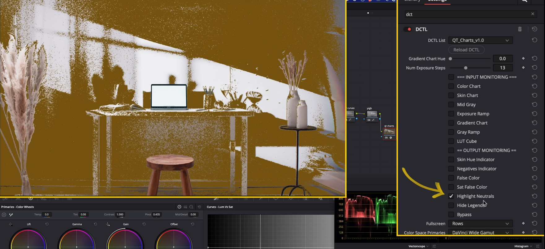
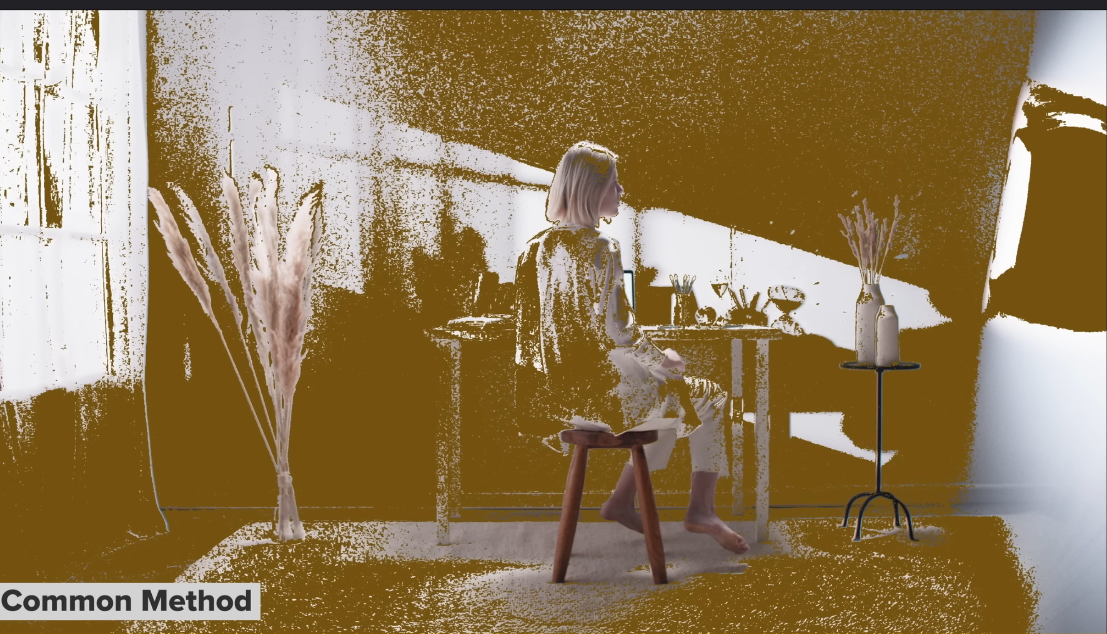
So, is this truly white? The only way to confirm it is by using QT Charts.
In QT Charts DCTL, select Highlights Neutrals to check if the highlights are neutral and balanced enough to be considered perfectly white.
The brown areas indicate regions with less than 5% saturation, meaning they are as neutral as they can get.
Since most of the highlights in the image are sitting around this point, it confirms that our highlights are indeed neutral and well-balanced.
Preferred Method
We’ll leave the Balance node as is since the footage is already well-balanced.
Next, I’ll add three nodes:
QT Color Compressor
QT Saturation Control
QT Look DNA
These will help refine the color, saturation, and overall look for a polished final result.
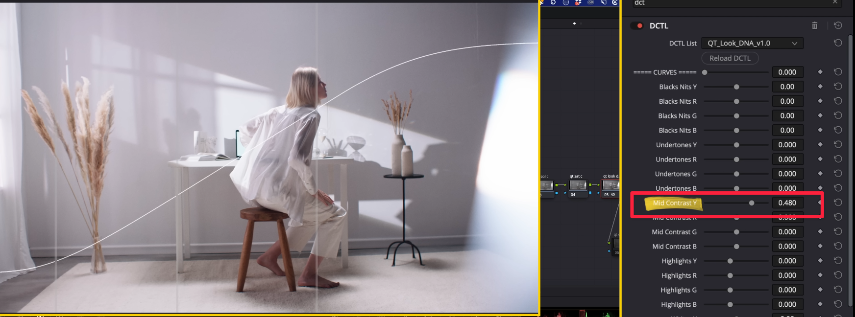
In QT Look DNA, I’ll go to Mid Contrast and increase it.
The great thing about this tool is that it automatically locks the 18% grey, so there’s no need for any extra steps to preserve the neutral point during contrast adjustments.
Now, I’ll increase the Highlights Y Channel to push the highlights further and achieve that high-key look, adding brightness while keeping the image clean and balanced.
I’ll bring the Whites Y down slightly to soften the highlights and prevent them from looking too harsh, ensuring a more balanced high-key look.
In Undertones Y, I can add a bit more punch to enhance the undertones, giving the image more depth and richness without affecting the highlights or shadows.
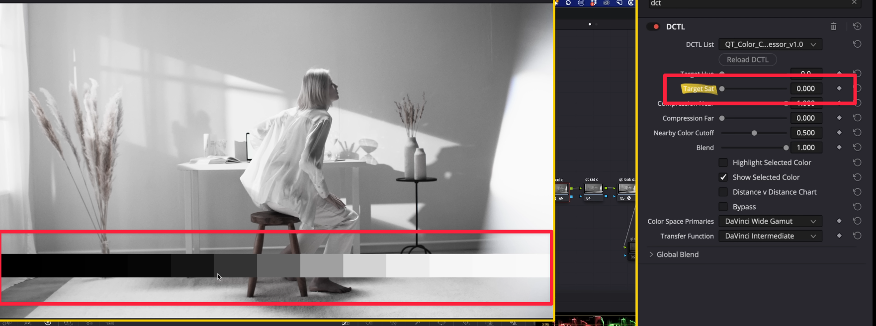
Next, I’ll move to QT Color Compressor. The purpose of this tool is to add and control any color in your image, allowing you to introduce subtle tones or bold hues for creative styling.
By increasing Compression Near, we’re adding the selected hue and blending all nearby tones into the image, creating a cohesive and uniform color adjustment.
If I lower the Target Saturation all the way to grey, it removes any excess saturation, effectively cleaning up the image and giving it a more neutral and polished look.
Now, this is where we can use the Nearby Color Cutoff. By adjusting it and pulling it back, we can reintroduce colors selectively, bringing back natural hues while keeping the overall look clean and controlled.
Now, look at how we’ve cleaned up the image by removing all the magenta tones from the background and across the frame, while still preserving the saturation and detail in the key areas. The result is a much more polished and balanced image.
QT Color Compressor did an excellent job of cleaning up the image while keeping all the necessary saturation intact.
Now, let’s move on to QT Saturation Control—a powerful tool that offers different saturation models to help you fine-tune and control the saturation levels across your image precisely.
The QT Saturation Control offers three saturation models:
Spherical
Cylindrical
HSV
My preferred model is Spherical because it provides more flexibility and doesn’t break or crack easily, even with strong adjustments.
Under Mid Sat, I’ll boost the midtone saturation to make those areas pop. Don’t worry about the subject—we’ll handle that separately to ensure they remain balanced.
Next, I’ll adjust the Low Sat to target the areas with very low saturation in the image and pull it back even more to further clean the magenta tones from the background, ensuring a cleaner and more neutral base.
Now, let’s go to QT Look DNA and navigate to Bleach Bypass to clean up the image further. This will help desaturate the highlights slightly and create a more polished, cinematic look.
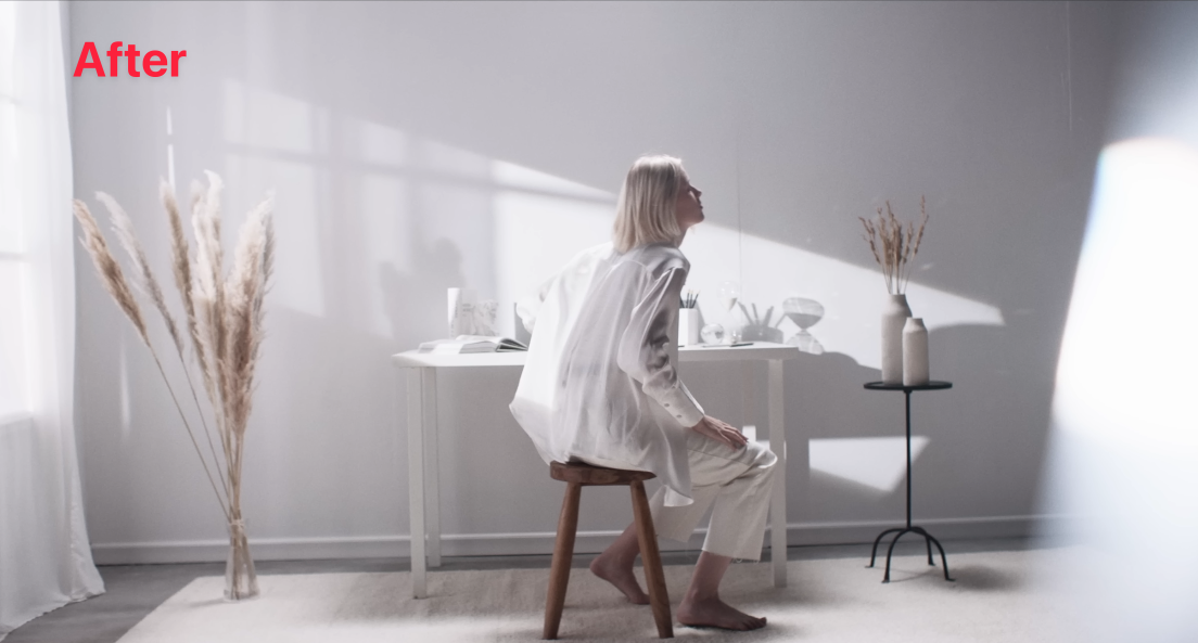
Let’s compare the two versions:
Common Method: The traditional approach to achieving the clean white look.
Preferred Method: Our refined approach using QT Look DNA, QT Color Compressor, and QT Saturation Control for a more polished and customizable result.
By comparing both, we can clearly see how the Preferred Method offers greater control, cleaner saturation, and a more balanced high-key look.
Here, we can clearly see which version is more neutral.
Our Preferred Method using QT Tools shows a much cleaner and more neutral result compared to the Common Method, with minimal unwanted color shifts and a balanced, polished finish.
Feeling inspired but need professional help with your project?
Contact us for expert color grading services that bring your vision to life.


