
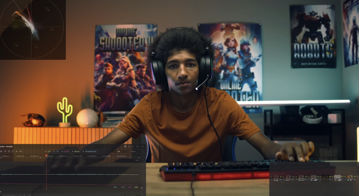
Common Color Grading Mistakes Among Beginners
The mistakes I’m going to cover in this one are inevitable. I’ve made these, friends and others who make these mistakes. I’m going to show you the mistakes and the solution.
Let’s start with mistake #1.

Looking at our first example, let’s look at this first show.

These colors in the waveform look perfect, so when we convert it to rec.709, it will look great.

Now every time that you juice up your image, it will get saturated automatically. But let’s take it a step further and do some basic contrast adjustments in the curves.


But if you see our vectorscope in the top left, the saturation changed. Even just adding contrast, it will keep adding saturation to the image. So when we compare our look here to other professional colorists, just look at the difference in vectorscope.
In an image like this, you might think there is so much color, but in reality, it’s less pushed. Same with this next example.

So when you’re identifying what makes your image less professional, you have to look at it. So moving back to our image, we can pull back on the global saturation.


But even here, it’s still looking high on that saturation. Our main concern is the red and orange in the back. So one way I can attack it is by using hue vs luminance and pull down the colors.

Now I am going to go into hue vs saturation this time and bring down the saturation on the orange and reds.


We are looking so much better now, so let’s try again to pull out some saturation in the global saturation.

Even just doing a tiny bit, we are doing better than what we started with.
Now moving onto our second mistake, people don’t push their image enough.

If I had a dollar for anytime someone said that they like rec.709 better, I would be in Fiji living my best life and everyone who thinks that is just absolutely wrong.


Rec.709 is only for viewing, not for final delivery. I see so many people convert this and call it a day. But this comes at a huge cost. So let’s dive in. Let’s compare this shot to some from Joker.

In this shot I can barely make out detail in the shadows. That’s the point. This is the battle the colorist has to take on.


Now look at our image compared to this. Rec.709 is just a starting point. We are going to do a few things and keep it simple.


Just look at how much better our image looks. And at this point I can go into my global offset and start creating crazy looks.

Then go into my curves and use the hue vs hue to protect the skins.

There’s more we can do (for full effect watch the tutorial), but the premise is that the images are not pushed enough because people are too afraid to go farther with it.

Rec.709 just isn’t in the world. You have to make changes from it to make the image look as good as possible.
Now, the next mistake is pushing it too far.

This is obviously the opposite of our last example. Beginners would heavily overdo the primaries, which is common.


The problem with overdoing this is that you now have a lot of damage control. You will have to fix this and any other areas, but beginners wouldn’t know how to fix it. All this does is add too many extra steps into the process.
The next mistake is that they are too on the nose.

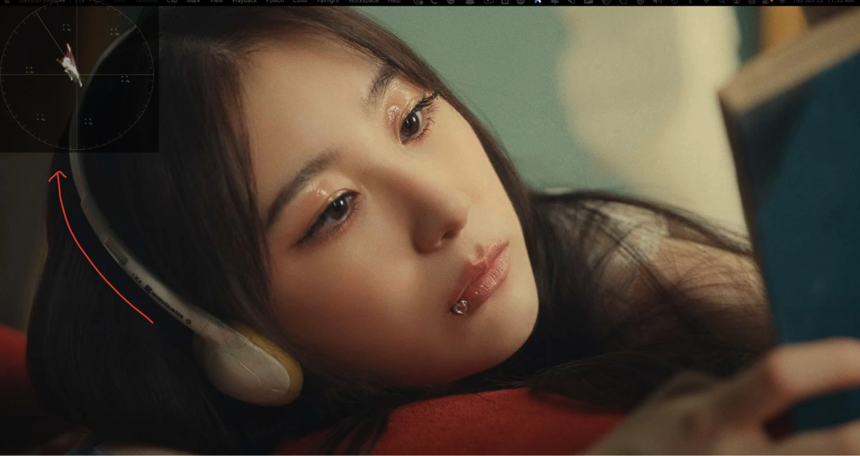
This is super common. But what do I mean by this? Let’s take glow for example. They’d drop it on and start messing around with all the parameters.
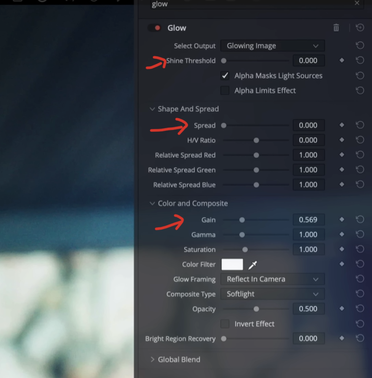

Like this could be a music video, but it looks too much like added glow. Say they want to add halation.


This is just too obvious. What I would do instead is these changes.


Here you can see that this stuff is applied, but it’s not a dead giveaway that you’ve added this.
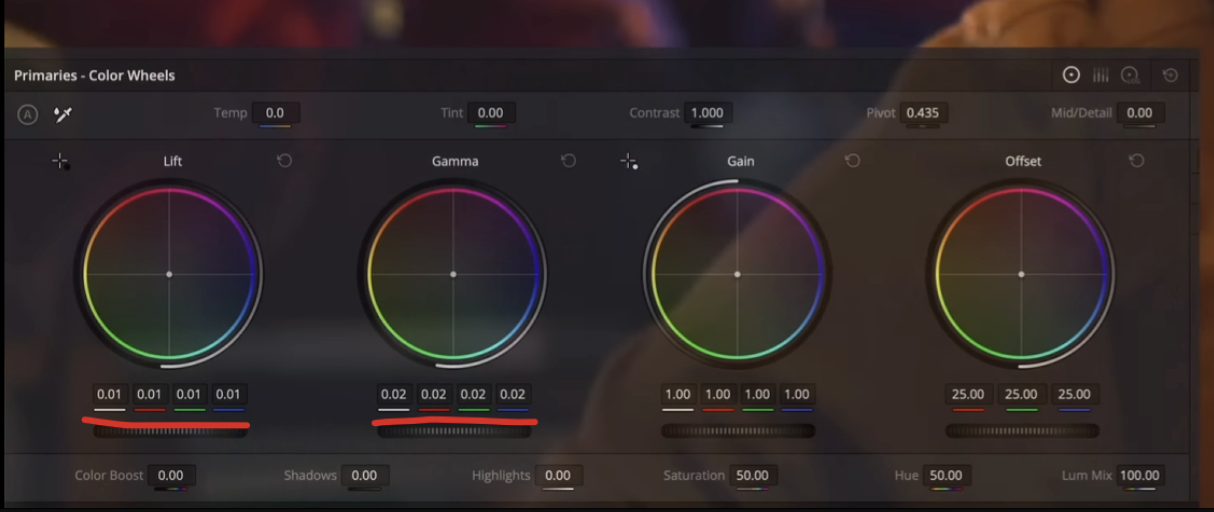
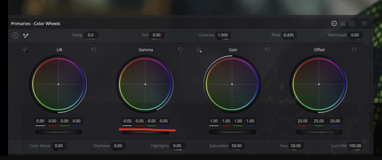
The next one is gunky shadows.

This is a dead giveaway that someone is new at color grading. You’ll find that people start with their lift and add that teal, then add the warmth back into the gamma to try and add separation.


Now on it’s own, the look isn’t terrible, but look at the skin tones and the shadows. They are turning green and ugly. That’s a massive problem. The easiest fix is to go under the shadow wheel in our log wheels and counter that.


So right here you can see it’s cleaned up. Now the look is still applied, but it helps so much to remove that green. If you want to keep the teal out of the hair, but into some of the rest of the shadows, you can move your low range in the log wheels.


The last thing is if you like the look but want to dial it back a bit, you can go under your node key settings and take the key output down.

The next mistake is new tool fascination.

New tools are definitely exciting but no one gets more lit on it than people who are new to grade. You’re always looking for a cheat code, but that’s not going to work. Now say the client wants the eyes brought up a bit and you just heard about magic mask. So the beginner will add it here. They will go into it and select features and face.

Then you select the face.

And then they track it forward and backwards. Then here they add some exposure to the lift to bring out the eyes.
What that does is mess the image up a bit.

You can see how the mask jumps around and does a weird dance. Plus it makes the system so much slower. Instead, we are going to create a window and create a shape around the eyes.

Now I will do the changes to the exposure.

Then in the mask I’m going to soften it.

Then I will track it back and forth. And just like that it’s so natural.
And with this method we get real time playback.
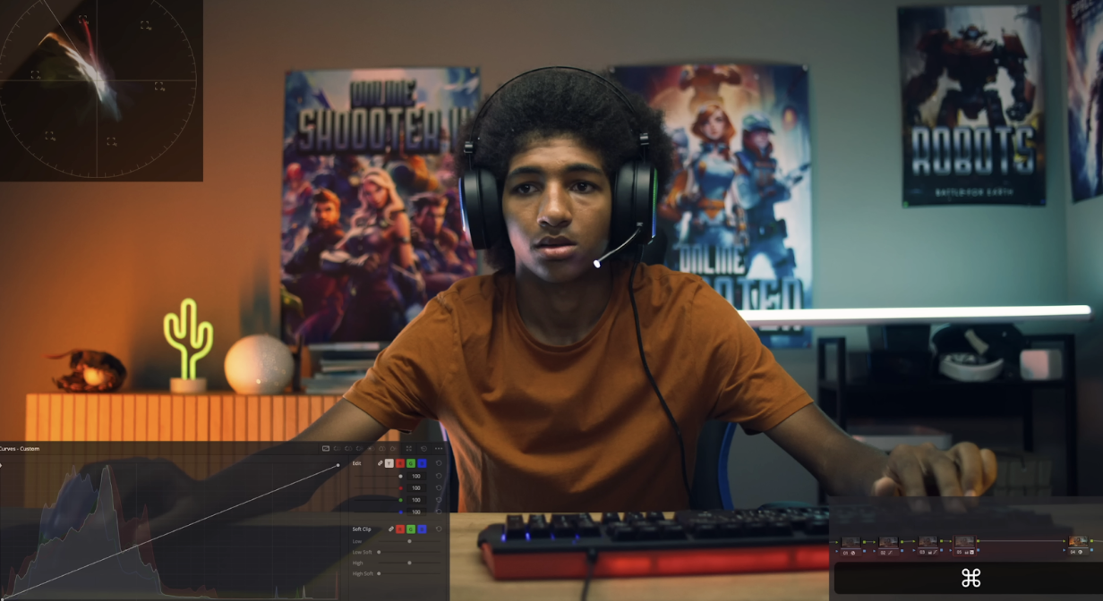
Now moving into our next mistake, which is a lack of a proper workflow.

When you’re starting out, you will attack every project differently. That’s the worst thing you can do because it adds so much time to every project you work on and it is nearly impossible to copy your workflow. But a workflow can be a simple 5-node, node tree, set up to convert properly to rec.709. Then you can start by balancing your shot and matching it.


Then you can do your look.

Then you can add some windows in the next node and take down exposure.


Just look how simple that was. The node tree is so small and we transformed the image. From here we can reset all of these nodes and save this node tree as a power grade. This can be used on any number of projects. All you’ve gotta do is change the input device.
The last mistake is grading blindly.

It used to take me hours to come up with a look idea. Once I got to my base, I’d try a bunch of different things (for full effect watch the video to see the changes). So once I come up with the idea, I send it to the client and they come back and are like, “WTF?” This is not what we wanted at all. So if you ask from the start, for your client to send over some hints and stills, then you can dial in that look. This helps you from having to spend a bunch of time on something and not having to redo it all. Just by asking, I have saved hours of time because I finally have direction.
So there we go. These are the 8 most common mistakes that everyone makes when they are first starting to grade. Which do you make the most?