
How to Get the Joker Look Part 2 | DaVinci Resolve 16 Tutorial

Hello! In this tutorial we are going to be recreating a look from the Joker movie. This is part two of a three-part series.
Now, as always, before we start grading, we are going to analyze the shot. The first thing I am going to do is drop in my color palette. From this, we can see it’s this vintage teal and orange look. The orange isn’t the transformer orange, but a vintage orange. In our highlights, everything is leaning towards this off-white color.
Once that analyzing is done, we can start setting up our node tree.

First let’s start with our exposure node. Bring up the contrast a bit and bring down the gain a lot. To get that creamy exposure look, we will bring up our gamma quite a bit. We will also bring down our lift and shadows (as well as our low range to control what is affected). Moving on to saturation, we want to give it enough juice, so we have some detail to work with.
Under our balance node, we will use our primaries to get it in the ballpark. Starting with gain, we will be bringing up the orange to try and get it to that vintage orange/red we need. Then we will use the gamma and go straight towards yellow to match the middle parts. Now we want to put some blue/cyan into the lift.
Do you see the power of primaries? Look what we were able to do just by using my primaries wheels. So many people overlook their primaries wheels all together and just move onto doing all these other adjustments. This is how you get the cleanest image possible.
Now let’s get into our look nodes trio. The first thing we are going to do is use our hue vs hue curves to dial in colors. Let’s take the yellow and turn it into the orange/reddish yellow we see in our reference image. In this section we are going to select the reds and bring them up just a hair. Next, we are going to click the cyan to match that green/teal color.

The way I am building this grade is with 0 qualifiers so you can apply this look to everything and only need micro-adjustments
Now we are going to use hue vs luminance, this is a tool that you need to understand, otherwise you can really crack your image. I am going to select the red channel.
Now my rule of thumb with this tool is to never go past two notches with any camera.
Under hue vs luminance, I am going to pull down the cyan to match the depth we have in our reference still.

Going into our third node in our look tree, we are going to use our LOG wheels to start dialing in these colors. Starting with our highlights, we want to start pushing it into this orange world. Next, we are going to take our midtone and really pull it all the way (almost) to that yellow orange color.

Now, we’re going to make micro-adjustments with the primaries to get it into that world. We are going to start with the gamma, bringing it up a bit towards red. Next, we want to get the shadows to have that green color. Using lift is not helping so we are going to go into our LOG wheels, under shadow and bring in that green.
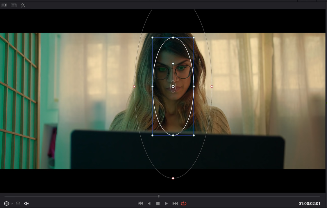
Moving into our look adjustment node, we need to bring down the highlights to match the reference. We are going to take the highlight selection on the bottom bar and drop it quite a bit. Now I am realizing we need to add a fourth parallel node to work on the talent. We just want to pull her out from the background quite a bit. We are going to create a power window (picture below) and raise the regular curves a lot to bring that exposure up on her.

Along with that, we are going to crank down the midtone detail to help soften her face to sell that vintage look.
Now that we have really dialed in our look, let’s move to our vignette and create a window, and invert it.

Now pull the curves down a bit to help sell the look.

In our sharpening node, instead of sharpening, we are going to pull down the midtone detail over the whole image.
Now in the film grain node I am going to add my favorite 35mm 400T and crank the grain strength until I can see it.

Under the noise reduction node, we are going to add my signature noise reduction.

For our global adjustment, we are going to bring down our gain quite a bit to match the reference and then bring down our color boost a bit.
And there we have it! That is the process to create the Joker look (part 2). I hope you enjoyed this!
MORE LIKE THIS


