
How Hollywood Directors use COLOR to tell their Stories

What’s going on Qaznation! Welcome to this awesome video where we are going to break down how different Hollywood directors use color to tell their stories. Then we will jump into Resolve and go over how to get a few of those looks.
Now let’s start off by looking at what characteristics determine the look. I’m breaking it into three different sections. Number one is genre.

Number two is time frame.

Number three is setting.

Each variable can change the entire look and feel of the movie because something could be like West World which is a western, but in the future. Which is a completely different look than something like Blade Runner.
Let’s start off with our first director, David Fincher.


So now the first shot we are looking at is from Fight Club.

This is a psychological thriller and he decided to go with this green, ugly tint through the whole movie, but the skin tones are sitting fine so it works. Our scopes tell us everything we need to know.
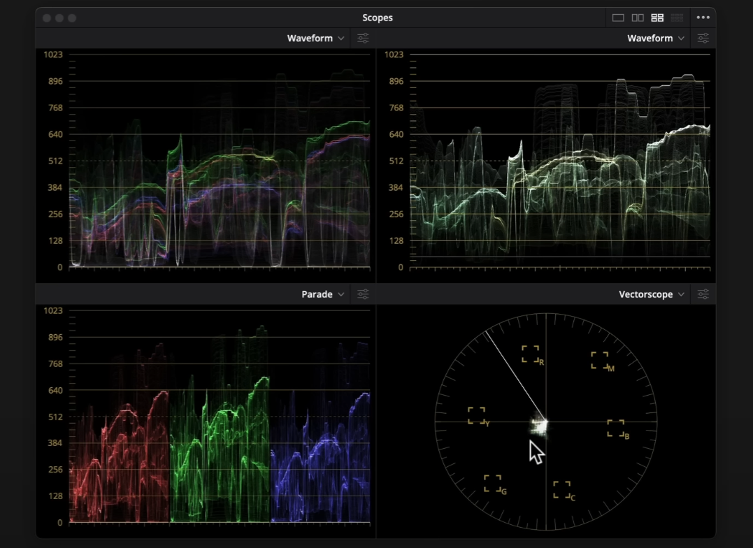
The vectorscope shows that it is muted, but also that the colors are next to each other which means they are analogous. The waveform shows us the entire story by giving us that green tint.
The next shot is from the Social Network.


If you watched the movie then you know there was a lot of shady stuff happening in this film. But keeping that in mind, Fincher went with a lot of yellow tones, which is the color of deceit.
Moving onto the next shot, this is from The Girl With the Dragon Tattoo.


This is a murder mystery so gray is a great choice to go with murder. If it’s not black or white, it’s gray. It creates an intrigue. To me though this is a more of a monochromatic color scheme.
It’s important to look at stills and analyze them so that when you try to recreate the look, you don’t think it’s rocket science.
Now moving onto Gone Girl.


This is a supposed murder mystery, but then it’s not. So to throw you off, he went for this gray look, but with at least some, muted color. And once you start picking up on these themes, it is so much fun to watch content. One of my favorite things to do is watch content that I know inside out.
So now when we look at all these images as a whole, we can see that, yes there are different colors used to tell a specific story, but as a whole it does have that Fincher signature look.

Now moving on, we are going to discuss Quentin Tarantino.


Now jumping right in, we are going to take a look at Pulp Fiction.


Just look at this image. A lot of his looks are maxed out, hitting the top and the bottom, and they are just in your face. He also uses a lot of primary colors which are very in your face. And that goes without saying because his movies are like that. This is almost like huge vengeance, all hell is going to break loose.
Now moving onto Kill Bill.


We can see again, primary colors are being used. Here the green is pushed. And in the scopes you can see things are clipping. This contrast is very punchy. This movie is an action movie, so the colors almost convey the actions of punchy.
Moving onto the next shot, this is from Kill Bill again.


Again, in your face, saturated, primary colors. And people may think it’s too much but it isn’t.
Moving onto Django Unchained.


This is where we see more of a complimentary color scheme going on. The reds and blues compliment each other. There are nice greens in the back, the dirt behind him, everything pops.
Now looking at all four looks, we can see that the colors are just popping off the charts. It all looks delicious and that is what makes Tarantino, Tarantino.

Now we are moving on to Denis Villeneuve and unlike the other two, he is very diverse.


So now let’s start off with this shot from Sicario.


Now this example is not necessarily using monochromatic colors, but more complimentary colors. However the colors are muted.
Then moving onto the next shot, again from Sicario.


There is a hint of complimentary colors going on with the green and yellows, but it’s not committing to it. The contrast is very gentle and nothing pokes you in the eye. It’s so soft.
Now we are moving onto Doom.


This is sci-fi and fantasy. Here it’s a flashback sequence so he is using tons of color, but in a monochromatic color scheme.


What he does in this movie is create these whole different worlds with color.


These past three looks are all from Doom and they are all different.
Now moving onto probably my favorite from him, Blade Runner.


I mean just look at where it sits on the waveform. Everything is breathing in the middle, yet they are using a monochromatic color scheme.
Moving onto a shot from Arrival.


This look just grabs you and keeps you in.
And one more look from Arrival, this is an example of a complimentary color scheme.


But it is still muted on the cooler end. There still is saturation in the warmer tones.
Now when we looked at the other two directors, you could tell their look. But what I love about Villeneuve’s work, is that it looks like it could be five different directors. Yet it’s only one.

Every frame on its own could be a cover of the most expensive cover of a magazine you could ever buy, but collectively it does have a magic when you look at it.
Now, it’s time to go ahead and recreate these looks. Starting with Tarantino. We are going to use this shot to start off.

We are first going to build out our node tree and add a color space transform to the first one to convert R3D RAW to DaVinci Wide Gamut so that everything after will be using that.


Then we are going to copy that over to the last node and change the parameters around to DaVinci Wide Gamut for the input and rec.709 for the output.


So starting in our fifth node, I am going to start adding contrast and adjust my pivot accordingly.
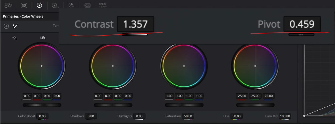

It’s now got that Tarantino punch.
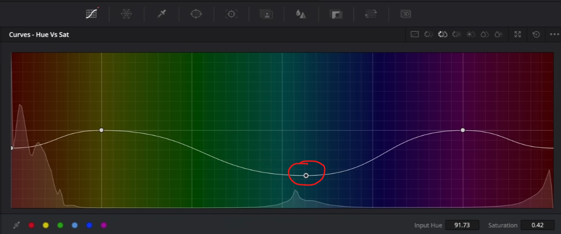
Now I am going to go to the fourth node and take the cyan into more of a primary color. I am going to use my hue vs hue and mess with our cyan. Then we are going to mess with our green and blue.

Then I want to go into hue vs saturation and pull down on the red a bit. I want it to have information and not blow out.


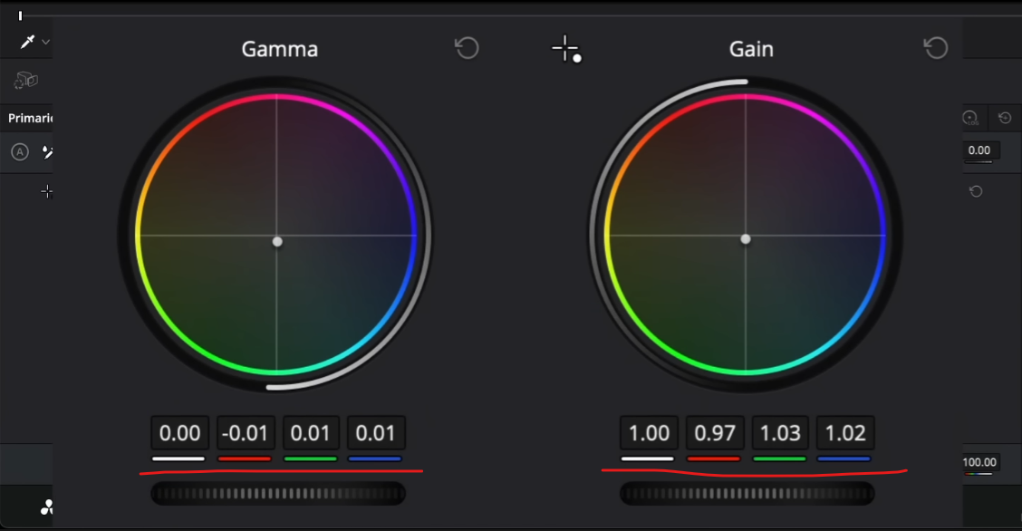
Then in my second node I am going to drop my gamma and lift, then bring up my gain to add some more contrast.


Again, we are not going for a 1:1 match, but just get some practice in to understand what’s going on.
Now my image has a bit more warmth in the image than the reference so I am going to add a -1 yellow in the offset. Then I want to add a couple cyan as well.


Then I want to add a bit of saturation.


Now we are going to create our Fincher look. I am going to keep the same grade I had for the Tarantino look, but we are going to go in our fourth node and go into our huge vs saturation and take out most of the other colors.

Now what I want to do is transfer that node #4 corrections to node #3 and then in node #4, I want to dial back on the saturation.

Then I am going to go into my gamma and gain and add some of that green.

This look is there. You can see the colors are muted enough and the contrast is there.
Now we are going to move into our Denis look. Now most of his looks stem from super soft contrast. Meaning we have to go in and delete our corrections in node five. Instead I am going to use my custom curves to dial in that contrast.

Then we can take the contrast slider and mess around with it a bit.


Now I want to go into my offset and I want to add a bit more cooler tones.

Then I want to bring back the saturation a bit too.


Then I want to go into my HSL curves and make sure that I am not suppressing any colors. Then I am going to mess around with the saturation one more time.

Then I don’t like the strong green, so I am going to use my HSL curve and take my cyan and turn it more blue.


Then I want to adjust my custom curve a bit.

So now what we are going to do is grab the other versions and compare them.

So these are the looks we are able to create after doing tons of analysis and research on films by these directors.
So there you have it! And remember, work hard, get obsessed and get possessed.
MORE LIKE THIS


