
How to Color Grade a Music Video | DaVinci Resolve 16 Tutorial

What’s going on everyone! Welcome back to another tutorial. Today I am going to be walking you through the process of getting and grading this music video that I got to color grade.
So first, how did I get the job? I got hit up on Instagram by one of the directors.

The director said he loved his work on Instagram and wanted to work with him.
How long did it take to grade the music video? It took me a solid 10 hours to grade the video. I used tons of windows and qualifiers, but that’s usually a pretty good speed for music videos.
This was all done as a Remote Grading Process. They uploaded everything to Google Drive as a clean video. I brought it into resolve, used scene cut detection, and went from there.
What was the director's look inspiration? The director was in love with Joker and he wanted a mix between Joker and John Wick and he loved it.
What was the communication tool? The main communication tool was whatsapp. You can send long voice messages and pictures/videos, so it’s a great way to communicate.
What was the storyline of the music video? It was super sad. The daughter was born, the wife is dead and the guy doesn’t know how to feel. It’s all about anger and passion.
What was the camera used? Alexa Mini. The DP knew what he was doing and used many different lights on set which helps.
What was the reference image? I was using some of the shots from Joker and John Wick. I wasn’t going to a 1:1, but more just making sure I was in the ballpark.
Analyzing the footage. Once I watch through for the storyline, I watch it through to analyze. That will lead me to go to the lightbox mode to see the grid view. This is where I will start grouping things by scenes. Once you start grouping, you need to start off with figuring out which clip to start with. You need to think about the conversation with the creative director and pick the best one to represent.
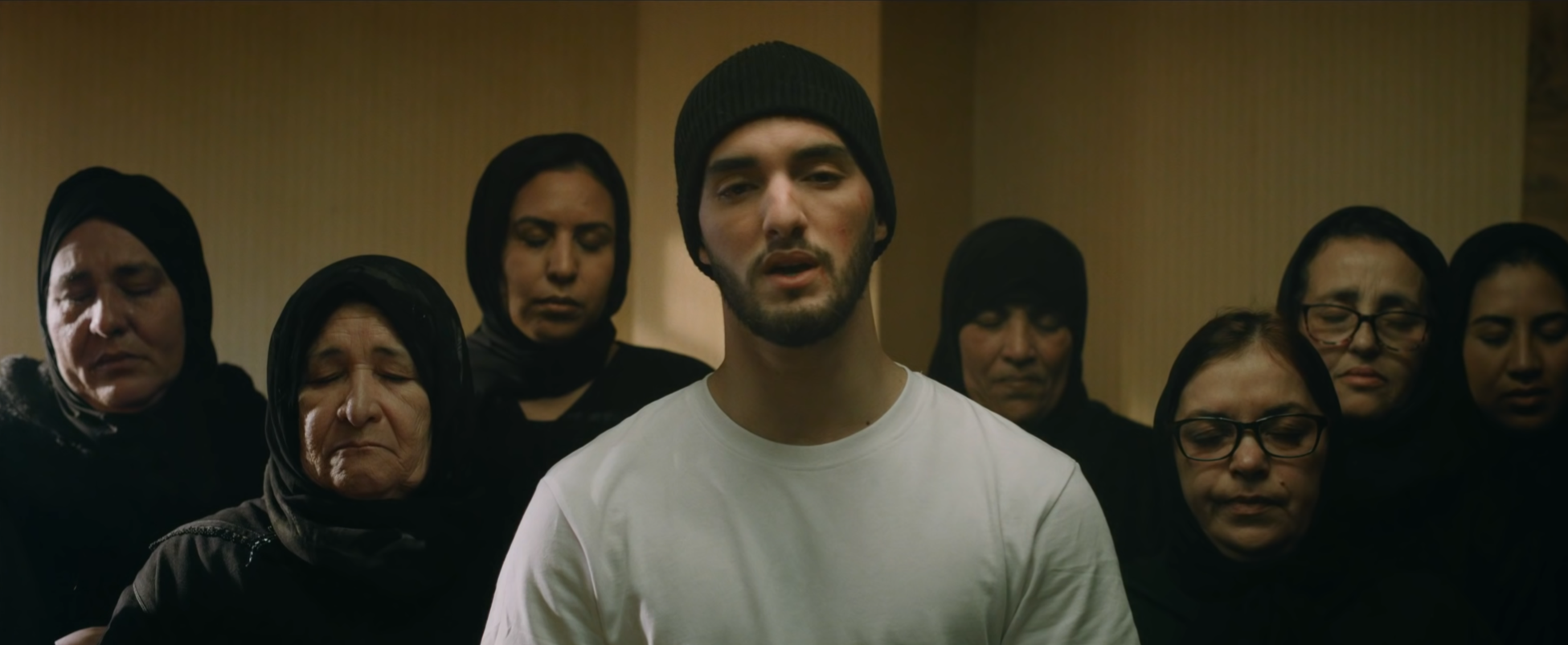
I chose the hallway scene. I felt that it had the best colors and allowed for me to get a great base grade for the whole video.
Here is the node tree that I used.

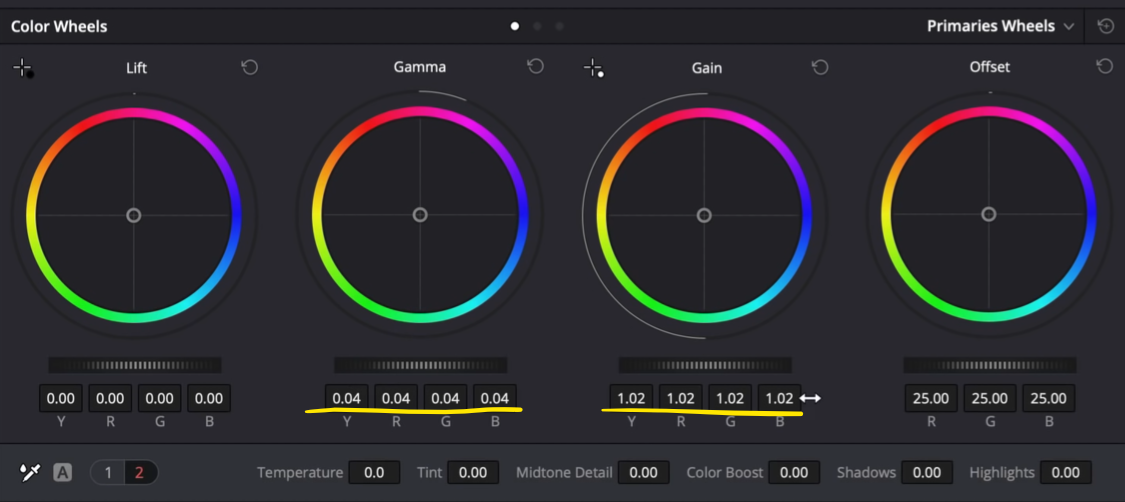
I started in my exposure node with contrast and a combination of lift, gamma, and gain to get the mood right.


Then I went into my saturation node and cranked it, pretty far, and then shifted the hue just a tiny bit.


Then I moved into the balance node, which was more of a look node than a balance node. I started to get the colors similar to that Joker world.


Then in our look node, I popped the green in the highlights of the window to take out the blue cast that was there.


Then in our skin node, I really worked on getting his skin into the same general color that was in our reference. I used my log wheels heavily to get us into that world.


Then in my look adjustment node I just barely touched the gamma, but brought up the gain a bit.

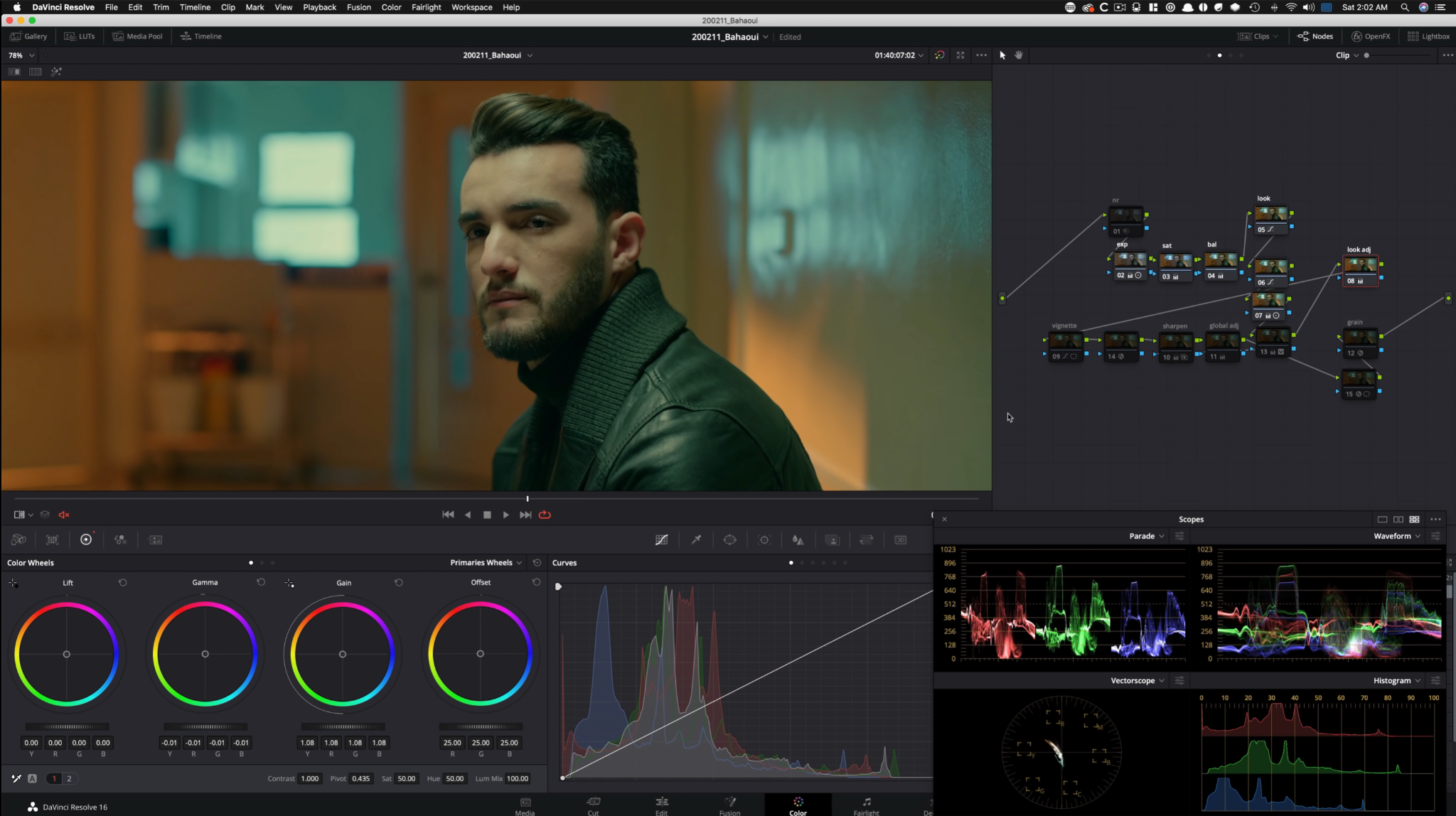
Then I created a vignette to really just pop him out because he is the focus. We want to draw peoples’ attention to him.


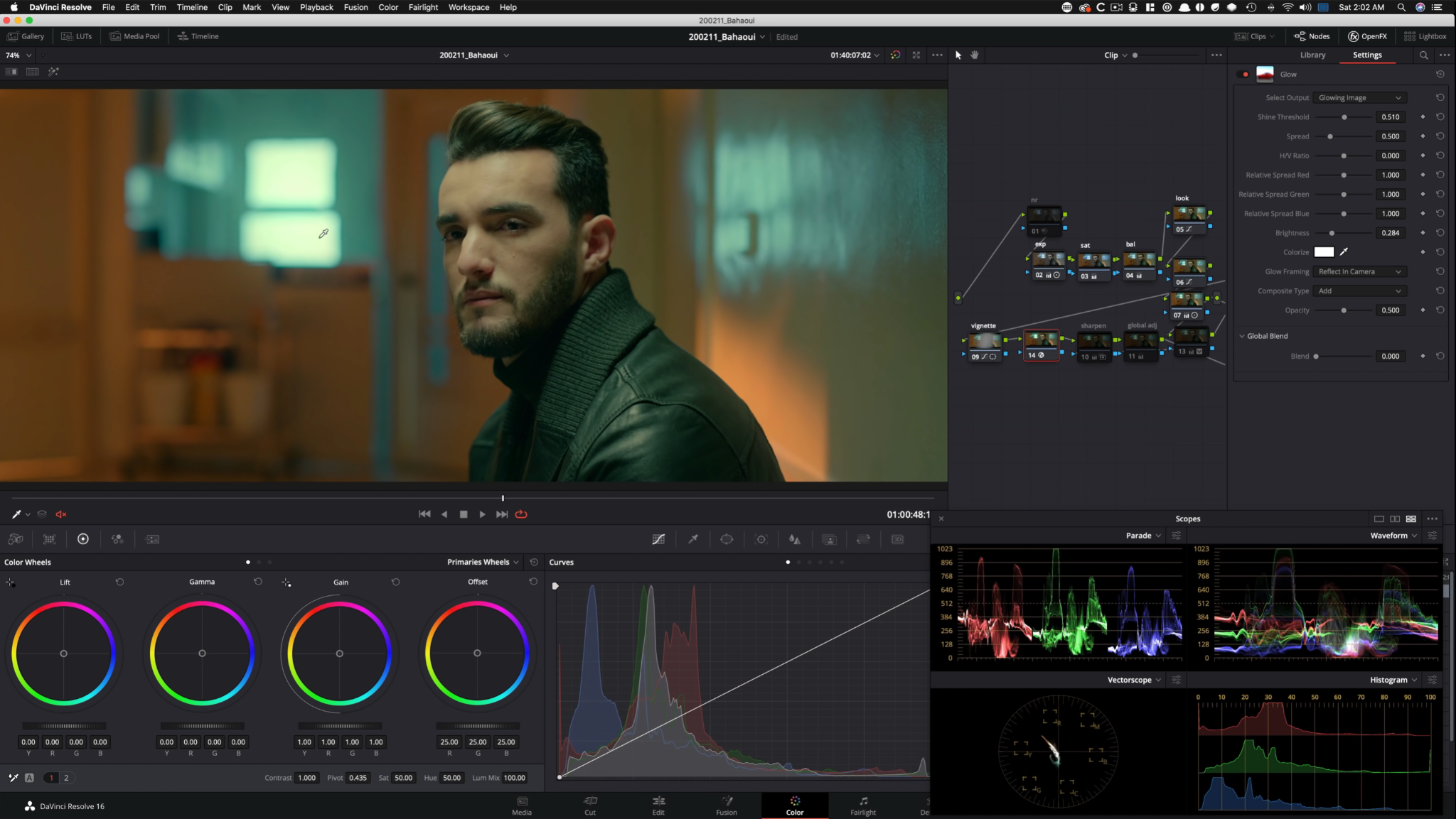
Then I went into our next node and popped in our glow effect to add some interest into the window.

Instead of adding sharpness, I actually pulled some detail out using the midtone detail.

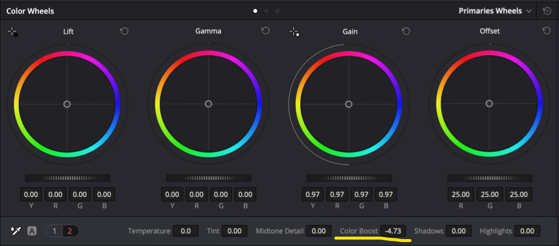
Then I moved into my global adjustment node and I brought everything down by pulling down the gain a bit. I also took out just a tiny hair bit of color by pulling down on the color boost.


Then in the next node, I created a window to pop him out a little bit.


Then I added a lens reflection look that gave it this subtle anamorphic lens flare effect.


Then I topped it off with some grain at the end.

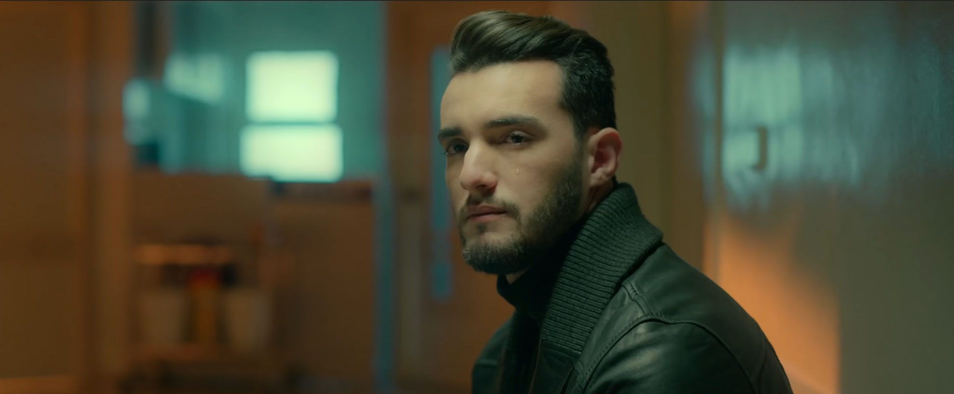
This is the final look.
The next scene is from the car. This is the node tree I used.

As usual I started with the exposure. I added some contrast and played around with my lift, gamma, and gain.


I didn’t think it needed saturation so I skipped that node and moved onto my balance node. In this node I used both my primaries wheels and contrast, along with my hue vs tab to start dialing in the look. Like the last shot this became more of a look node.


Then in my next two nodes, I used my curves and hue vs tabs to really just refine and dial in the look a bit more.

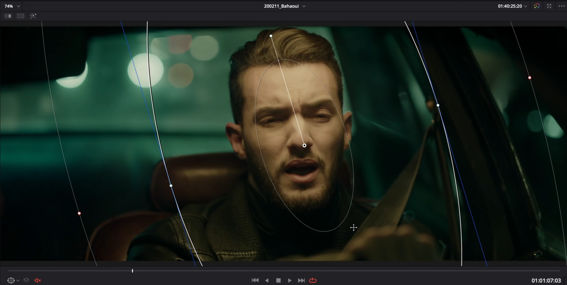
I didn’t touch my look adjustment node, so I moved onto my vignette node. I created a vignette around the subject, inverted it, and then using the RGB curves, I brought down everything around him.

Then in my next node I used my glow to pull him out of the background and also add a little bloom to the highlights in the back.

Then in my sharpening tab I brought the midtone detail down like I did in the last shot.

In my global adjustment I dropped the color boost just a bit.
Then in the next node I used the RGB curves to inject red into the top portions of the image to create color separation.


Then I went to my next node and I qualified my highlights to pull back on the highlights to take out some of the sting.


Then I added grain and noise reduction. Let’s check out the final look.

Moving onto the funeral shots, this is where we had a few back and forths because at first it was too red and I needed to make some changes.
Moving into the grade, here is the node tree I used.

I started off with the basics, using contrast, but then I went into my tint and really brought it back towards the blue side of things.


Then I started creating the look just a bit using my primaries wheels.


Then I moved into our third node and created a custom curve this time to give it the right amount of drama.


Then in my sixth node, I needed to bring back up the detail on the right so I created a power window and used my primaries wheels to bring up the exposure.


Then I went into my fourth node and used hue vs saturation to add some saturation, and pull the gunky green out in the lower mids.


Then in my seventh node I brought the image down quite a bit using my gain and created a window around his face.


Then in my next node I qualified the warmer areas and brought back some of the green that we were using in our look DNA to match the rest of the video.


Then in the next node I started to bring back the green in the image a bit.


Then I topped it off with grain.
Let’s check out this final look in full screen.
This was a fun music video to grade. There were more looks, but these couple were the heart and soul of the music video, the look DNA for the video. Feel free to watch the video if you want to pick up on a few more tips and tricks.
MORE LIKE THIS


