
How to Color Grade a TV Commercial

What’s going on guys, this is Qazi and welcome to another epic tutorial. This time I am going to talk about how to grade a TV commercial. I am going to bring you along step by step through the entire process.
Alright, starting with the soft skills, how did I get this job?

Let me show you the email.

What’s cool is he found me through social media. Social media works and it’s a great platform to show off what you can do, but also to engage with people.

The other awesome thing is he wants to have it graded like a Genesis commercial that I graded. But then I gave him my day rate and he said it was a little out of the budget, but next time. Now, here is one thing to note: don’t give up.
The next step is negotiation.

Most people here would say “well, lost a job, onto the next one.” I did not do that. I asked what their budget was.

I decided to take on the job to build the next skill. An authentic relationship.

I realized the guy was just hooked and I wanted to make it happen. The important thing to note is that you can’t do it too much or too little. You have to play your cards right. So I reached out again and figured out if he was local and how he wanted this to be delivered.
The cool thing is this job has led to more.

The next email, which obviously shows that the client is happy, had the subject Next Project. He goes on to say:

Now this 30 second spot is a full blown TV spot. So what started out as just a small internal job, turned into a TV spot. Then another email came in:

This is why I titled this section 1 job to infinity. Once you get past that corporate BS facade that people create, you get that authentic relationship which leads to more work. And as a freelancer, that is all you have. That is why it pays to be personable and to stick with things. In a matter of weeks it went from a small branded thing, to a couple TV spots. Now we are calling each other buddies and it’s game over! Now I am this person’s go-to guy. This all started with an email that said, “I discovered you on YouTube.”
Now we are going to switch gears to the hard skill section.
First, let’s start with everyone’s favorite topic: what camera was used?

They used an Alexa Mini LF, which was one of the main reasons I took the job. It is the best camera I have ever worked with in my entire life.
Let’s move on.

Let’s jump into the project and see what we got. This is going to be a round trip since I picked up the physical hard drive and I’m working from that.
Now that I’ve watched the spot through, I am going to use the lightbox mode, which gives me a birds-eye view.

A quick little pro-tip, make sure to click on this little “I” icon as it will give you important information about the clip.

This is a short form spot. What I love about short form is that you can really go ham on the shots. You can take more time to dial in the look since you are working on less shots overall.
Now the next step is to organize these by scene or location.

I can look at it from the birds-eye view and be able to see what clips are from the same location, or from the same scene.
Now that we have our scenes broken down and organized, the next step is to figure out our approach.

Since this is a short form, there are many ways that you can attack it. I took the lazy route and graded them shot by shot.
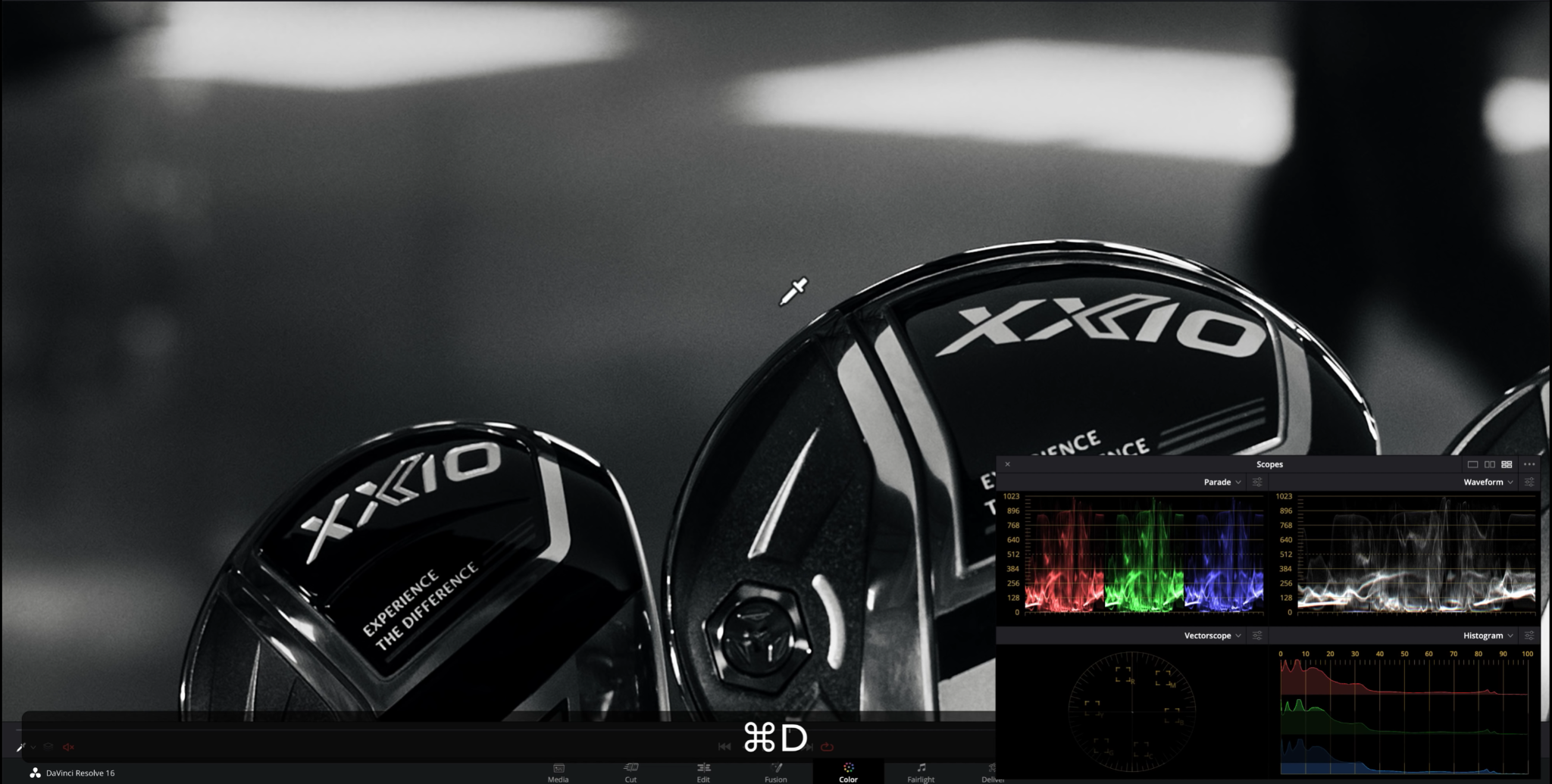
Once you have determined your approach, the next step is to pick a hero shot.

A hero shot is something that represents the scene, or the general spot. I am going to pick this shot:

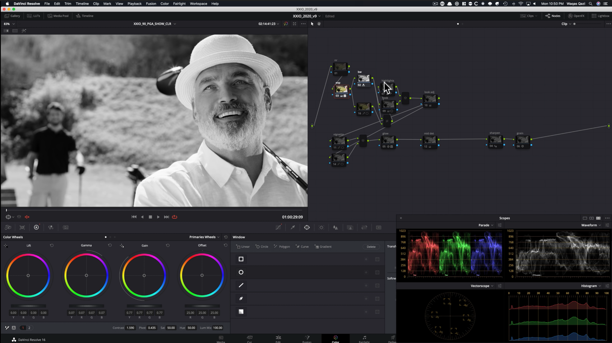
Let’s first go over the node tree.


It is loosely based off of my signature node tree, but like I have said in the past, you will need to adapt it on a per-project basis. First thing we want to do is to make it black and white. I did it by going to my rgb mixer and turned on monochrome.


From there, I went back a node to start working on my primaries. We really pushed it in this node. This is what they wanted.


The next step was to take it further and make a look DNA.

You may be wondering, how do you create a look DNA with black and white footage? Just like you would with colored footage, as you will see.

As you can see, I worked on balancing out the image. It had a more red tint to it, so I brought back in the blues to balance it and give it a more neutral look. Just nudging it. Not going too far, but a gentle grade. This is what gives it elegance and that look DNA.

Next, I wanted to work on the highlights. I needed to do some damage control. The way I did this was by using a qualifier.


I used the luminance qualifier, because it helps you pull the cleanest key. I was able to soften it and really dial in what was picked so that I am only grabbing what I really need to affect. Then, once that was done, I went into my number 2 tab and brought down the highlights.


Once I had taken care of the highlights, I moved onto the look adjustment node. This is basically my node that will be used to do my balance for the entire commercial.
Then we created a vignette.


This was just a simple gradient window that allowed me to pull down and control the bottom part so that the eyes would not look at the bottom, but more at the top of the golf clubs.

Next I created a vignette just around the clubs so I could pop them out from the background and draw attention to them.


Once that was created I used my curves to bring down the surrounding parts of the image. Then I created an outside node to bring up the exposure a bit on the clubs themselves to sell that effect.
After this I went into my light rays and did it in a very specific way.

All this was doing was taking the highlights and blooming them just a little bit. It gives it a really nice feel and takes off the digital edge.

Now the client wanted the image to be sharper. They didn’t specify how they wanted me to achieve that, so I decided to achieve that by bringing up the midtone detail.

If you are coming from photoshop or lightroom, you know how powerful this tool is. It really helps bring up that detail in the image.
Now even though I had it sharpened, per the client's request, I used the generic sharpening I normally do as well.
Finally, I added grain to the image.
Now with the grain, I didn’t do it too much. Clients freak out when you do too much, so I had to make it tasteful.

Finally I am going to show you what I did. This is where I made the selections and kept the color in the sticks and the heads of the golf clubs.

The node tree structure is set up like this so that I can pick out what the color was before anything was applied, then use a layer node so that nothing I did after could affect it.
After that, I went ahead and popped out the gold in their logo that they wanted. This was a lot harder. I started with my curves, using hue vs luminance to make everything more deep and rich.

Then I selected my key, like how I selected the blue.

Then, I had to create power windows around each of the yellow parts because there was a lot of spillage happening, just to make sure everything was perfect. I also went ahead and tracked all of them.


Moving onto our next shot we are going to be covering:

Let’s first go over our node tree.

This is the same node tree from our previous frame, but adjusted for this specific clip. It has fewer nodes.
The first thing I started with was the monochrome conversion, done the same way as our previous shot.

Then I went into my primaries and gave it the most juice possible.

As you can see, I really cranked the contrast up a lot. That left everything sitting pretty dark, so I went ahead and brought up my gamma quite a bit. That blew out my highlights, so I brought my gain down a lot to compensate.
Moving onto the look node, I just kept that node the same as previous. I didn’t have to change it at all.
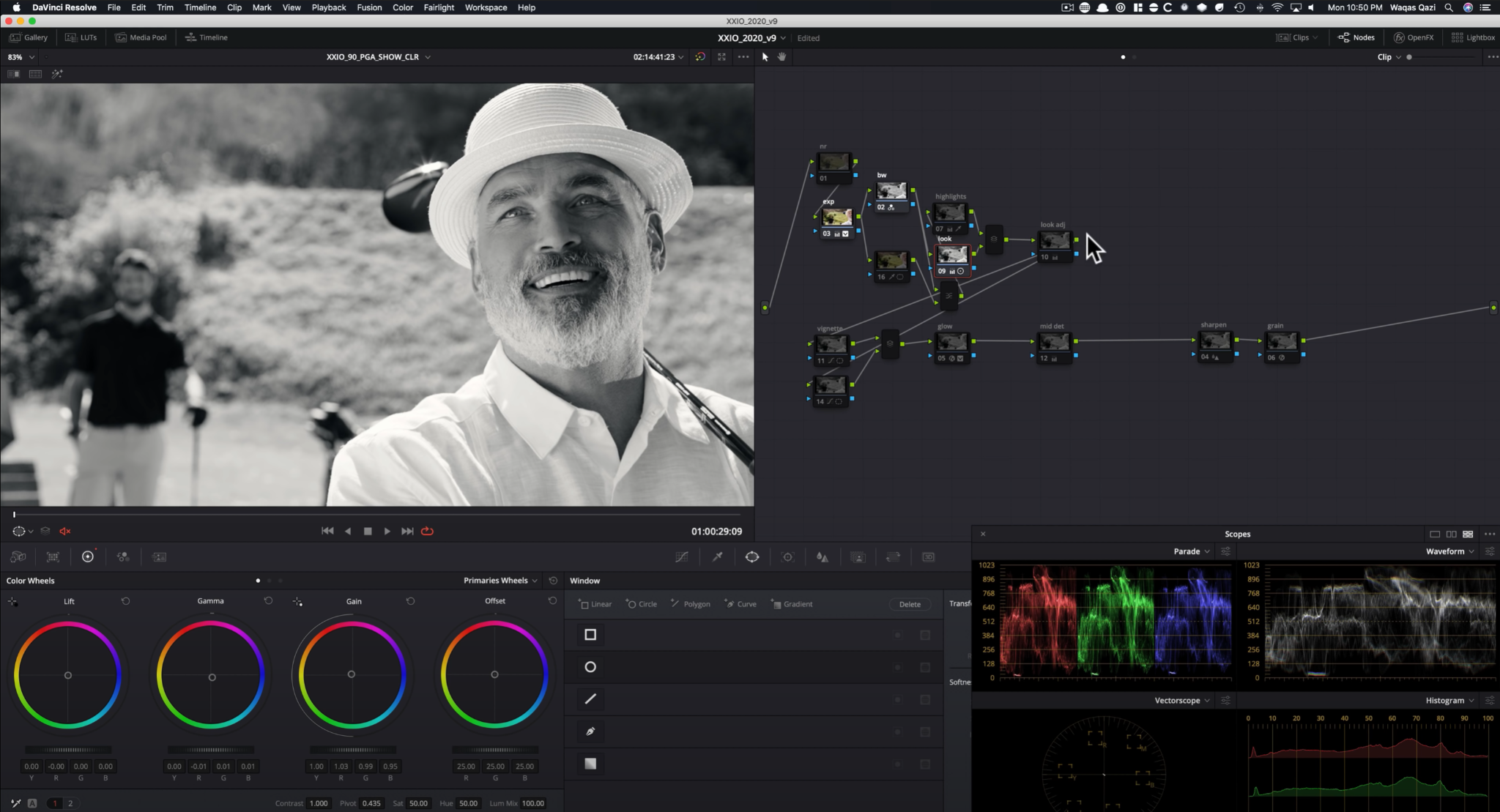
Same with the highlight node, I kept that the same.

And like I said in the previous example, the only thing I was really changing on a shot-to-shot basis was the look adjustment node.

This was just my node to make sure that everything was matching and as you can see I brought everything up.
Then like the previous shot, we have a vignette that is pulling focus towards his face by darkening the bottom.

Then I created another vignette from the top to just subtly darken the top.

I did create a gradient window to pull the blue out in the golf club.

The rest of the grade stayed the same from the previous clip.
So to recap, I used my general node tree to set up the shots, but I customized it to this grade. I used power windows, to really control and dial in the look that I was going for and to pull out color, but only on specific parts of the image.
So I hope you learned something from this tutorial! Just remember to apply the tips I gave in this tutorial.
MORE LIKE THIS


