
How to get the Atomic Blonde look | DaVinci Resolve 16 Tutorial

Hello and welcome to another look recreation. Today I will be showing you how to get the Atomic Blonde look.
Before we get started on the grade, let’s first pop in our color palette effect to analyze the image.

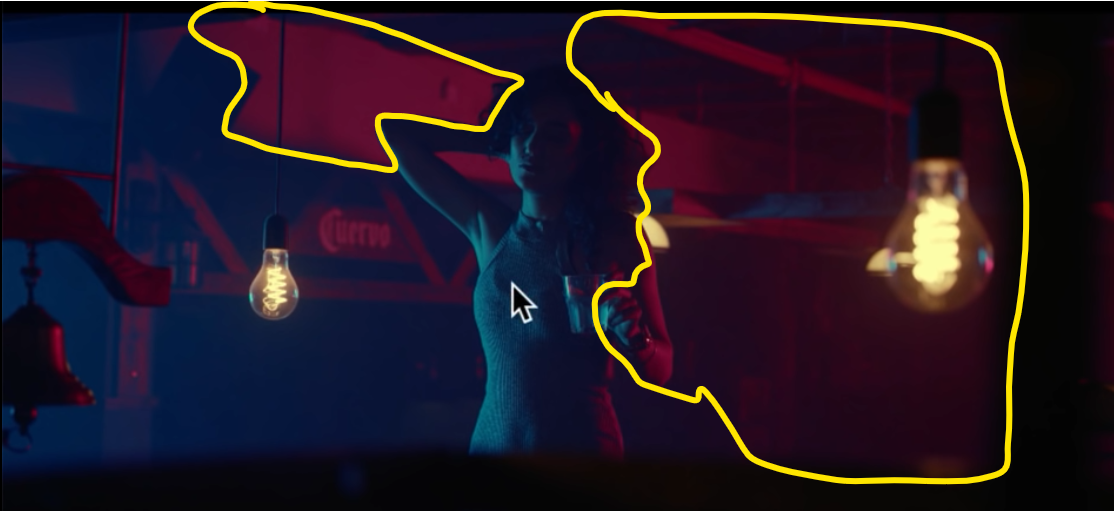
If we look at the image we can see there is this heavy red/magenta cast. But there is also this gunky green on the skin that the DP left in. Last, we have really nice blues. The shadows are literally gone, crushed.
Now that we have the shot analyzed, let’s go ahead and create our node tree.

Starting in our primaries node, let's bring up the contrast, but not too much. Somewhere around 1.28. Once that is done let’s pop on over to our LOG wheels and bring down the shadows. It’s grabbing too much of the image, so we will need to bring our low range down to affect the lowest blacks.


Now let’s head into our curves node. We will want to click on our default anchors.
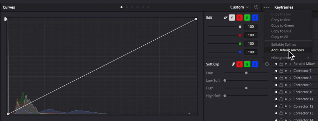

Using the curves section this way allows for more finite control over the image. Go ahead and pick the middle spot between the bottom knuckle and the first anchor and pull it down to add the contrast in the black points.


Now switching to our RGB curves, what I am noticing is that the blue is very dominant. There is a lot of blue in our reference, but it’s not even close to what we are working with. Now click on the blue channel and drop the highlight knuckle a lot. After this step, you should really see the colors starting to get in the ballpark. Now switching to the red channel, we want to bring in more reds. I am going to pull it up from about ⅓ of the way up from the bottom knuckle. Last, I am going to pull up on the green channel, just a little bit farther down from where I picked up the red.


Moving into our look node, we want to pull our magenta area, more towards red.
So, select the magenta preset under “color -> preset -> magenta.” Once that is selected, start moving the offset towards the red in our reference.


Now even though there isn’t much to do with our reds and blues, I am still going to grab them, just to get more control. However, in the blue node I want to bring the gain towards the blue/magenta color space.


Now in our red, we want to take our offset and push it a bit towards the yellow side, but not much.


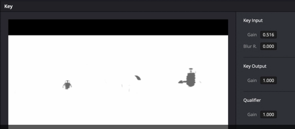
Now the bulbs are looking so clean that I don’t need to do much. However, I am going to show you a trick. We are going to qualify the bulbs by taking the low luminance up until it only selects the bulbs.

We aren’t going to do anything with them now, but if I need to later I have them qualified.
So in my look adjustment node, I want to give it a bit more pop. I want to bring our girl out. I am going into my curves and checking on editable splines and bringing the curves up quite a bit.


Now what you can do is send the key signal from the bulbs node into the look adjustment node, so that you can tell DaVinci to affect everything but the bulbs. And then we want to blend it so that it looks seamless.

In my shadows node, I am going to qualify the shadows by using the luminance qualifier. Now that we have the shadows selected, we are going to turn off our luminance mix so that it only affects the channel I am trying to affect.

I am going to start pulling down the blue in my lift to pull out the weird purple/magenta undertone. Next I am going into our gamma to pull blue out as well.


This is probably the node that really got the look dialed in. I am calling it now.
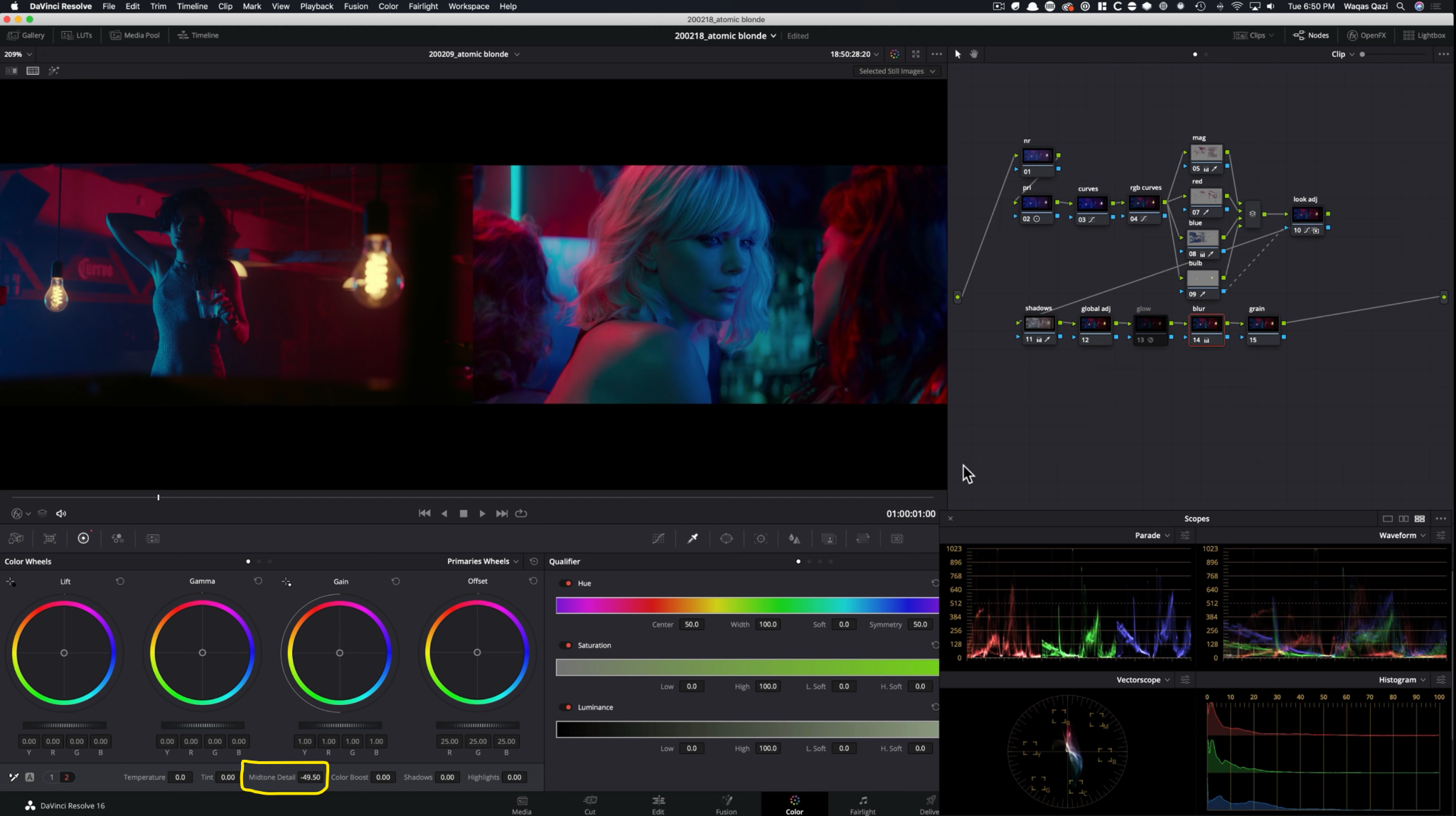
Next I am going under the blur node and I am going to bring our midtone detail down to about -50 to soften the whole image.
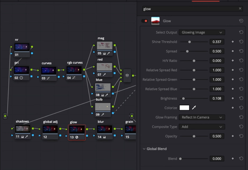
Let’s go under our OFX and add some glow to add that extra sauce on the highlights and make them bloom.

Now we are moving onto our film grain, we are going to add our generic film grain, but crank up the strength and texture more than normal.


Now this is our final look! Let’s see them in a big format!


And there we have it! Thank you for checking out this tutorial today and I hope you learned something from this! I will see you in the next one.
MORE LIKE THIS


