
How to Create HBO's Euphoria Look in Resolve | Color Grading Tutorial
What’s going on everyone! Welcome to yet another epic tutorial. Today we are going to be creating the Euphoria look. This will be a look inspired by NOT a look recreation. This is one of the most beautiful looking shows ever and thousands of you are asking for a look breakdown of this, so here it is. We will be taking concepts of look recreations, but throwing our own flare onto it. This is my interpretation of this look. I will also NOT be using any third party plugins, which makes things more complicated. It will be complicated because I won’t be able to use the same film negatives/prints used in this show. I don’t want to do that because some of y’all may not have access to these tools. Now, let’s get into it!
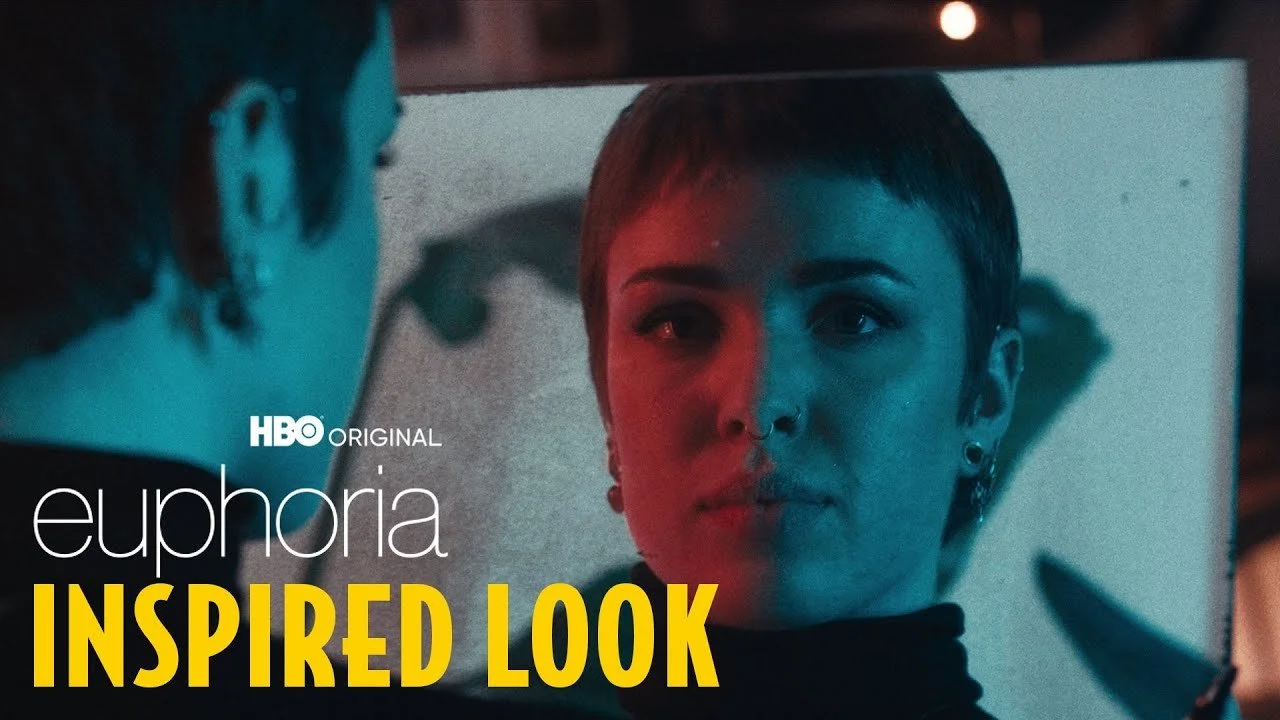
Let’s start with a good old fashioned analysis of our inspiration.

We are not going for a 1:1 match, but use it as a guide. That should always be the goal for you to recreate a certain look. Don’t become a copycat. Here are four things that you need to do. First, nail your contrast. This is talking about your highlights and shadows. You need to get those correct for the image to fall into place. Second, you need to work on the colors. This doesn’t need to be a 1:1 match, but at least needs to be in the vicinity. In this example, we have a red and blue/teal contrast going on. Third, you need to focus on your saturation. You can use the vectorscope to figure all of that out. That will help dial in the image. Fourth, you need to focus on texture. What does that mean? I’m talking about the grain in the image.

This texture is what’s giving it the look DNA. So focus on making all of these as close to the look as possible to really sell the look.
Before we get into this tutorial we need to make a quick pitstop. Go to imdb.com and type in Euphoria, and look under technical specifications. You need to see what camera was used. The entire season one was shot on Arri Alexa 65 and season two was shot on Arricam LT, which is a film camera. Everything you see in season two that you love, was shot on film. This is why it looks so good. It looks like film because it’s shot on film.

It was graded by Tom Poole at Company 3. Personally he is one of the best colorists in the world and he always puts out great work.
Now here is the clip that we are going to be working with.

It was shot on RED Dragon in LOG.
Now let’s create the node tree. I am going to create six nodes for this look.

Here’s the thing. If you are using paid plugins, like DeHancer, you can get access to the film stocks that were used on the show. You can use these to build the look. Now Company 3 has color scientists that are concocting these looks, so slapping on a plugin or lut is not going to make it look like that.
Now the first thing we want to do is use a color space transform to convert it properly to cineon film log color space so that the lut we are going to use will convert properly.


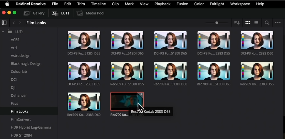
Now on the last node, we are going to apply our Kodak 2383 D65 (the cooler version) lut onto our node.

Now let’s compare that to our rec.709 so you can see how this changes things.

With our film lut, it already looks more “filmic.”
Now one of things you need to know is which battles to fight and which to give up. What am I talking about? If we pull up our reference, you can see three main light sources going on in our reference. We’ve got the moonlight in the back, the natural light coming through giving her perfect skin, and then the redlight on her face. In our image, we only have the red and green lights. So we are not going to fight and unnaturally create the perfect skin tone because we can’t. That’s why I say not to always go for a 1:1 match and to drop some battles. Do you also see the highlights on her face? We won’t have that. So our image will live around 512 or lower on the scopes.
Now the first thing we need to do is balance our image and bring up the exposure. So one thing that bothers me is the crushed red at the bottom. You can go into the hue vs saturation curve and pull down on the cyan.


Now in my third node, I am going to go to the HDR tab and select the proper color space and gamma.


Once you have this selected, it works as your camera RAW module. So if you increase the global by 1, it increases it one stop basically. Now I am going to increase the global to 0.75.


Now another thing I want to do right now is add some noise reduction. I am going into my first node and I am going to use the settings pictured below.


The next step is to balance our image a bit. We can see in our reference, we have more of a cooler blue. So we need to pull out that green in the blue. I will be using printer lights which can be activated under the color at the top. I am going to start by removing some green. I am going to take out two green. Then I want to add two cyan and one red.


Sometimes you need to play around with it. You can see our background is already looking a lot closer to our reference. We can even see in our scopes that it’s a lot closer.

We do need to dial in our contrast, so we are going to do that in our fourth node using our custom curves. I want to start by pulling down on the highlights, then pull up on our shadows. In our reference, you can see that the blacks are a bit lifted and soft compared to the highlights which are harsh. Our colors will go crazy using these curves but we will fix that. Now I want to create three points in the highlights, and two in the shadows (pictured below).

Now we need to dial in our saturation. The best way to attack this is to kill the saturation, then slowly bring up the saturation and see where we want to be in comparison.

Now here is where we want to be on the saturation, then under hue vs hue in our curves, I want to swing the reds up a bit.

We can see that we are close to the saturation with our vectorscope. Now I am happy with where the colors are.
Now I do want to go back to my HDR palette and raise the offset to 1.


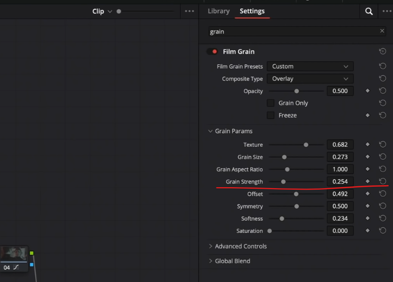
Now the final touch will be dropping on the film grain to get that texture. I am going to start with my 16mm archival print and it gets us in the ballpark. I will want to pull back on the grain strength, but now we are pretty close.
Now there is one more step I need to do or it will drive me crazy. I am going to create another node after our third node. When we look at our reference, look at how the colors belong and there are many variations. In ours, it looks like one color and a blob. So what can we do to pull more information? One of the ways we can do that is to take our shadows saturation in our HDR palette down a little bit. I want to get our background more into our reference world. I want to dial back my light saturation to just get a hint.


Now one last thing to do is to actually kill the shadow saturation I just did, but then swing the global hue in our HDR palette down a bit. Then I want to bring the shadows down a bit, and lift up the light.


Now I wasn’t expecting to make as many changes as I did in the HDR palette, but this is why I say to try out the new tools.
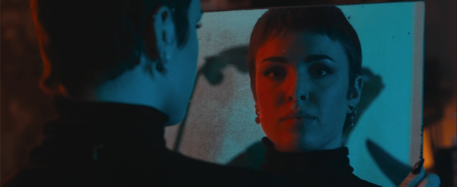
Boom, just like that we are done. We did our recreation, but gave it our own flare. So let’s now take a look at this look in fullscreen.

Sometimes these tutorials get pretty complicated to produce because I am always doing my best to come up with new ways to do the same thing so that you have more tools in your toolbox. So hopefully there was a lot of stuff here that was of value to you. Now, with that, work hard, get obsessed, and get possessed.
MORE LIKE THIS


