
3 Simple Color Grading Tricks to make your Footage POP | DaVinci Resolve 17 Tutorial

What’s going on everyone! Welcome back to yet another epic tutorial where I will be showing you three simple color grading tricks to make your footage POP. One of the most common things you’ll hear from your clients is going to be “take this footage, and make it pop.” So there are so many different ways to approach that and there are many techniques you can use. But this is going to be one of the most practical and simplest ways to do it. The footage I’m using is rec.709. I don’t even know what camera this is shot on.
Alright, so here is our clip.

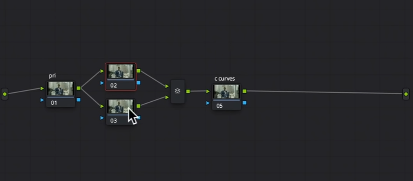
This is going to be a really straightforward tutorial with three simple steps. The node tree will be super simple.
So taking a look at our scopes, we can see tons of green in the image.

It’s also visible in our shot.
Now moving to our custom curves node, we are going to make sure editable splines is checked on.

Once that is set, we are going to bring up the highlight point.

After doing that, we are bringing up the exposure, but the beauty is that nothing is being clipped. Then I am going to bring the bottom down.


That’s the first step to making footage pop. Just look at how much we did in that one node.
Now we are moving onto primaries. Remember the green? Let’s take that out using the offset. I am going to start by subtracting my green.


Look at how much better this all looks. If we hover over his skin, the skin indicator on the vectorscope is right in the middle.

This is an example that once the colors are separated, it looks so much better and things just pop out. Everything belongs.
Now, step three is to make a point of interest. That’s our dude. In this shot, everything is so bright, and the only thing dark is our dude. So we have to correct that and reverse it. How am I going to do that? Normally I’d use a circular window, but in this case I want to use a custom shape because it’s really only his face that’s dark.
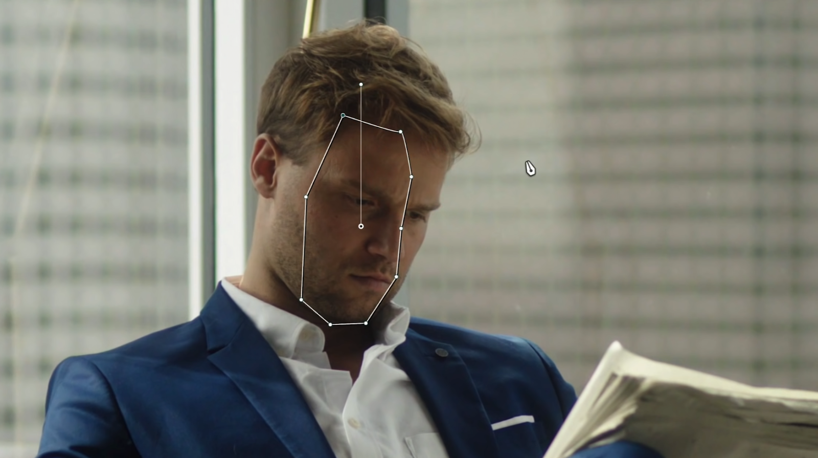
I will make sure it’s softened out, and then I want to raise the gain.


Now moving to the third node, I will create an oval and put it around our dude and feather it out and invert it.

Then I am going to use my gain to bring it down.


Just look at how we directed focus to the guy. It looks natural and beautiful.
These are the three simple steps that can and will work on anything and everything. It could be a food, or car commercial or even a movie, and it will pop it.
Now at this point I can see that my blues are a bit lower on the scopes, so I need to work on my white balance a bit more.

For this I am not going to use offset, but make individual channels. I am going to start adding more blue to my gain, to make that white a pure white.


You can see here that I wasn’t lying that it’s going to be one of the simplest and easiest tutorials on this channel. BUT you saw the effect and the transformation it made. Color grading doesn’t always need to be rocket science or extremely complicated. You can simplify it and strip it down and get amazing results. With that, work hard, get obsessed, and get possessed.
MORE LIKE THIS


