The Mustang | Commercial vs. Film Grading | DaVinci Resolve 17 Tutorial

What’s going on everyone! Welcome back to yet another epic tutorial where we will be covering film vs commercial grading. It’s been awhile since we’ve done one and the cool thing about this one is the way I am approaching it. We always think about commercial vs film as a rec.709 or “natural” look vs a more cinematic look, but why? What’s the difference? Sometimes the two worlds do intersect. Company 3 does this with commercials too. So what’s happening? The main difference is this: when you are working on a commercial, the product is everything. In this example, the product is the car so I will build my grade around that. But when we talk about the film look, it’s about the story. We will create the emotion.
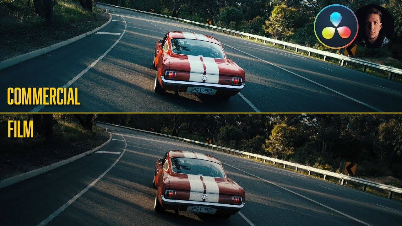
Here’s the shot we are working with, which was shot on RED.

I am going to create three versions so we can compare the rec.709, commercial, and film grade.
For the rec.709 look, we are going to use a CST and put the right settings on there.


This is version number one, our rec.709. It looks pretty good honestly. I’ve seen commercials just as rec.709, but it has to be shot well.
Now I am going to create my second version and keep the CST, but add a node after, and a couple prior.

I will be using the Kodak 2383 lut and you might think commercial and film luts don’t work together, but trust me, it happens all the time.
Now our CST needs to change a bit. We want to use the Cineon Film Log output gamma because that’s what resolve needs for the film luts.


Now I am going to go into my last node and go to luts, film looks, and select the Kodak 2383 D60 version because it looks clean.


The whole point is to sell the product and draw your eye to the product for commercials.
Now the first thing I am going to do is move to my primaries and bring my gain down, then I am going to use the gamma to pop out the car a bit more. Then I want to pull down my lift a bit. Then I want to crank the saturation to about 60ish.


This node did so much. We brightened it up and pulled out the car more. It’s already looking very cool. Now something very interesting is happening here. What I’m trying to show you here is the most basic level commercial grading. Usually you would be working with tons more nodes and on each individual part separately because you have 20 shots to work on in a full day. I’m just giving you the concept here.
Now moving to my second node, I am going to create a gradient window at the top.

Then I am going to pull down my gain even more. I do want to keep it realistic though. Next I do want to add a bit of blue into the sky to make it look a bit more natural and lifelike.


Now I am going to delete node three and instead make an outside node so that I can affect everything but where that gradient is. Then I want to lift up my gamma and just look at how much it does.


We almost have that HDR look going on. We got so much detail back in the car.
There’s so much more I can do now too. I can go into my second node and take the lift down and it adds so much more detail into the sky.


I can then add a bit of contrast into my primaries node as well.


There’s our commercial look. Just remember that a commercial needs to sell a product. We got all of this in three nodes.
Now let’s get into that film look. We will create a new version and delete all the nodes except the CST and lut node. But I am going to change my lut to the D65 lut, or the cooler one.


The reason I am using the cooler one here is I love what it does with the image. You can see the teal undertones in the pavement and I love it.
Now this one will be a bit more involved, so here is our node tree.

Now the first thing I want to do is break that super strong contrast in the image. I am going to be in my primaries here and I am going to take my gain down, gamma up, and then leave it there as a starting point.


One thing I want to mention again is that for film, our job is to tell the story and the emotion with the color. This is where our hero and his girl are doing a burnout into the sunset. So the car doesn’t matter as much as the environment. For this, we will focus on the environment.
Now moving to our 6th node, we are going to create a very exaggerated film curve.


This just looks filmic. The blacks are a lot softer, the colors are more dense, and everything feels and looks nice.
Now moving to the third node I am going to use a gradient window and select just the sky.

And now I am going to go nuts. I am going to use my log wheels and push my midtones far.


Just look at that. It looks natural too, almost like it was shot that way.
Then I want to move to my fourth node and create a custom shape and take the softness to 100.


Now what I want to do is go back to my log wheels and start adding a bit of magenta/warmth into the sky.


Even something like this. It’s not over the top but it adds a bunch of character to my image.
Now there is one more thing I want to do in my curves node. I want to move to the hue vs saturation curves and select a point on the reds so I don’t affect those, but then kill the saturation in the orange areas. Then I want to pull it back to 100 around the greens.


Then moving back to my primaries node I am going to lift the saturation up to about 60-ish to pop out the red. I also want to go into my curves and use the hue vs hue to select the red and give it more of a magenta red than orange red. Then to mess with the contrast a bit, I am going to pull down my gamma a bit.


We are creating a very interesting look here. We are creating a mood more than anything else.
Now going back to node number four, we are going to add more orange into the orange sky using our offset. Then I want to bring my shadows down a bit in that area.


Then I am going to create a third parallel node. I am going to create a power window around the back tire/back part of the car. I will then use gamma to bring up the information a bit. We can even let it stay there when the car drives off because it doesn’t look too weird.


Now I am noticing that the hue vs hue change on the car we did is messing up the background a bit. So we are going to undo that change. Now the reason I left that in the tutorial is I wanted to show you that sometimes there will be changes you do that will ruin your image, even if you liked it before. That is totally okay.
Now I am going to add that film grain to the first node. I will leave it in 16mm, the stock preset. But I do want to show you what happens when you increase the grain saturation.

It gives you the VHS/SRGB color which we don’t want. However, I do want to add a bit of saturation to the grain because it adds just a little funk to my image that I feel looks cool.


So here is what we ended up with. It looks clean throughout the whole moving video. You can also see how much we did with our sky that wasn’t there before.
Now I am not saying which look will be better. But what I am saying is you will need to come to each project with a different mindset. Now let's check out both looks in fullscreen.


Hopefully you all picked up tons of tips and tricks from this video. Again some people think commercials are boring to work on because it’s more literal and less creative than a music video or film. But I disagree. I go back and forth and work on both types of projects. I think the line is being blurred now for the commercials because the directors and DPs are more experimental and selling the idea to the client. The client wants that film/cinematic look. The other thing is it’s always fun to mix things up. It creates challenges that are fun for me as a professional. Then when I work on a music video I can have fun. There will never be one way to approach color grading. With that, work hard, get obsessed, and get possessed.
MORE LIKE THIS