SICARIO | Commercial vs Film Grading | DaVinci Resolve 16 Tutorial

What’s going on guys, it’s Qazi here with another awesome tutorial. Today we are going to be going over how to grade this shot for a commercial, then for a film using Sicario as a reference. We aren’t going to go for a 1:1 match. This will be jam packed with new techniques, which is the point of my videos. I want to make them unique and entertaining, but bring something new to the table.
Alright, here is the clip we are working with and this is absolutely gorgeous. Now let’s pick our hero frame.

This is a perfect hero frame because we can clearly see her skin and eyes, we have black points for our anchors, we have our wood so we can match those and we have highlights to keep everything in check.
First we are going to start off with our commercial look. In our second node, we are going to be using a rec.709 LUT which is a technical LUT that converts the LOG image to a rec.709 color space. The one we will be using is built into resolve, under Arri.


Now when you drop on the LUT, you might as well just print it, this is good enough. That is honestly how a lot of movies are done. They are shot and lit so well that all you have to do is drop on a LUT and make a few changes and boom you’re done. That’s what Christopher Nolan is known for. He only allows his colorist to use printer lights to balance some things out, but then they have to print it.
Moving back to our first node, we are going to call it primaries. In this node I want to balance this image out a bit more. It’s too orange, and her skin tone is looking orange rather than pink. To do this I am going to start with my temperature and tint. I am going to pull back on the temperature to cool it off a bit, then I am going to take my tint to start adding magenta.

Now we can see the cool tones coming through the window so what we are going to do is move our gain towards the opposite color to inject some warmth into the highlights. Then we are going to counter that just a slight bit in our gamma.


Now I am going to create a new node and call it vignette. I am going to create a power window and adjust the shape and rotation, then I am going to invert it, and track it.


Then I am going to take my curves and pull it down.


Then I am going to create an outside node to do the opposite of what I just did, in order to pop out our subject.


I am going to add another node and call it log wheels. I want to use this to neutralize the highlights. I also want to bring in more juice to her skin. To start, I am going to pull my highlights towards the warmer side. You can see that it’s pulling some more red into her skin which is nice. But I am now going to move my midtones to add some more juice into her skin.


Boom. That’s the commercial look.
Now I am going to create a version, and I am going to pull up my still from Sicario.

Just look at where the waveform is sitting.

Now let’s create a new node and call it film look. First thing we are going to do is go into my gain and really pull it down. To get it into that color space, I am going to move my temperature and tint around. Then I am going to pull back on my saturation too.


Now in my log wheels I am going to pull down on my shadows to try and match our black points. It’s affecting too much, so I am going to use my low range to control it.


There we go. We just created our film look. You can see it’s not a 1:1 match because our highlights are a bit brighter, but that’s because our reference image doesn’t have a bright window in the frame.
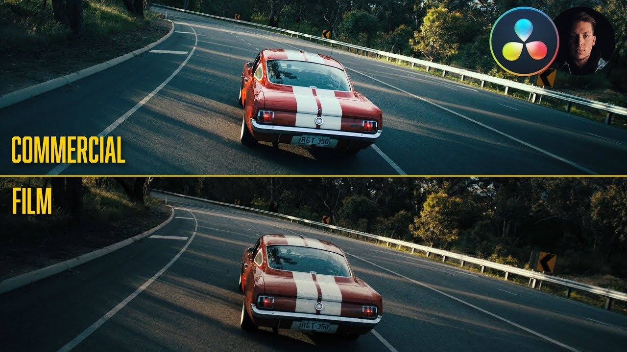
Now, let’s check out both looks in full screen.


Hopefully you guys picked up tons of tips and tricks in this tutorial and hopefully you can continue to see how easy it is to go from commercial to film!
MORE LIKE THIS