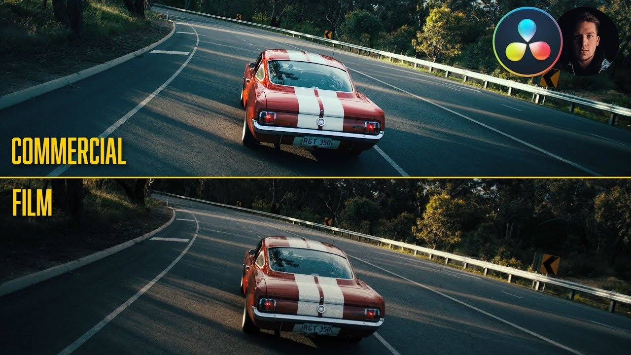
Chernobyl | Commercial vs. Film Grading | DaVinci Resolve 16 Tutorial

Hello and welcome to yet another commercial vs film grading! Today we are going to be making our commercial grade towards the place we are in with this pandemic. For our film grade, we are going to be recreating Chernobyl with that sickly green color to it.
Alright, let’s dive into our commercial look and create our node tree. This commercial look will be a stepping stone towards our film grain.

I want to create life in this image. I want this to be like a PSA for us to stay home and soon we will find hope.
Starting in our exposure node, we are going to add in some contrast. Then I am going to lift my gain and gamma a bit, then drop the lift to add a bit of contrast.


Then moving into our balance, we are going to take our saturation all the way to 100. To balance the image I am going to pull it up to take some of that green out. Then I am going to take my gain and pull out some of that teal we have in our image. Then I am going to take out some of the red in my shadows using lift.


Now moving into my look, I want to right click on the layer mixer node and go down to composite mode, then select soft light.

Another thing I want to do in my look node is to crush saturation. Take it out.


Then I want to go back into my exposure node and bring up the gain, gamma, and lift wheels to counteract what that softlight just did, crushing our contrast.


Moving into our second layer node, I am going to go into my hue vs saturation to and lift it up to see what is happening. Now I don’t need the blues or as much information in the sky, so I am going to bring down my blues/cyans.


Moving onto our look adjustment, we need to expand our dynamic range. I am going to go under my curves and check on the editable splines.

Then I am going to raise my top knuckle on my RGB curves and really just pop the image.


Moving into our eighth node, we are going to qualify our dock so really pull out the dock and give it life.

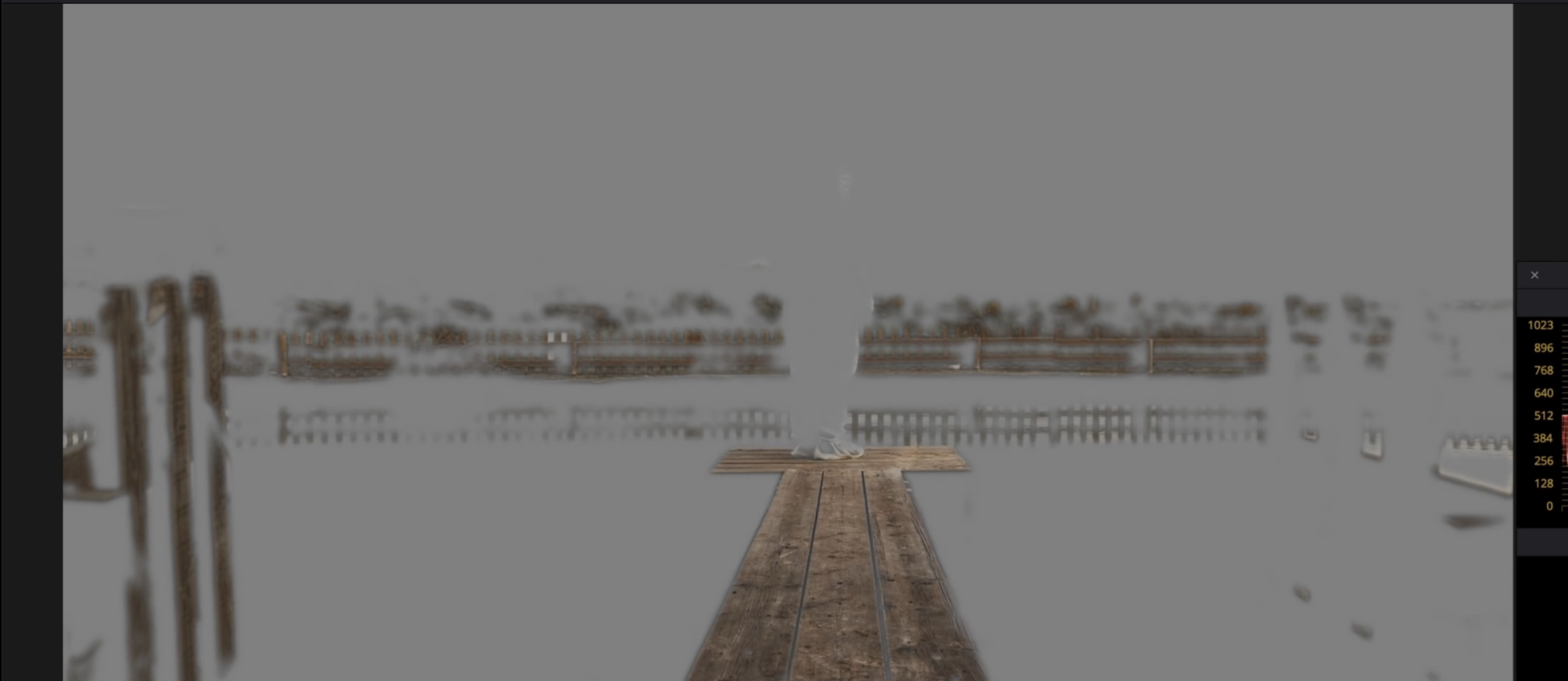
Now I am going to go into my gamma color wheel to really pump in good color to the wood. I am bringing it up towards the orange/red color space.

However, now it is spilling into the other wood parts, which I’m not wanting. So I am going to create a custom shape around the dock and give it a little bit of softness.


Now I need to track it to the dock. Next, we are going to go into our curves, uncheck editable splines and pull down on the bottom portion to pull more detail into the wood.


Now I want to create another node to isolate my dude. So I am going to create a power window and select the dude and the dock. Then feather it all the way to 100.


Now I want to move into curves, recheck editable splines, and raise the top part. My focus is my dude. He’s the hope so I really want to bring that out.

Now I want to create an outside node by right clicking on my node, and selecting the outside node.

Now I want to uncheck editable splines again and grab the curve from somewhere around the middle and pull it down just slightly.

Now I want to go into luminance vs saturation and grab the white points, and pull out the saturation.


Now we are going to create a global adjustment to create a little bit of pop. Under my curves, I am going to bring up my low soft and then I am going to bring my lift down to create that soft film look.


And this is our commercial grade! Let’s go ahead and check it out in full screen.

Okay, jumping into our film look now, we are going to take our commercial grade as the base grade, then build on to it. We are going to use Chernobyl, but we are not going for a 1:1 look.
This is going to be based on three layer nodes.

Starting in my look node, I am going to take my gamma and pull in a lot of green, until it feels right.

Now let’s add a gradient window to take the green out of the sky.


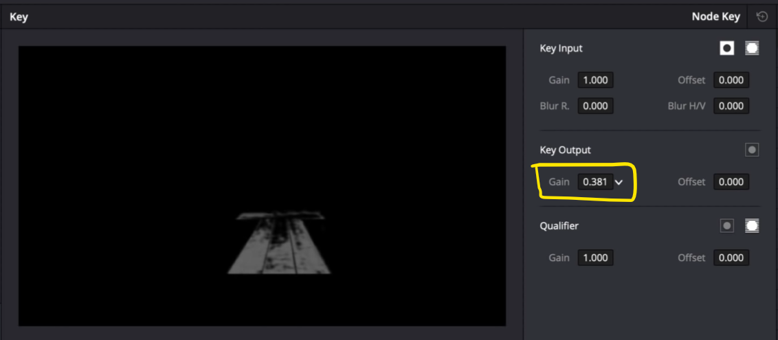
Now I am noticing my highlights are starting to be affected and I don’t want that. I am going to go into the highlight node and qualify the highlights to grab the top.


Now I want to split the difference because I do want it to blend, so I am going to go into my key and drop the key output.

Now to make it just a bit more believable, I am going to go under my gain and drop the wheel a bit towards the green.


Now I want to keep the green out of the wood, so I am going to hold option and click on node eight and drag it into my platform layer node. Now it copy and pastes the window and tracking node, but I am going to reset the gamma so that it keeps the color of the platform. It may be a bit shocking, so we can split the difference in our key.
Now, finally, as an extracurricular, I want to add some more punch into my image. I am going to create another node, and I am going to go into my curves and lift the low soft and then go into my lift and drop my lift. Then I am going to lift my gamma a bit, and bring my gain down.

Then under my log wheels, I am going to pull up on my highlights a bit to really just pop out that sky.


Now, I am going to go nuts with the grain. I am going to select the 16mm archival print, then raise the strength a bit.


We are done! Let’s go ahead and check the look out in full screen.

I hope you guys had a blast and learned something new! Be ready for the next one.
MORE LIKE THIS