Cars - Commercial vs. Film Grading | DaVinci Resolve 17 Tutorial

What’s going on guys and welcome to another epic tutorial. Today we are going back to the film vs commercial grade series. In the analysis I will be discussing more about trends in the commercial vs film grading. Just as there are trends for anything, color has those trends. They tend to take longer to move throughout that cycle. It is important to be on top of these trends.
As you know, in many of today’s commercials, there is a smaller and smaller distinction between film and commercial grading. Though this line is fading, there are a lot of nuances, which is what I will cover today.
Jumping right in, we are going to quickly discuss the theory of color in the car world. Originally, you wanted to create an image that was as poppy as possible, like this example.

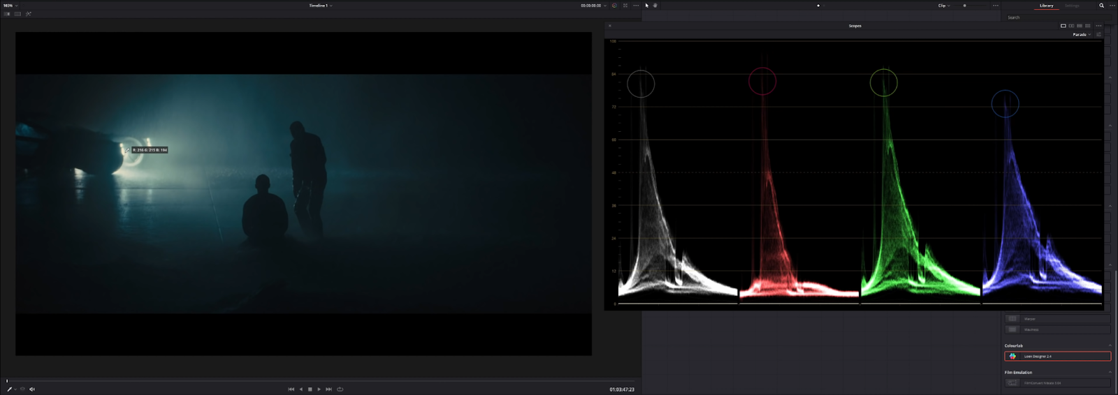
There’s a lot of contrast, blown out highlights almost. Now in comparison, take blade runner for example.

This is what is considered a great looking image. It’s not about how bright an image is, but more about contrast. Contrast is not always using the 0-100 range. You can eventually get there, but it takes time. The more you grade, the better you will get.
As I said earlier, these lines are starting to blur a little bit. Take a look at this Acura commercial.

This kind of grade is closer to what we would see in a lot of modern films, with the exception of the specular highlights. In Blade Runner, you can see that the specular highlights are still below 100.
In the acura commercial, they are over 100.

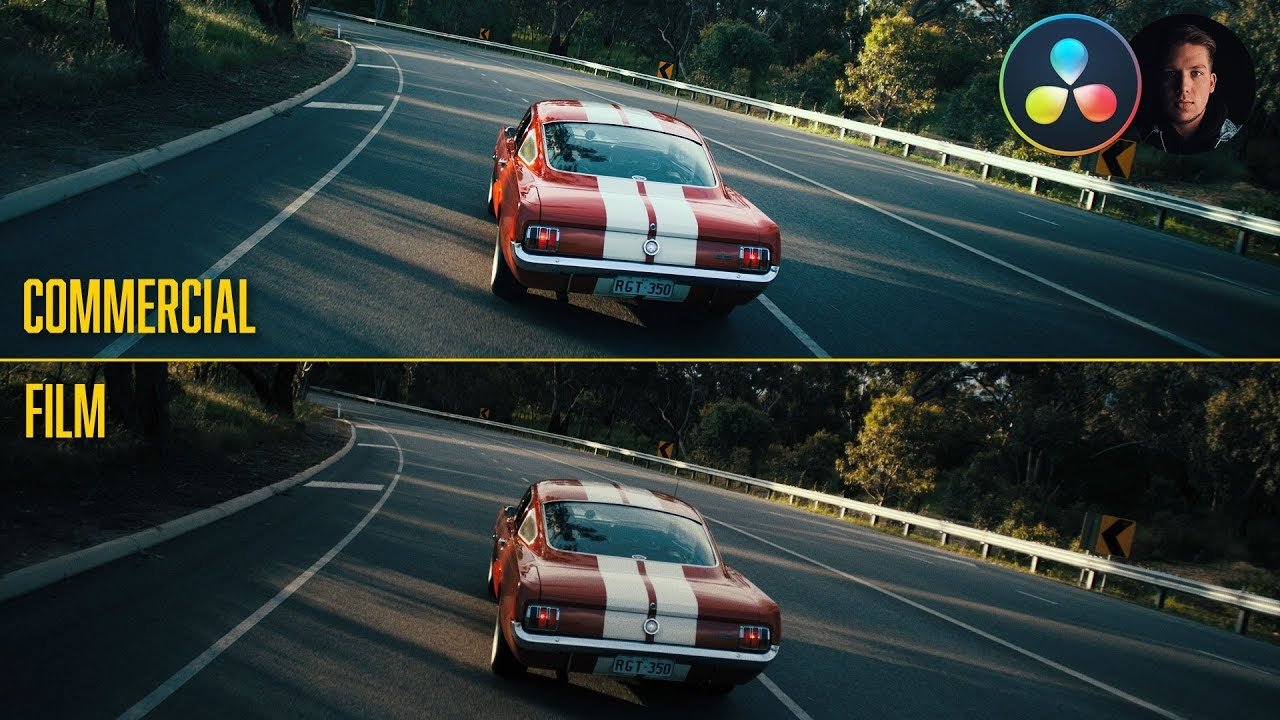
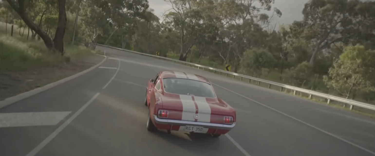
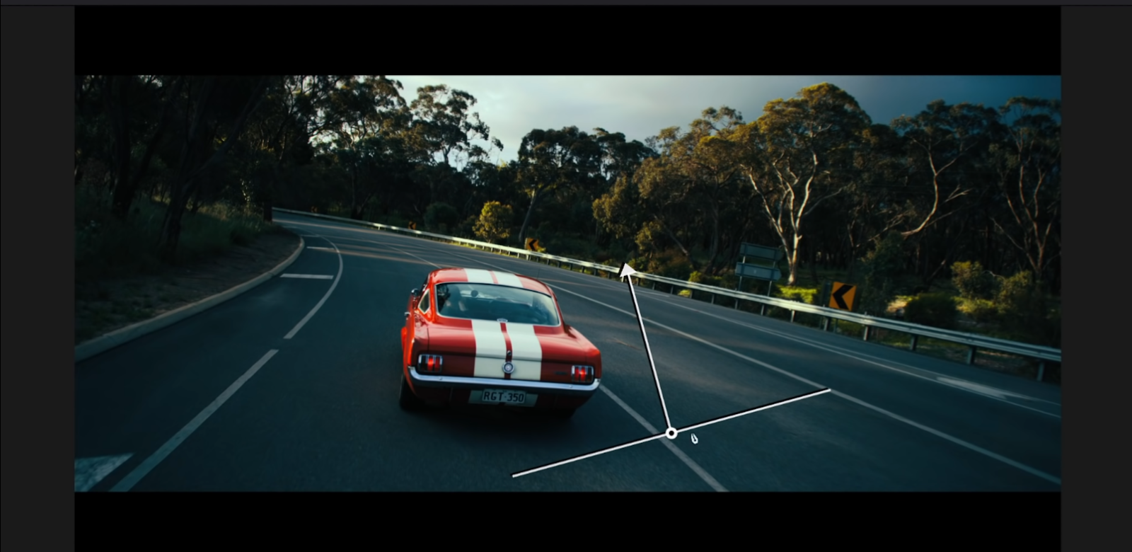
Now we are going to do a commercial vs film grade using this shot.
Let’s get into it! Starting off, I am going to use a plugin that I have started using a lot more that I love, called look designer. This is from Colourlab. We are going to be using it for our color space transform. To do this, we are going to drop the effect onto the image. Then we are going to change the input profile from Arri LogC to RED Legacy Film.

Now this plugin can do a lot, but I use it mainly because of its film emulation. To start off we are going to pick our negative options (picture below). We are going to use the negative stock GEN 2. Then we are going to use our negative stock, the AGFA XTR250. Then we will bring the negative intensity up to 1. Then for our print options, we are going to use Kodak 2383. Then for our print stock we are going to choose 2383 Modern, then increase the contrast intensity.


Now what I want to do for the commercial look, I want to make this car stand out. But I am going to do all the changes before the look designer plugin.
Starting in our first node, I want to use the color warper to work on the hues of our trees. The first thing I want to do is take the center and cool everything off. Then I want to take the red and swing the saturation up, then move the hue a tiny bit to bring out more red. Then I am going to take my blue points and desaturate them a bit. Then I want to saturate the greens and yellows a bit, and swing the hue a bit more towards blue.

Now after our hue adjustments, we are going to add another node after the hue node and use our log wheels to bring up those highlights. Then we will pull our high range back to open it up a bit more.


Next we are going to add three parallel nodes. In the top node, we are going to add a circular window around the car and invert it.


Then we will make a slight vignette.


Then we will create an outside node and bring up the exposure a bit.


Then in our second parallel node we will add a gradient window coming up from the bottom of our image.
Then we will use our curves to bring it down slightly.
It’s okay to go a bit overboard on these commercials. The shots are generally on for a few seconds, so you don’t need to worry too much.


We will be skipping the third parallel node for now, and add a node after our look designer node. This will be for sharpening. So we will want to increase sharpening.


Now moving back to our fifth node, we are going to use our hue vs saturation and pull down on our red a touch.

Then moving to our hue vs hue, we are going to select the red and yellow channel presets and on our red preset, we are going to swing it up. We will have to refine the points a bit so it hits where we are wanting it to.


Now we want to add a node prior to the color warper (or our first node), and bring up the lift and gamma a bit to open up and brighten the image.

We will want to split the difference on this node with our keyer.


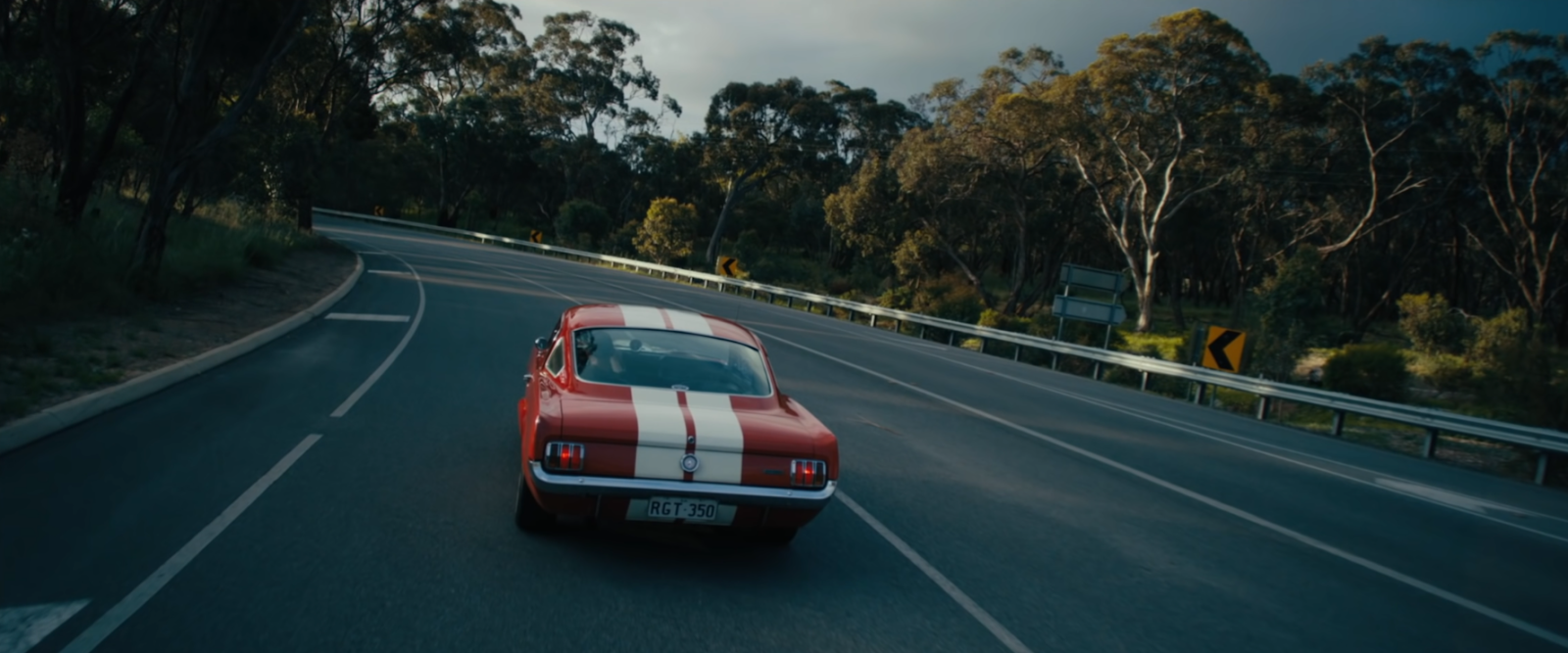
Just like that, our commercial look is done. It’s still following that “poppy film look” that a lot of car commercials are following nowadays, but those highlights are sitting up high, and our contrast is perfect. Now we are going to save this version and add a new one for our film version. To do this, I am going to delete everything but our look designer node. Then add two nodes prior to the look designer node.
For this look I want to keep it a bit simpler. In our first node I want to push the image a bit. To do this we are going to bring up our gain, then drop our gamma. Then up our lift a bit.


Now moving back to our look designer node, it’s a bit too saturated, so we are going to scroll to our post-processing tab, enable post-processing and increase the PP intensity.

Then moving to the subtractive color, we are going to increase the cyan and magenta and yellow.

Then moving to the overall saturation, we want to pull that back a touch.

Now moving to the third node, we are going to move to our hue vs hue and swing our yellows up a bit to try and give them a bit more red. Then make sure our greens are staying green with an anchor point.

Then moving to our hue vs saturation, we are going to increase the saturation of the car.

Then moving to our custom curves, we are going to click on the blue channel and bring down the top knuckle, but cancel it out for the midtones and below.


Then adding a serial node after the look designer node we are going to add film grain using 16mm 500T. Then we will increase the grain strength.


So there we go! Let’s check these out in full screen to see the real difference.

Thank you for tuning in to the latest episode. I hope this added some clarity on the trend of car color grading. Obviously they are getting closer, but there are still subtle differences between the two.
MORE LIKE THIS