
Night Out | Commercial vs. Film Grading | DaVinci Resolve 16 Tutorial

Welcome to episode two of commercial vs. film grading. This came from your concerns on how to work with the methodology on how to grade a commercial and a film. This time I am going to be using a lot of different tools, so grab a notebook and let’s get into it.
Let’s start by analyzing the image. This shot is beautiful. There is so much potential with it.
Let’s get started. This is going to be a very simple look. Let’s get our node tree created.

The first thing about using LUTs is you have to be methodical about it. So before I do anything I am going to drop in our film LUT first.


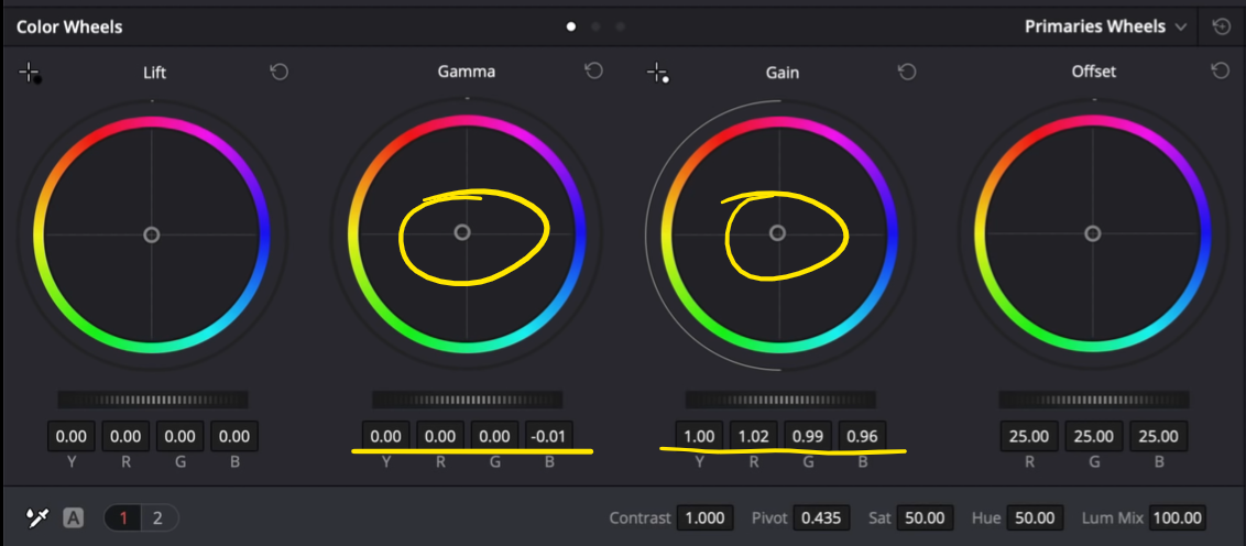
Going back to my exposure, the reason I have it before the LUT is that a rec.709 LUT crushes the image. To make sure we don’t crack the image, we need to put the exposure first. Now I am going to raise my gamma and pull my gain down a bit.

Next I am going to go into my LOG wheels and pull down on my shadows. I will need to control it so I am going to bring down my low range to only affect the darkest parts.


Next I am going to move to my balance node and pull up the saturation a bit. Then I am going to use my temperature to cool it off.


Now under my hue vs node, I am really going to work on popping out my skin tones. I am first going to dial in my hue vs hue until the skins look nice.

Then I am going to pull up my skin tones in the hue vs saturation.

Now I am going to go under my hue vs luminance and see what we need. If we lower our reds down, it’ll give the skin tones more depth and then let’s raise our yellows.


Moving into our skin node, we are going to qualify the skin. It will need to be finessed just a bit.


I really want to go heavy so I am going to take my gamma and gain to pop out the skin tones.

Now we can go into our key and blend it a bit so that it’s not so crazy.

Now we need to qualify it so that it doesn’t spill onto the walls.


Now moving on to our clean background node, I am going to show you a cool way to work with the background. We are going to go into our qualifier and select only the highlights in our image. Now we need to adjust it so that it doesn’t select the skin.


Now I am going to go into my saturation vs saturation and pull it down from the bottom. Look how much is coming out from the sides.

Then we are going to go into our key and blend it a bit to where it will be believable.


Now in my global adjustment, because it is a commercial, we have to give it a pop. It cannot be too moody. I am going to click on my editable splines and raise up the top knuckle.


Then I am going to take my highlights and pull them down.


So this is our commercial look! Let’s look at it in full screen.

Alright, moving on to part 2 to create a film look. We are going for a look from The Grand Budapest Hotel. I’m just picking up on the DNA of the reference, not a 1:1 match. Let’s get started with our node tree.

We are first going to start by dropping in our LUT.


This made it really dark, so we are going to go into our exposure to brighten it up.
It’s important to have your reference image up when dialing in exposure, so that you can get it to the right place.
First I am going to bring up my gain, and bring down my gamma to preserve as much as I can in the highlights.


Now jumping forward a lot, I am going to do something in my global adjustment. I am going to go under my LOG wheels and bring down my shadows and low range until my lowest darks are selected and are black.


Now moving into our balance, the first thing I am going to do is give it some saturation. Then we are going to go into our temperature to cool it off.


Now moving into my look node I am going to move the temp and tint aggressively to really get into this world.


Moving into our hue vs hue, we are going to dial in the skins. Starting with our red channel, we are going to bring it up. Then we are going to duplicate that with our yellow channel.

Then we are going to go into the hue vs saturation and crank it.

Now I am going to go into hue vs luminance to add that depth and pop.


Now we are going to go in and qualify the skin. I am doing this after the LUT because it allows the key to be cleaner.


We are really just adding a touch of color. It doesn’t need much.

Now we are going to move onto our grain node.

Now before we look at both versions, let’s look at our film look in full screen!

Just like that we are done! Let’s compare both versions side-by-side.

The film look definitely looks better, but man they are both looking good.
I hope you guys had a blast! Be on the lookout for the next tutorial!
MORE LIKE THIS


