
Understanding and Creating Different Types of Teal & Orange Looks | DaVinci Resolve 17 Tutorial

What’s going on everyone! Welcome back to yet another epic tutorial where we will be going over how to understand and create different types of teal and orange looks. There are so many different variations of teal and orange so there’s no one size fits all. In this tutorial we are going to look at real world examples and how they use it, then we will create three different types of teal and orange looks. Then I will also sum it up at the end and tell you when you should be using each look. So there is a lot of brand new and practical information. Now let’s get into it.
We are going to break down a couple of our favorite examples. Starting with a warm shot from Joker.

Also pay attention to the colorize waveform because that’s helping tell this story.

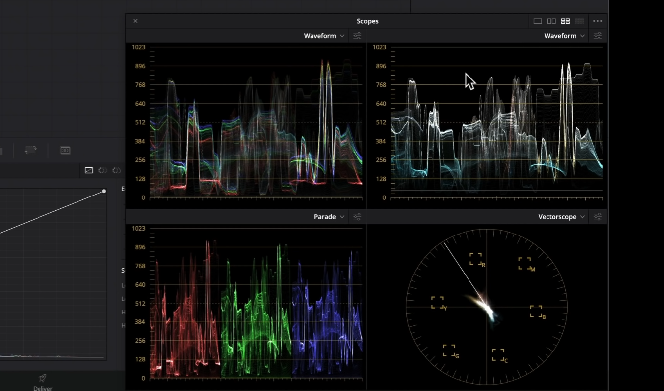
Now for example's sake, let’s go ahead and add a lot more teal into the image so you can see how these scopes change.

Now in our vectorscope, on the warmer image, you can see that everything is sitting in our warm quadrant.
Now let’s look at our cool teal and orange.

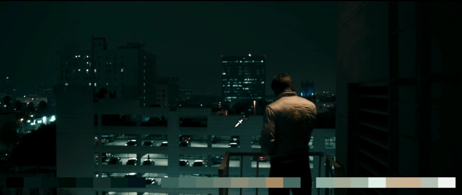
This is cool, but very natural and pleasing. If you look at the skin indicator in the vectorscope when I hover on his skin, you can see that it’s perfect.

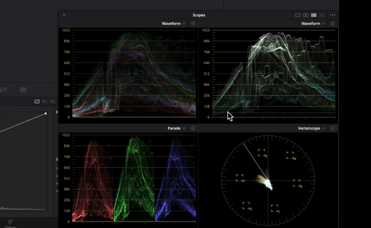
This is a perfect split.
But also keep an eye on the contrast in these images. They are creating a nice pop in the image, but still preserving their shadows. With these images, our eyes go straight to where they need to go.
Same with this next shot, a similar shot to our cool look.


This again is a perfect split. It is an aggressive grade.
Now taking a look at another example, this one was mainly done on set.


They did this by using the sodium vapor lights to add warmth, and contrasted that with the cooler tones on the right side.
Moving back to Walter Mitty, you can see nice teals here but clean.

This next one is an extreme example of teal and orange, yet more on the sickly, nasty New York teal and orange.


You’ll notice in the vectorscope that the skins are nowhere near perfect. This is an example of trying to portray how terrible things are and color grading is taking it to that next level.
Moving onto this next shot, this is a really well done teal and orange.


This is the epitome of what we think of when we see teal and orange.
Moving onto the next shot.

You know that buildings should look gray, not teal. The lights should be white. But this is a nice pushed grade that doesn’t feel out of place.
Moving onto another from moonlight.


Look at how much teal is in here, yet his skin tones are perfect and in the center. It’s extreme, but when the skin tones are correct, it sells the shot.
Moving onto another shot from Joker, you can tell there is crazy stuff happening because there is tons of green to help out with that.


Here is another example of where the skin tones are off, but it’s okay because it’s helping sell his mental illness. Something everyone needs to learn to do is to push their grades.
When it feels normal, you haven’t graded your footage yet. It’s just a color corrected image. When it just starts to feel a certain way, that’s when you start color grading.
Looking at another shot from Walter Mitty, this one has really clean highlights.

Keep on eye here on the contrast how there is detail here that is going to nothing. That’s what I’m talking about. Be unapologetic with your contrast.
Moving to the next shot. When we think that the film look is low contrast, let’s take a look at this image.


This is the epitome of the cinematic/film look. It’s a teal and orange pushed towards a green bias. If we start going in the other direction, it takes that green and makes it more teal.

This completely changes the intentionality and purpose of the shot.
Now keeping all these examples in mind, let’s take a look at what we are working with.

This was shot on blackmagic and we will be using only five nodes.

The first thing we are going to do is use our color space transform and use a gen 5 color science transform.

Now I am using a cineon film log output gamma because I will be using a film lut built into resolve. I am not sure if they are still included in the free version, but they are in the paid version. Now quickly, let’s take a look at what these luts do on a grayscale image.

Now usually we use the Kodak film prints because they are really nice. But because we are going for an over-the-top teal and orange look, I am going to go with the Fujifilm 3513DI D60.


With this, you can see those teals are starting to come into the shadows here. The contrast is really pushed on this, as you can see in the bottom right corner. That’s not going to help us on this shot because it’s super contrasty. But we are going to apply that lut and look at what happens.

This could be a look, but we don’t want to do that.
Moving to my third node, I am going to aggressively pull down on the gain, but pull up the gamma a bit to bring back some information. Then I am going to bring down my lift. Why am I doing that, because the examples we went through, our images were pushed.


You can see here that now everything is balanced a lot more. We can see through the windows now, the skin is retaining a lot of information and we can see the darker areas too. We can also start seeing the teal coming through.

You can see that in the laptop. It’s supposed to be gray, but it’s teal now. This image that we’ve done now is already a really good image and could basically be printed.
However, just for the example, I am going to do this. I am going to add a version, and in my second node, I am going to add tons of teal into the bottom. We are going to use our offset and add tons of teal.


Now you may be saying, whoa that’s crazy but bear with me. Go into the log wheels and under midtone, start adding some warmth. Then I will do the same in my highlights.


If you look at our previous version to this, it still looks really good. But I am noticing that I can work on the contrast a little bit. Remember the contrast was pushed in the other examples. So what I am going to do is go back into the third node and add contrast.


This one is a bit more intense, sort of a cross between Joker and Tenet.
Now I am going to create another version based on that second version and start warming it up a bit. Going back into my second node I am going to start using my gain to warm it up.


Now you have to be the judge of which one you like the most.
Now let’s go to our splitscreen and check out all 4 all at once.

All three of these are so great. It totally depends on what you are going for. I actually personally like the top right, the cooler one because it feels straight from a movie. But so does the warmer look. Once our anchors are set, we can push it a bit more. Whichever project you are working on, find the right look and go with it.
Now for an extracurricular, let’s go ahead and add grain to the first node and select 35mm 400T.

Now let’s check these all out in full screen.


So as you saw, there are so many different types of teal and orange. It can go in the green quadrant, or the extra warm, or be a perfect split. Hopefully there was a lot you gained from this video. Remember, work hard, get obsessed and get possessed.
MORE LIKE THIS


