Common Mistake Beginners Make When Balancing Their Footage | DaVinci Resolve 17 Tutorial

What’s going on everyone! Welcome back to yet another epic tutorial. This one is exciting. We are talking about how to properly balance your image. Now color correction and color balancing is not the stuff people want to do, or think about when it comes to grading. They just want to get to the good stuff, which is creating the look. But, when you are working as a colorist, most of your time is spent shot matching and balancing. So if you get efficient on those things, you can save that time and spend more time doing the color grade. The stuff I am going to show you will make you 60-70 percent more efficient.
Okay, here is the shot we are working with.

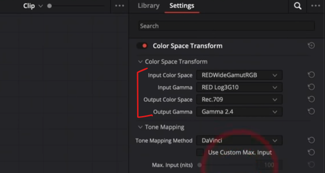
We are going to start with the beginner approach, going through a couple variations, then we will get into the pros approach. I am going to give our beginner the benefit of the doubt that the beginner not only knows how to properly convert footage, but also knows that this was shot on RED. So with that, let’s get started. We are going to throw on our CST on a second node and select proper parameters.

The first thing you might be taught is to use the white balance eyedropper tool. But since there is nothing white in the frame, it won’t work properly. Or there is the auto grade button, which also doesn’t do a good job. It’ll make it look different, but not proper. So what our beginner will do is start on a granular level. Meaning, start making small changes rather than thinking broad. They will notice there is too much green, so they will start off with their gamma, and move it over to the blue/magenta. Then to bring the blue out of the shadows, they will bring the lift up, but that adds too much red overall, so they are going to take the gain and pull it down. It’s too cool, so they will bring their gamma up.


Now what’s wrong with this? Doesn’t this look pretty good? The idea with the primary correction is to get the image as close to what it looked like on set. That’s not what’s happening here. Let’s take a look at our grayscale image.

So look what happens when I make the corrections that a beginner does.


What is actually going on is that our hues are being twisted and turned. We are pretty much grading it, instead of a linear change. So what do I mean by a linear change?
Let’s reset this and go through the pros approach. What the pro will do, will have a node for the exposure and contrast. Why is that important? Remember when our image was flat and nothing was wrong with it, then we dropped the conversion onto it and we can see that the color was way off? The same thing happens with contrast and exposure. What I am going to do is go under the HDR palette and raise up the image a little bit with the global offset.

Then I am going to use my curves to bring up the shadows and down on the highlights.


This is the first step. You have to have a proper exposure first.
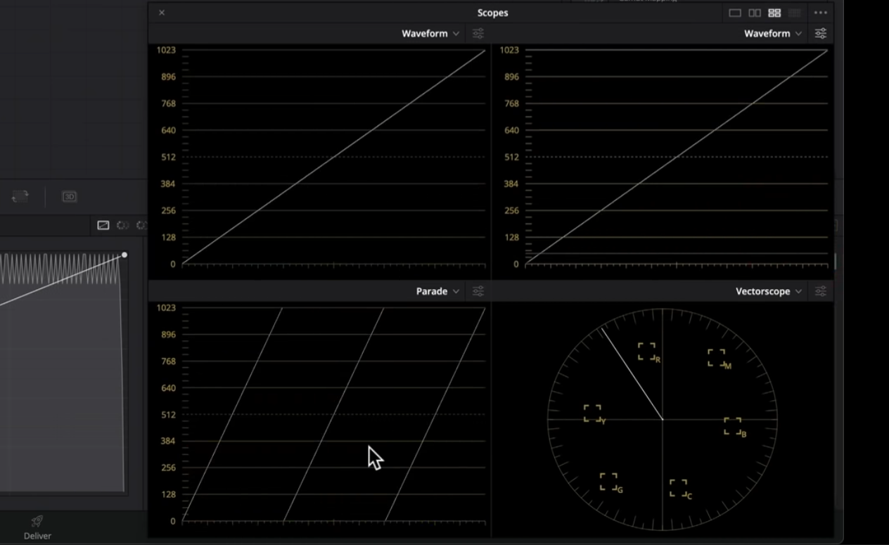
Now going into the first node, we are going to use our offset. Why? Let’s take a look at our grayscale again.

When I move my offset, look what happens.


Look at how linear that is. There’s no bending, no curving, just simple. There’s no banding or anything. I am making linear changes to pull out the color cast I don’t want. Then in theory, it’ll look like what it was on set. So why don’t we just use temperature and tint?

The black point stays the same. Meaning if your image is not balanced properly, it’ll throw an anchor on that black point which is wrong, and you’ll never be able to get a proper black point.

Now that we know all of this, we are in our offset now. So what am I seeing here?

There is too much green, and everything is pushed towards yellow. So what I am going to do is start by getting rid of green. I am going to subtract green by 1. It already made a huge difference. Now, we need to subtract 3 yellows. Now our white point is right in the middle.

Now I think I went a bit too far with my yellow, so what I am going to do is add back half a yellow. Now there’s a bit of magenta, so we will subtract one magenta, but that brings too much green, so we will take out a couple quarter greens.


Just look at these changes. Once you are dialed in and you know how to use your offset, it’s going to be a piece of cake to go from A to Z this fast. Even hovering over the skin tones, you can see those are sitting properly.

So now what I am going to do is create another node and add two gradient windows. Now this is all extracurricular at this point.

I am doing this because I cannot stand the vignette in this shot. So I am going to raise my gain to bring it up.


Another thing I want to do is swing the hue on the yellow and warm it up using my hue vs hue curve.

Then I am going to give it more saturation under hue vs saturation.

Then I am going to use hue vs luminance to put more depth into the shot as well.


That looks so good.
Basically what I am trying to tell you is that if you balance your shot like a pro, you can spend the time you saved correcting and grading your image and creating a very beautiful look. Now you can see there’s a color shift on the edge. This is where we will use temp and tint to get rid of it. Now that the image is balanced, we don’t need to worry about losing our blacks. All I need to do is add some warmth, then add some magenta.

There are many ways to do things, but there is a method to the madness and a right time to use one method over the other. Use the color temperature sliders once the image is balanced. Used offset to balance the image. Then use lift, gamma, gain to put together the final look or make slight changes if something is still not correct.
Now, I am going to add a node before our first node and just drop on film grain and leave it how it is. So let’s take a look at this in full screen.

I’ve said it before and I will say it again, but the sequence of your nodes matters. The sequence of the tools matter. Now just remember to work hard, get obsessed and get possessed.
MORE LIKE THIS