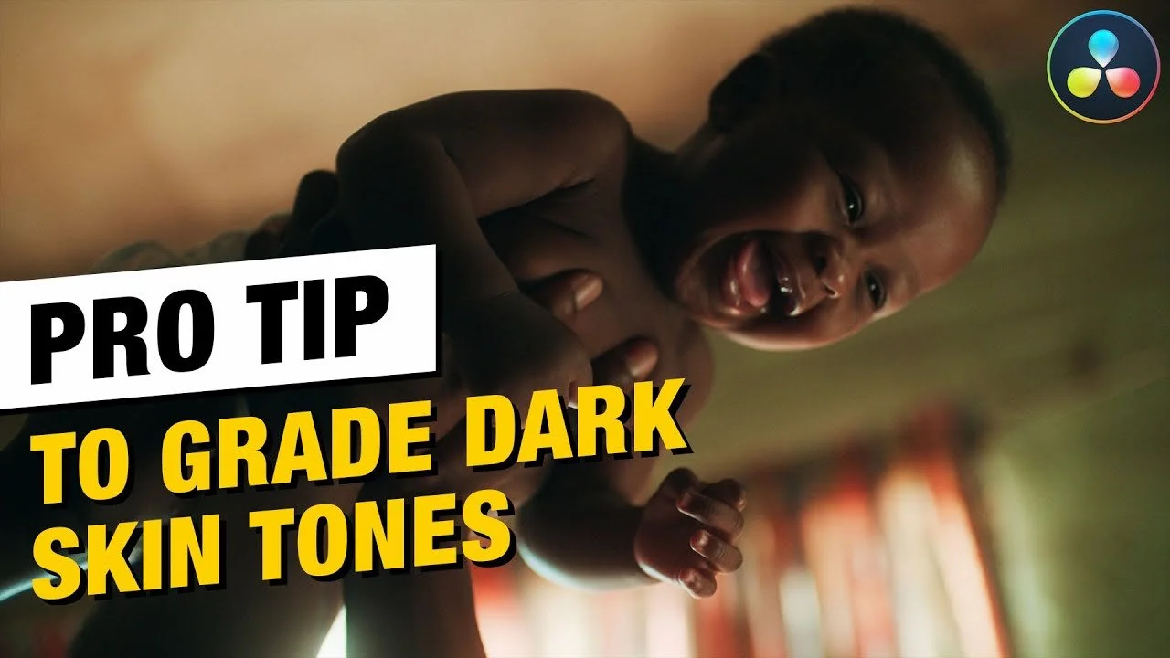
Common Mistakes Beginners make when Creating a PUSHED Look | DaVinci Resolve 17 Tutorial

What’s going on everyone and welcome back to yet another epic tutorial. Today we are going to be talking about the common mistakes that beginners make when it comes to making a pushed or poppy look. It is going to be one of those looks you will be asked to make all the time and people make these mistakes I am showing here. We will go through different tiers of beginners and the mistakes they make and then I will show you the pro way. But I want to make one thing clear because people in the comments take it to heart that I am calling them stupid or beginners and making fun of them, but everybody starts as a beginner. So my intention is not to put you down, but lift you up. It’s more about pointing out the mistakes and then telling you how to do it the correct way.
Alright, so this is the shot we are working with.

A beginner wouldn’t care to know what type of footage, what camera, or where it came from. The first thing they will do is look at the scopes and max it out. They will start with the gain and raise it to the top, then bring the lift down to the bottom. Then they will pump in a bunch of color. This colorist won’t have enough knowledge of how to isolate colors, so they will just push the color too far, then dial it back until it sits right.


Now that is scenario number one. There is a second beginner scenario. This beginner will know that you need to convert it properly to rec.709 before grading. They will right click on the first node, find the lut and then apply it.


Now they went with the lut because they are a beginner and don’t know the CST route and how to properly use it. Now in this case, the beginner would say this is it. Let’s print it.
Now we are going to look at our final beginner scenario. They will have applied the lut like beginner two, but then they will create a new node and top and bottom it out to add more pop. They will raise the gain and bring the lift down, then add saturation.


So now let’s go ahead and take a look at all three and compare.

When we compare it to the log image, even the rec.709 conversion looks like a big change.
Now what I am going to do is show you the pro version. Before I even get into it I am going to pull up a still from La La Land.


As you can see, this is an example of a perfect pushed look. You can see with the scopes, everything is conservative yet the image is so poppy. What is it that makes it this? Let’s get into it.
The first thing is the pro will lay out their node tree.

Now on the last node, the ODT, we are going to select the proper Arri to rec.709 parameters.


Because we put this conversion at the end, we can still retain all the information from the log image in the previous nodes. If you apply a lut first, the information is burned in when you use nodes after.
Now moving into our custom curves node, we are going to turn on editable splines and push the top up.


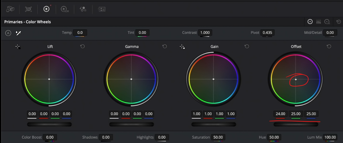
Now I am noticing a bit more magenta/red in the image so under my primaries node, I am going to use my printer lights to add one green and subtract one yellow.

The big key to a poppy/pushed look is color separation. Once you do this correctly, it starts to turn into that kind of look. This is looking good already.
Now I am going to move into my hero node and create a wide circle around our talent and feather it, then invert it.


Then I am going to drop my gamma down a bit.


This is what I am talking about. The pros approach is all about being a director of photography in post. You are re-lighting the scene instead of using cheap tactics.
Another thing I am going to do is pop out the sky. I am going to create a gradient window in our sky node.

Then I am going to go into my log wheels and crank back the high range a bit. Then I am going to start adding blue into my highlights.

Then I am going to use my gamma to darken it up a bit more.


Now I am noticing that our mountains in the background are looking just dead. So under the adjustment node, I am going to use my color warper to start adding more red into the entire image.


This is how we pros create a pushed look. It’s all about creating that color separation and surgically working on each element separately.
Now I am not a fan of too much yellow in my image, so I am going to go under hue vs saturation and take my yellow and pull it down a bit.

At this point I am very happy with how everything is. I am going to use saturation vs saturation and grab my really pushed colors and pull it down a bit.


Now moving to our first node, we are going to drop on our grain. We will be using the 16mm 500T preset. The reason that we are adding it in the first node is so that it’ll look like it was actually shot on film. When you shoot on film, the grain is embedded in the image out of camera.


Moving to my second node, it’s simple. I am going to use my qualifier (luminance only) to select the brightest areas in the image.

With this I can make a change, but since we delicately did everything in this, we don’t need to do that.
Now in the directors node, they feel it’s just too vanilla, they want more character in it. They want a bit more warmth, so I am going to show you two different ways. The first is using your printer lights, or offset. You would add more red into the image.


The second way is to use color temperature and crank it to where we want it.


However, they may want it to look cooler. Again, using our offset we can do that.


The whole point of this is to show you that once you have everything all dialed in, you can start creating looks that look good.
Now what I want to do is compare one beginner grade to the pro grade.
Here is the pro:
Here is the beginner:

I don’t need to tell you that the pro version is just better and more subtle and beautiful.
One thing that I can see and we can try to add some more pop and push it even more, would be to add a bit more contrast by dragging down the bottom curve anchor in our custom curves section. I will want to bring up the top portion a bit too.


I mean just look at these side by side. There is no comparison. The beginner looks way worse than the pro.

Look at the detail in our shot. Everything looks kosher. There are no ugly shadows on our talent, everything pops and belongs in the image. The colors are proper and nothing is too thin or over the top.
Now let’s check these out in full screen.


Hopefully the major takeaway from this video was that even if you’re doing something as basic as a poppy look, there is still a method that matters. Just remember. Work hard, get obsessed and get possessed. I will see you in the next one.
MORE LIKE THIS