Common Mistakes Beginners Make When Doing Look Recreations | DaVinci Resolve 17 Tutorial

What’s going on everyone! Welcome to yet another tutorial. Today we are continuing with our common beginner mistakes series, talking about what beginners do wrong when doing look recreations. Now pretty much every client has an idea of what they want and when you ask them, they’ll send you shots from movies, or a YouTube video. This makes look recreations super important. It can be intimidating and confusing, so in this video we will be covering the beginner way to do things and then the pro way.
Let’s get going on this.

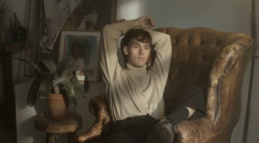
Here is our shot. Now the first thing is a beginner wouldn’t care what camera this was shot on, they just have no concern.

Secondly, here is our reference. The beginner wouldn’t know where this came from. Is it from a movie or TV show? The other thing is beginners copy. They don’t use the reference as inspiration. They will look at this and make it a 1:1 match. This might sound great in theory, but it’s the wrong approach.
Now let’s jump in. The first step a beginner would take is using the lift, gamma, and gain. They would start by dropping the lift, but working on not crushing the blacks because they read in a color grading 101 book, you can’t go past lines. Then they will raise the gain up. Then they will drop the gamma down to bring the look closer to the reference.


This is the extent of the contrast they will do. It doesn’t look terrible given they don’t know the camera. Another thing is they don’t know what printer lights are or what the offset wheel really does. They will only use the color primary wheels. To balance the image, they will start by moving the gain to cool it off. But they won’t know really what they are looking at or what they are doing. A pro would have analyzed the image and now where the problem points are and which section needs to be balanced. Then after they are done balancing the image, they will start dialing back the saturation.

Now you may be thinking, this doesn’t look bad. And you’d be right, but just remember there’s still more they will be doing. Because a beginner’s approach is reactive, they will keep stumbling and trying to catch themselves before they fall. When they’re grading, they don’t have a game plan. Now we already said they will copy it, so now they will start using power windows to create that same look. What they will do is create a power window around the dude, soften it correctly, invert it, then bring the gamma down around the guy. They will keep bringing it down until it matches.


Now you may be thinking, “dude what is wrong with you?” This actually looks half decent. And until you see the pro version, it won’t make sense. The next thing they would do is look at it and say there’s too much saturation in this shot. So what they will want to do is bring the chair down to match the headboard in our reference. What beginners like to do is move to their secondaries and mess with things, bringing objects into worlds where they don’t belong. So this is a leather chair with a beautiful dark brown color. What they will do is use the qualifier to select the brown leather chair and maybe mess around with the parameters a bit.

Then they would start dropping the saturation to make the chair look closer to the headboard. Then they will start bringing in that green color too.


Now you may be thinking again, this really doesn’t look all that bad. The leather couch matches that desaturated vibe, it’s looking good. Yes, but look at this.
The shadows are starting to turn gray. That doesn’t happen in a grade. Or it shouldn’t. Don’t forget that this is just one of the many shots that will make up this film.
Then the beginner will look at the shots and think, what else do I need to do to get it looking the same. They will notice that the bottom right is still not dark enough like our reference so they will create a power window to bring down that area.

Then they would start pulling down on their gamma. Now I am making all these changes in a subtle way that it’s still pretty. I promise you, there will be tons of people who like the beginner look because I’m putting some effort into it.


Now they will see some color in the painting in the back and want to take out that color. What they will do is create another window around that painting. Then they will drop the saturation in the color.


What happens with that, is that it moves around, so then they would track it. But remember, this is one shot. It’s a whole music video with 180 shots. This has to be copied to the rest of the shots.
At this point they would be thinking this is looking good, so what else do we have to do? What I need to do is bring out his face a bit more. What they will do is create a power window around the dude. Then they will bring both gain and gamma up, but bring the lift down to keep that contrast.


Just like that, the faces are matching a bit more. So now at first glance, it’s not bad. Now I was being very gentle and swift with my moves. Obviously if you’re a beginner, you won’t know how to be gentle with your tools and you’ll tend to push it too far. Then everything looks muddy and weird.
Okay, so now here comes the pro approach. The first thing the pro would do is ask the editorial department to send them the camera specs. They found out it was shot on Arri Amira. When you go into the CST, they only have Arri Alexa LogC. So what they would do is go online and find out how to get this properly converted.

They would try to understand that if we only have Arri LogC to rec.709, can that be applied to Arri Amira?

Yes you can. So now they know they will be okay. Then the next question they would ask is where is the reference from? When they find out which movie, they will look at some other stills in that same look to really understand the look. A pro will always look at look recreations as a whole. What kind of mood are they trying to create? What kind of environment was that look done in to evoke a certain emotion? When you look at the still, you need to look for a few things.

Once you see that it was shot on film and not digital, which negatives were used and which film print was used when it was printed? So then you’d go to “shotonwhat.com” and find the film negative stock.

Plus now we even know what film print stock was used. This is how I learned that Roger Deakins loves to mix and match films. So once the pro knows this information, the next thing is going to be to evaluate what their options are. The other thing a pro will do is drop on the color palette OFX to analyze the still even further.

This is a good, almost monotone image. The blacks are good, but lifted quite a bit. Our highlights are super protected. The white balance is pretty close, but it’s a bit warm. Now once the pro has all the information, they can go into their grade. Now you may ask, will a pro really spend all that time researching the look? Yes, 1000%. It’s taking longer because I’m announcing all the steps to you, but if I’m grading, all these steps take seconds and then I’m hitting the ground running. Now let’s move back to our shot and park on our hero frame.

Now it’s time to assess our options. One of my options is to use look designer. I am assuming that it will have both the positive and negative luts that I’m looking for. In the profiles, I can change the input to Arri Log C, then the output to REC.709 ODT.


That’s the rec.709 conversion. Then I can go under the negative stock and look for the stock we need. I do notice that they don’t have the specific one I am looking for, but they have every other one. In that case, we have to figure out how to get that look DNA in, in a different way. What we can do now is go under our print stock and look for it. Now I can tell you they don’t. Which also means that filmconvert and dehancer don’t have them either. So we need to scratch that. So now, our option is to create this film curve in our own custom way. So that means we will start building out our whole node tree first.

Now on the last node, I will add the CST and change it to Arri LogC.


Now moving to my look DNA, I am going to use my custom curves to build that film curve. The whole goal is to preserve some information up top and lift my bottom. Then I am going to create another point at the bottom and top and lift it. Then I am going to continue adding points to dial in that contrast.


Now you can see that we are in that ballpark contrast wise. Our image has so much punch. That’s what the beginner’s image was missing.
Now I am going to move to my primaries and use my printer lights to cool it off. Right now I just want to make it neutral.


Now we are starting to look a lot better. Then I am going to bring up my gain, then drop my gamma a bit. I will also pull some of the warmth out using the gamma.


As a pro, I will start using these tools to build in the cool tones that the image needs.
Now moving to our look adjustment, this is where we will dial in those desaturated highlights. What I am going to do is go under my saturation vs saturation curve and bring down the least saturated areas.

Then I am going to go under luminance vs saturation, and take the bright parts of the image and pull down the saturation.


Just like that we are already pretty dang close. But what can we do to make it even closer? What I can do is go under my look DNA node and try to add a bit more contrast on the low end.


Now I want to move into the halation and grain node. We can see that in our reference image. What we are going to do is add the halation plugin (built into resolve). Once I drop it on, it does too much. However, all I want to take out from this is the saturation. Going under the saturation, we are going to take it back, almost all the way.


Now we have this bleach bypass look that’s very natural and is giving us a similar feel around our highlights. We might want to bring that strength down just a touch because it’s a bit harsh on his face.

Now we can see that there are a bit more warm highlights. Now we need to go into our log wheels and add some exposure in our midtone. Then we need to start adding that yellow into our midtones. Then move our highlights and add some warmth as well.


Now our image is still a bit saturated, so we are going to move to our look adjustment and drop our color boost.


Now all I have to do is add some grain. I will first turn on the grain under the halation plugin and dial the strength back to .1, and the size to .2.

One more thing that I am seeing is that I want to add a bit more warmth in the image by adding some warmth in my gamma in the primaries.

Now our look DNA still needs some work. So I am going to move some of the points in the shadows.


Overall I am still seeing more saturation in our image, so I am going to double up on the saturation vs saturation, and luminance vs saturation. So under my primaries node, I am going to use saturation vs saturation to drop the top parts in saturation.

Then under luminance vs saturation, I am going to do the same thing.

Then moving under my log wheels, my image is just missing a bit more warmth in the midtones.


Now we are there. When you put them next to each other you can see we are there.

Now the final step is to see that if you pull down the right side, it’ll put the focus on our guy. The right side isn’t necessary. So I will create a node after the look adjustment and use a gradient window and select only the right side.

Then I will use my gamma wheel to pull it down.


Now that is a take it or leave it step, but I chose to use it. Gradient windows are a safe way to do these changes.
Now we can see that we are there. But we’ve kept our own flare. I took this look and then made it mine. When it comes to look recreations, it’s about doing your research, planning it out, finding the best solution that can be applied to the entire scene or project, then attack it. Now let’s check this out in full screen.


You can see the pro version on the left is just prettier. It’s softer and almost looks like it could have been a photograph shot on film. Now let’s check these both out in full screen.


I like this format because when we were building the beginners look, it held up and looked good. That was until we saw the pros version and then there was that lightbulb moment. Hopefully you got a lot out of it! Now work hard, get obsessed, and get possessed!
MORE LIKE THIS