
Understanding Waveform in Resolve | Color Grading Tutorial

What’s going on everyone! Welcome back to yet another epic video where today we will be breaking down how to understand waveforms in DaVinci Resolve. We will be talking about how to learn, read, and discern the information in the waveform and the RGB parade. You can use these for white balance and contrast.
We are breaking this down into three parts. Part one, is going to be talking about how we use the tool and what it’s for and where we may want to lean on the tool, rather than our eye. Part two, will be showing you how the tool works and how to read it to get the information out of the scope. Then part three, will be showing you a lot of the different settings that I go to on a day to day basis.
We are going to start with the waveform set to Y and colorize on.
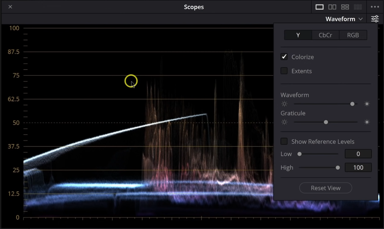
We’ve got three shots to look at. But already, with this shot, you can see that colorize feature shows the colors in the image.

This helps us identify the different parts of the frame, and where that specific color is. Now taking a look at our first shot, you can see the colors represented in the scopes.
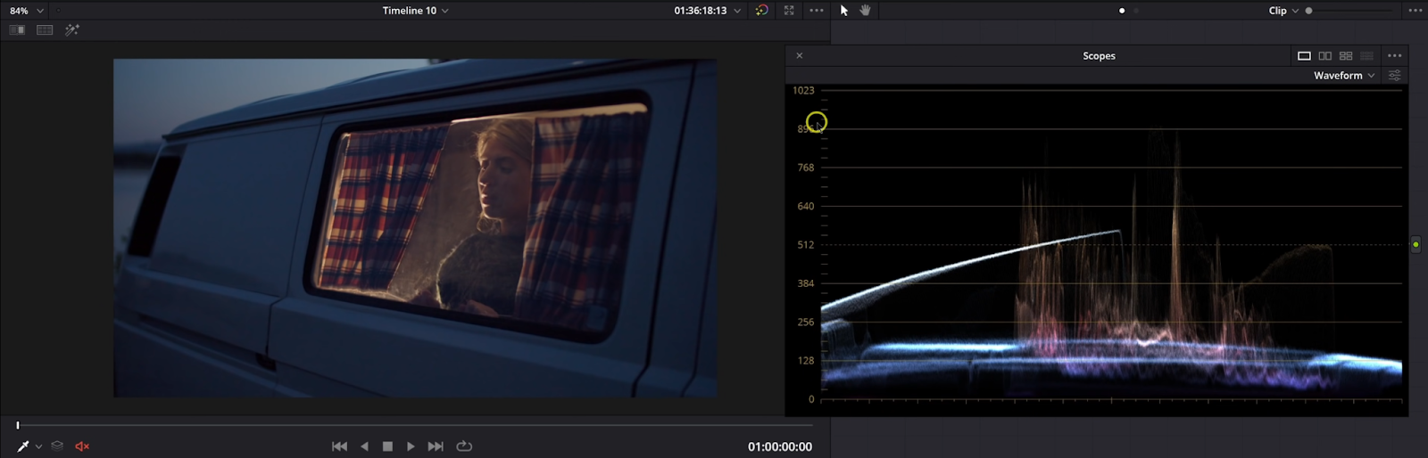
Both the RGB parade and the waveform is a 1:1 match of the luminance values on the screen from left to right. On this image, you can see we have the sky right here.

You can read this scope as the image. So the middle point of the scope is the middle point of the image.

However, the vertical part on the scope corresponds to the luminance or brightness of the specific color in that part of the image. You can see in the scopes, that the image is not that bright, and that is confirmed by looking at the image. To demonstrate this even more, I am going to take a power window, invert it, and bring the curves down around to show you what I mean.

As you move this around the image, the scope will follow.

Now we are going to move to the RGB under our waveform.

What we are looking at here is the red, green, and blue channels all stacked on top of each other here. It’s all the same information, just different ways to read it. To demonstrate this one a bit more, we are going to hop on over to our parade.
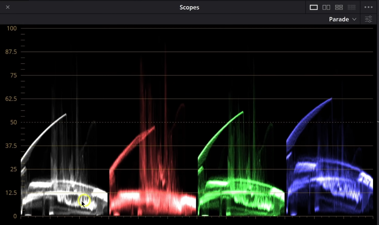
This is a combination of all of these. It has the luminance of the image on the left with the white, but then it shows the individual channels of red, green, and then blue. One way you can use this tool is for white balancing. The last one is more for luminance and contrast. But here, we can use this to measure white balance. But to get a true white balance, you need something true white and desaturated. If we turn the whole image black and white, the scopes will line up because it’s technically balanced.

Now moving to our next shot, you can tell this was shot to be a bit warmer.


However, if we do try to balance it, watch how the scopes change. What we are going to do is bring our red and green channels down. Then we are going to bring our blue channel up.


Now this isn’t necessarily a better image, but it would be a little more balanced by definition. Now there’s not really anything in this frame that would be perfectly white, so how would you know when you have the right white balance? I get asked this question all the time and the answer is three parts, experience, judgment, and story. That makes your decision when the white balance is correct. What do I mean by this though? Judgment, meaning, when you look at the image, does it feel right? That’s why having a calibrated monitor is so important because it gives you that faith that the image is being displayed truthfully. Then you can trust that to make the subjective decision to know when it’s right. For experience, you will gain this from seeing thousands of lighting scenarios and by grading tons of clips. Once you’ve done this, you will be able to pinpoint the part of the image that does need to be properly balanced and do that. Then lastly, the story. How are you going to use the story to make decisions on whether you should make the image natural, or not. What did the DP have in mind when shooting?
Now moving back to the scopes, here we have the RGB waveform.

So here again, just making sure that our image is balanced. Say you want to eliminate the blue in the sky, you can just bring the red up until it’s above it.

Now obviously this looks terrible, but you can see when we do “balance” the image, the waveform changes, helping aid our eyes.
Now lastly, we are going to look at some of the settings and controls I like to use. Up on the top you can select all three channels, or one or two of each. Then colorize, as I mentioned earlier. Then extents, which it shows you the lightest and darkest parts of the image, stuff you normally cannot see.

Then we have the waveform and graticule sliders help brighten the waveform and then the guidelines.

Then you have the show reference levels, which allows you to set the blacks and white points if you are trying to hit a specific value for a look you’re doing.

Then moving to the parade, you will again see the same options at the top.

All of the rest is the same as the waveform.
I know that was a lot of information to get through, but feel free to rewatch the video, or re-read this document. It’s all important and takes a long time to really become accustomed to using the scopes. Now you don’t want to be overly reliant on the scopes for creative decisions, because these are creative decisions. The scopes just show you where the stuff sits.
MORE LIKE THIS


