How to Get The Batman Look | Fuego | DaVinci Resolve Tutorial
What’s going on everyone! Welcome back to yet another epic tutorial. Today we are going to be going over how to get the Batman look. I am going to break this into two different parts because looking at the trailer, the movie is split between cool toned shots and warmed toned shots. We are going to start with the warm tones first.
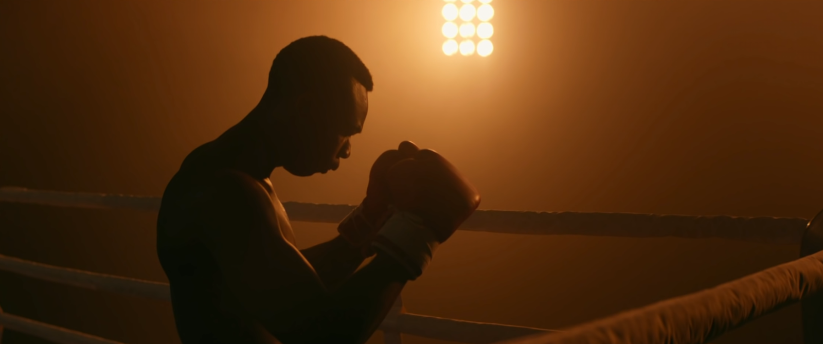
Let’s get into it. I am excited to attack this because it is so different from what Christopher Nolan did, but yet it’s as beautiful in a completely different way. So this is the frame I picked as our reference.
So what’s happening? First you can see that in my colorize waveform, the entire image is made up of warm tones. There is not a lot of complementary action going on. Now there is a slight hint of teal creeping in on the edges, but that’s it. Our blacks are desaturated.
Now, let’s go to our clip.
I will not be using any luts to create this look, just the primaries.
Now let’s build out our node tree. It will consist of five nodes.
Now we are going to start with our CST and convert it from Arri to rec.709.
One thing we need to look at are the technical specs on the camera. So we are going to pull up those right now on Batman.
Now they went through FotoKem Creative Services in Burbank, CA, which means all the jiggery-pokery that went on there, we don’t know. We don’t know the film prints/negatives, which is why I am avoiding it and trying to create a similar look within resolve.
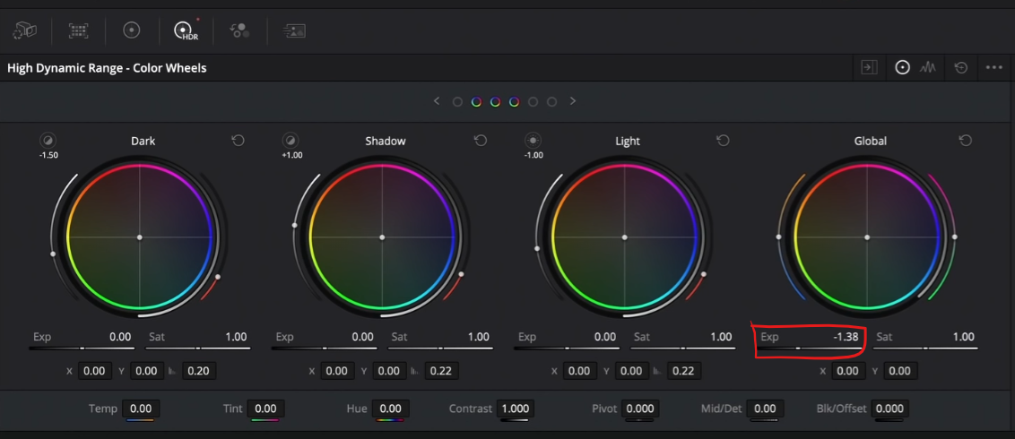
Now we are going to jump into the primaries and first use my HDR palette and pull down my offset to around -1.4.
Then, staying in the same node, I am going to use my printer lights (see picture below to find them) to dial in the warmer tones.
Here, I can see there’s too much green and yellow in our image. So I am going to start by adding 3 reds into our image, then I want to subtract yellow and add another red. Then I want to subtract 3 blues.
Now we see that there is still a lot more saturation in our reference than ours, but that will come by dialing in our contrast and black points. You can see more red in the blacks of our image than the reference.
Now we are going to move to our adjustment node and go into my log wheels and pull my shadows down to take out reds.
Boom, that helped us out a lot.
Now I want to go into my primaries to adjust saturation. We can see there is more saturation in our reference than our image. So what I am going to do is pump in some global saturation.
Now again, I need to work on my black points.
We have already come a long way so all we need to do is work on our contrast.
Before that, we are going to use our window node to add a vignette, soften it to about 25 and invert it.
Then I am going to drop my lift to get that effect. Then I want to soften it to 36.
Then another thing I want to do is mimic the teal around the edges of the vignette. To do that we will use our log wheels and add some teal into our shadows.
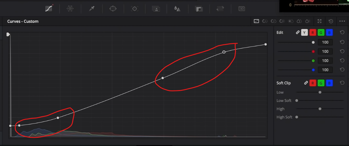
Now our blues are gone and crushed, so we will have to fix that. In our custom curves, we are going to work on our contrast (see picture below for points).
Once we do that, we can see that our information in the blue channel comes back.
Now going back into our adjustment node, we are going to bring the wheel of our shadows in the log wheels up a bit to bring back some information in the blacks.
You can see from all of this, why it’s important to take your time when creating your look DNA. Once you get this built, you can apply this across all the shots in your scene and it’ll look similar.
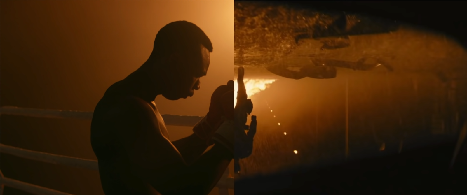
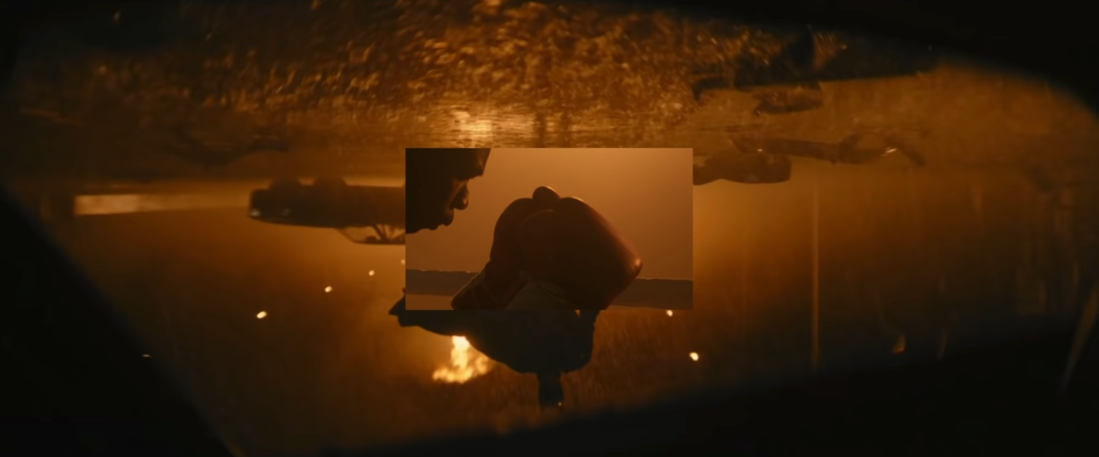
Now one thing I want to do is use our wipe mode to see how close we are.
You can see here that we are very close. The only thing I can see is that I can go under my look adjustment, I can swing my yellows a bit warmer in the hue vs hue curve.
Then I want to go into hue vs saturation and raise the saturation of my yellows.
The difference is so subtle that it is barely noticeable, but I think it helps.
Now before we look at this in fullscreen, remember that we created this without luts in 5 nodes. Adding that teal along the edges, really helped sell this look.
Now when I am in this image wipe mode, I realize I can swing the hue of my yellow a bit more.
So I am going to go back to my look adjustment node and warm up that yellow a bit more.
Then I am going back to my hue vs saturation and bring my yellow up a bit.
Now it feels a lot better.
Just look at this. It’s so there. And it’s cool that we used all the stuff you can get within resolve, even the free version.
Now let’s check this out in fullscreen.
My goal from these tutorials is always the same, which is to show you the simplest way to show you how to go from A to B. Hopefully it was accomplished in this tutorial. I think what we came up with in this tutorial was incredible, especially using all the tools that are available to the free and studio version of resolve. With that, work hard, get obsessed, and get possessed.
MORE LIKE THIS

