How to Get The Suicide Squad Look | DaVinci Resolve
What’s going on everyone! Welcome to another epic tutorial. Today we are going to be doing the Suicide Squad look. This is a pretty versatile, but stylized look. It’s pretty natural, but still pushed enough. Now remember that with these series, our goal is to show you a bunch of different ways to get the look. It’s not a 1:1 match. These look recreations are more of an inspiration than a 1:1 match.
Now, let’s analyze our shot.
Let’s look at the color story real quick. There really is no pure black, the whole image is a bit lifted. The highlights are border line blown out, but also pretty warm. The bottom is pretty even, so that’s looking proper. Our anchors are good. One thing to note is the location, the lighting, the set design and directing. There is warmth added in post, but the building on the inside is proper. Her skin is actually more pale than her normal skin tone because of makeup.
Now moving to our shot, let’s first pick our hero frame.
My project is set up in ACEScct, so just know that going in. But let’s build out our node tree.
This is going to be a simple four node project.
Starting in my second node, I want to dial in my contrast using the custom curves. I am going to start by bringing my shadows up, then highlights down. Then I am going to bring up the highlights a bit, and bring down the shadows a bit using multiple points.
Now moving into our first node, we are going to use our printer lights to try and do the majority of the look by using the offset. I am going to start by adding red, then adding some green and blue.
Now I am going to try and do a lift, gamma, gain dance to open up the image like it is in our reference.
Staying in the same node, I am going to work on bringing in the middle tones of our reference. To do that, we are going to use our gamma wheel and bring it a bit more towards teal/blue.
Then I want to go under my log wheels, raise my high range and bring the warmth into our highlights. I am going to add some warmth by adding some yellow/orange. Then I am going to take my shadows up towards magenta/red to even them out. Then I am going to bring up the midtone a slight bit.
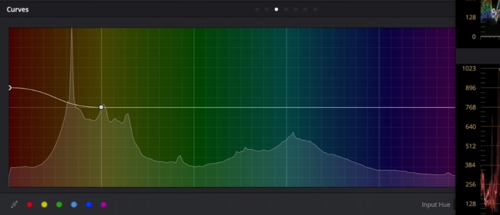
Now moving back to our custom curves, I want to use my HSL curves to dial in the colors a bit more. I am going to start off in hue vs hue and bring up the yellow a bit to add more red. Then I want to swing my cyan up to dial in the wall colors. Then I am going to do the same with the blue.
Then to dial in the red a bit more, I am going to start in hue vs luminance and bring the red down in there.
Then go to hue vs saturation and bring up the red.
Now I am going to have some fun. I am going to go under saturation vs saturation and bring up the lower saturated areas, but drop the more saturated areas.
Then under luminance vs saturation I am going to pull down on the brightest areas, to desaturate them a bit. Then I want to add some color to the shadow areas.
Now I want to move into my third node and add some of that softness. I am going to go under the sharpening tool and increase the blur to about 0.52.
Now what’s really going to sell this effect is going into our primary wheels and cranking the midtone detail down to about -40ish.
Now the final step is going to be glow. We are going to change our composite mode to softlight and open up our shine threshold. Resolve added the gain, gamma, and saturation tools to the glow effect now and what I am going to do is drop the gain quite a bit. Then I am going to open it up with gamma and then mess with the saturation a bit.
Just look at how good this is. We took inspiration from the reference and ran with it. The look that I created can be saved as a powergrade and used on other shots. That’s the beauty of these global grades. Now, let’s look at this filmic goodness in full screen.
This was so simple and so effortless and that’s the beauty of using the tools I showed you here, or the drum that I keep beating – keeping things simple and don’t just jump into secondaries.
MORE LIKE THIS


