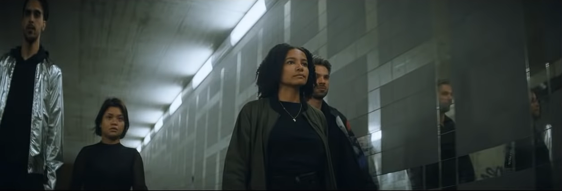
Teal and Orange look done right | DaVinci Resolve 16 Tutorial
What’s going on guys. Today we are going to show you the right way to do the teal and orange look. This is my preferred method. It will change from shot to shot, but this is the base on how to get the teal and orange.
First we are going to pick our hero frame to start.
Let’s go ahead and we will create the node tree as we go. Starting in node one, we will bring up the contrast. Then I will bring up the gamma a bit to pop our girl, then I will bring down my gain a tiny bit.
Then I am going to move to my log wheels and drop the shadows because I only want to affect the bottom portion of the image.
Now we are adding a second node, or our balance node. I am going to crank up my global saturation to about 75.
Now you can start to see all the colors, but yet it’s out of whack. I am going to start off with my temperature and tint.
Next I want to create another node and call this skin lgg for skin using lift, gamma, gain. I am going to take my lift and pull it down a bit. Then to counter that I am going to use my gamma and pull it up.
Now I want to create a parallel node and use this to qualify her skin.
Now I am going to bring up the gamma and exaggerate it a bit.
Now I am going to go into my curves and grab it and pull it up a bit.
Now I am going to add another node and this will be my look. I am going to use my temperature and tint to help dial in that look.
Now in order to stop this from messing our skin up, we are going to connect our qualifier node to this look node and then invert it.
Now it is a little off, so I will be messing around with my temperature and tint until I get the look I want.
Now we are going to add another node for our pop node. Moving to our RGB curves, I am going to turn on my editable splines and pop up the top.
Now notice that we are clipping, so I am going to bring up my high soft slider to help deal with that.
Now adding another node, I am going to use this for my glow effect.
Now I am going to create another node that will be for our grain.
So there we go. That is the look! You just saw how I created this, so let’s check it out in fullscreen.
The reason why teal and orange is so popular is due to color contrast. These are complimentary colors. You are taking skin and pushing it, then taking the background and pushing it in the opposite spectrum to make it look interesting. I hope you took something away from this!
MORE LIKE THIS


