Breaking Down SQUID GAME Color
What’s going on everyone! Welcome back to yet another epic video. Today we are going to be breaking down the color grade on one of the most watched Netflix series: Squid Game. Since the day it dropped, everyone has wanted me to cover this specific look. Now before I actually create a look on this show, let me deep dive and breakdown the entire grade for this series, and let you in on a secret you might not know. So open up a notebook, grab a coffee or tea, and relax.
One disclaimer I want to make is that sometimes, when trailers come out, they are done way before the final series or movie that airs.
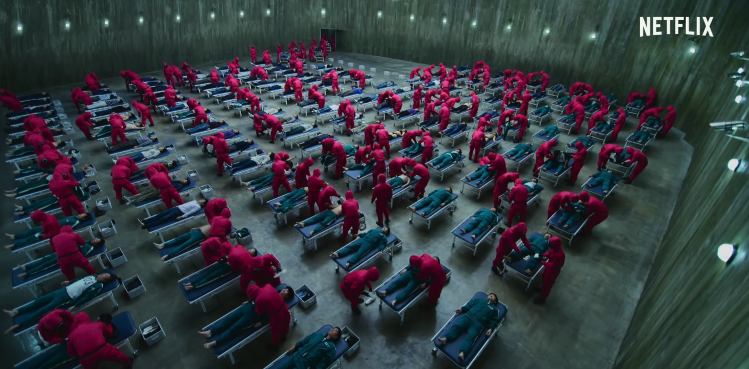
Taking a look at that shot, these lights are trying to mimic the sodium vapor lights that you would see on the street. But one thing you’ll notice is, like in Joker, the sodium vapor lights are a different color.
This is not to pick out mistakes in this masterpiece of a show, but more so to tell you that you don’t have to pixel peep. You don’t want to spend too much time shot matching to the point where it’s like pixel perfect. That’s what amateurs do. Pros use a broad stroke to grade and move on. And just to show you what the colors would look like in Joker land,
It would take away from the mood of the scene. That sickly green is what tells the story.
Moving on, one thing to note is that, at least for the inside scenes, the vignette that they use is crazy.
It’s really pushed. You can see the oval feathered out and inverted.
You can even see it there. How you can spot it too, is to look at your scopes. If you see it tapering off at the edges, you can tell it’s got a vignette applied.
Moving on to this shot
This is what dark should look like. Just look at the scopes. There is barely any information here.
If you sent this to a client, they would ask for you to bring it up. If you did that, this is the result.
So here we brought it up two stops and you can tell the difference. Most people would say this is better because you can see more detail, but dark is what we get in the original shot. This is the beauty of color grading. They are taking these liberties that also help push the emotion.
We can see it again here. This is dark.
Now this whole series is graded almost like a rec.709, but more like the commercial side than like a grade you’d see in the movies. Let’s take this shot from Blade Runner for a second.
There is so much information preserved in the overhead lights, and how everything is kind of living in the middle, yet there is still so much detail. Compared to Squid Games.
The top lights are gone, they are blown out. The blacks are at the bottom. So this just has more of a commercial type grade than a film grade. Nothing wrong with that, but it’s an observation.
When people ask me to do a Squid Games look, what makes this show so interesting, and the color so interesting, is the set design and art direction.
Take this shot for example. They didn’t add this color in the walls in post. The color of the walls is that color. Same with his uniform. That’s the color. That’s contrasted with the teal in the uniforms that the participants are wearing. They created this in the set design. Other than that, it’s nothing special. It’s a very standard commercial grade. Everything pops and there is a good amount of saturation.
Now let’s look at this image.
When we were watching the show, this seemed like a very clean white. But then you look at the scopes.
There is so much blue that it is clipping up top. Then green, then red. So what I would do to make it pure white is this. I would start by moving my offset and align the tops of the scopes.
Now the bottom is all out of whack. Now I am going to turn off my luma mix, and move my red channel in the lift down.
But that pure white isn’t what they went with. They went with the blue. This is the look they chose.
Once again, look at this dark image.
I love how they incorporated this type of shot. There is barely any information and I absolutely think that this is the right choice here. There are no distractions, only one focus right in the middle.
Now I love this bold choice.
They littered this whole shot with gold.
You can even see it in the scopes. Such a cool shot.
This is absolutely my favorite scene, especially when it comes to color grading because I feel like everything is done right. Every color, everything here belongs. The highlights, the shadows, the proper vignetting, the uniforms, everything just pops.
So there you have it guys. The moral of this story is that everybody who reached out to me that the color grading on this show was insane. The real unsung heroes here are the art direction, set design, and costume design. Now hopefully there were a lot of positive takeaways from what you just saw.
MORE LIKE THIS


