
How to Color Grade a TRAVEL Video | DaVinci Resolve 16 Tutorial

Hey everyone and welcome to yet another tutorial. Today we are going to be going over how to color grade a travel video! Let’s get started.
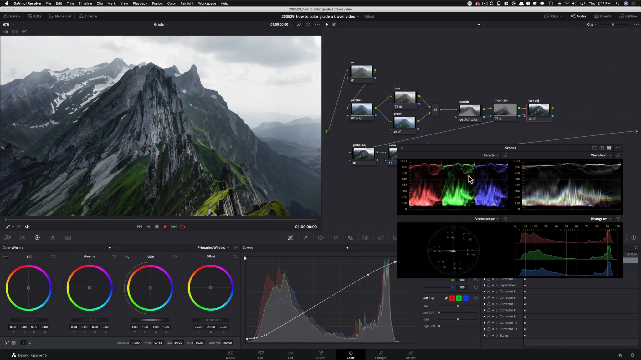
Let’s build out our node tree for the first shot.

Starting in our exposure node, let’s start by dialing in our contrast and pivot. Then I am going to pull down my gain to keep some information in the sky, then bring my gamma up. Then I am going to pull my gamma down. I will also pull down on my lift a bit. Lastly, I am going to pull my saturation all the way up to 100.


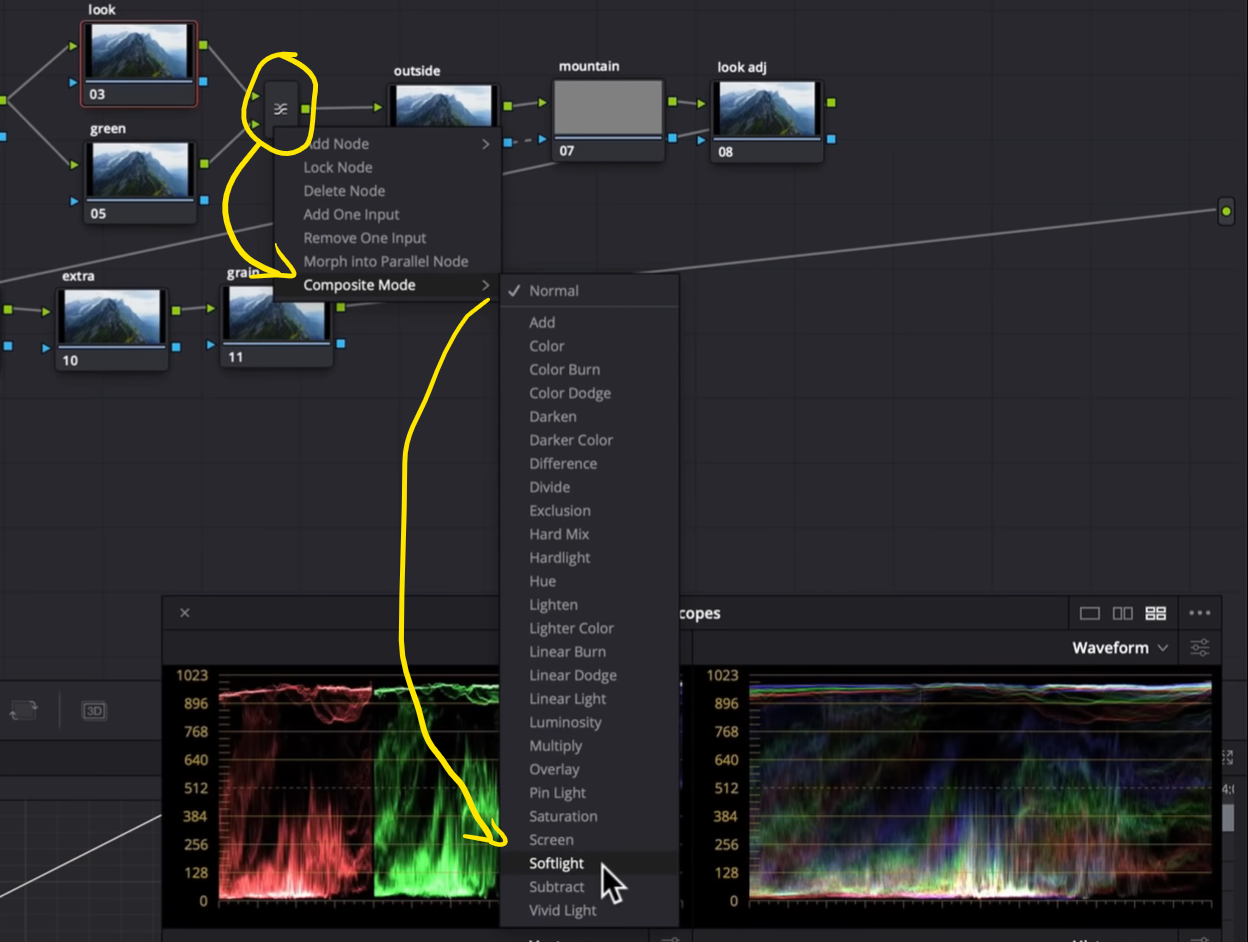
Moving onto our layer mixer, right click on the bind and go down to composite mode and select softlight.

Then moving into our look node, we are going to drop our saturation to 0.


Moving onto our green node we are going to go into our hue vs saturation and crank the green.


Now, moving into our outside node, we are going to create a custom shape around the mountain. This does not have to be picture perfect. We are also going to track it.

I will also soften it and invert the selection.

Now I am going under my RGB curves and start bringing it down from the middle. Then I am going to start messing with my contrast and drop our gain.


Now we are moving to our mountain node to bring it out. I will start by bringing up our gain and gamma (remember to always push too far then bring back).


Alright, moving to our look adjustment, we are going to create a custom curve in our RGB curves.

Now under my global adjustment I am going to bring up my gamma to lift everything up, then drop my lift a bit to add more detail.

Now I want to remove that blue tint in the image so I am going to bring my lift towards the green color space.


I want to go back to my mountain shot to crank our midtone detail.

In my extra node, I want to add a color compliment to the sky. To do that I am going to pull up the highlights toward this salmon color. Then to avoid clipping, I am going to use my high soft in the RGB curves to save our highlights. I am also going to control my high range so that the red doesn’t spill into our snow.


Now we need to get rid of that chatter in the image. To do that, we are going into our motion tab and we are going to add some noise reduction.

The last thing is to add some grain. I will start with 35mm 400T, and follow these settings below.

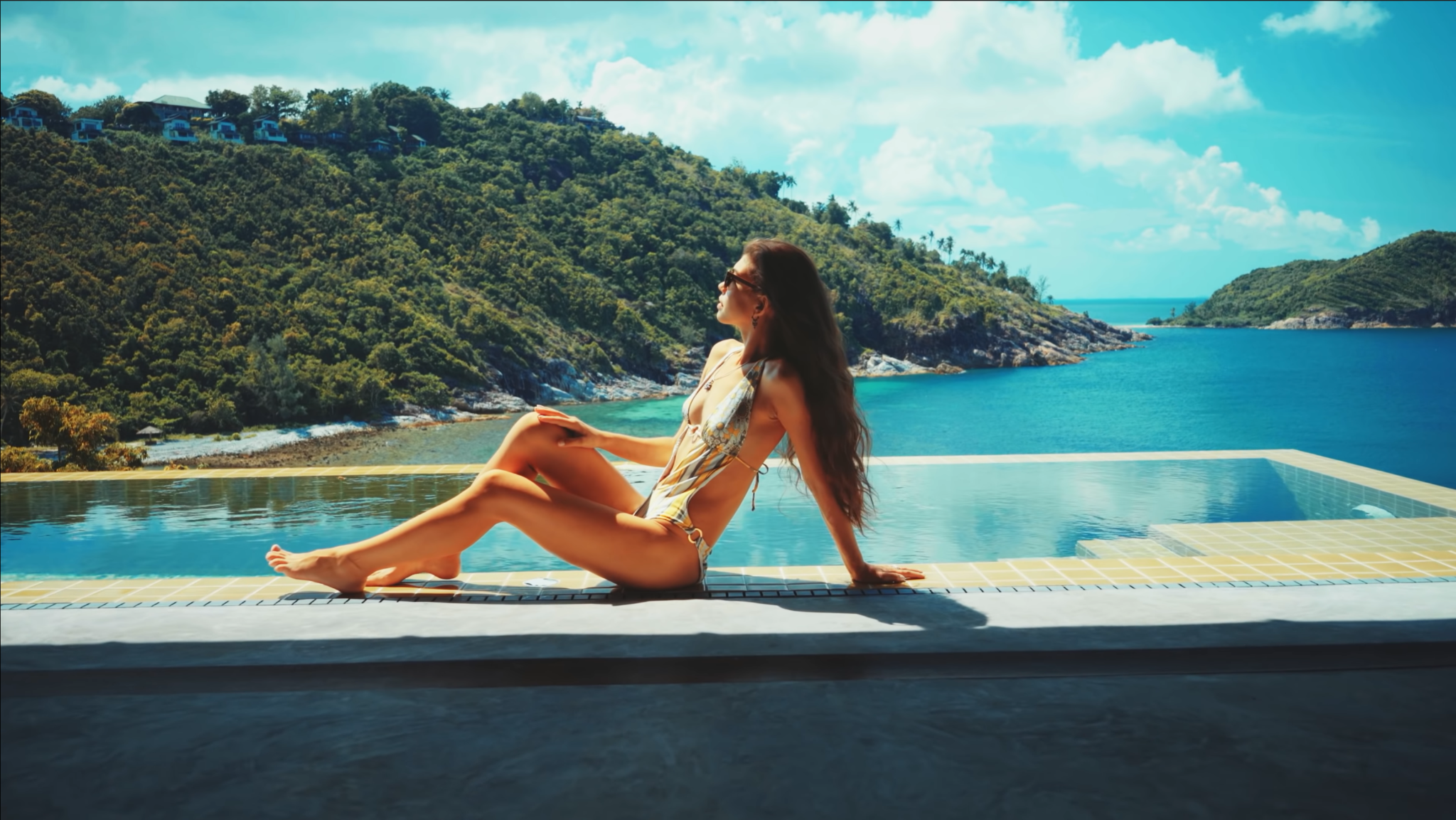
Let’s check out the final look in full screen.

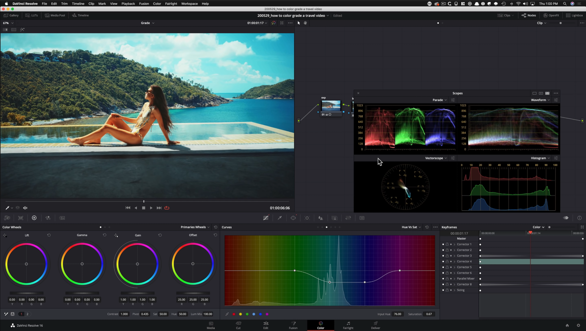
Okay, moving onto our second shot, we are going to create a whole different look DNA to add to your repertoire. Here we are going for that teal and orange. Let’s build that node tree.

Starting in our exposure node, we are going to add some contrast. Then we are going to bring our gain down, but our gamma up.


Moving onto our balance node, we are going to use our color wheels to balance out the image.


Moving into my look node, I am going to go under hue vs hue and start by taking my cyan towards teal instead of blue. Then we are going to take down our greens to add more green, so that it doesn’t look so burned. Then I am going to take my yellow and do the same thing, but not too much.

Now moving into our hue vs saturation I want to crank up the teal. Now I want to pull down the skin tones, so that those are not overdone.


Now I want to add a parallel node to attack the color in the shadows. I am going to create a window around the shadows.

Then I am going to go under my hue vs saturation and I am going to pull down the cyan, but bring back up the skin tones.

Then we are going to go into our rgb curves and pull down to darken the shadows. I will also pull out some more saturation from the shadows by moving my saturation slider.


Moving back to our look node, we are going to copy and paste the changes we made to our bottom parallel node, to our top parallel node and blend it so that it does not affect the bottom.

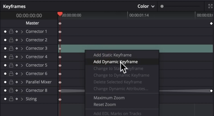
We will have to dynamic keyframe all of this which can be done by right clicking and saying add dynamic keyframe.
Moving onto our vignette node, we are going to add a window around our subject, soften it to 100, and invert the window to affect the outside.

Then I am going into my RGB curves and I will pull down from the middle, but also pull my saturation down on my blues using hue vs saturation.


Now under look adjustment I want to give it a custom curve to add that pop we are missing.


Going back to our look node, we are going to use our hue vs luminance to work on our blue and cyan.

In our pop node, we are going to raise our low soft under our curves and then take my lift down, and gamma up to create a soft film look.


There we go! That’s the look. Let’s go ahead and check out the final look in full screen.
Alright moving onto our last look, we are going to do something challenging, but it will help us out in the long run.
Let’s create that node tree.

Starting in our contrast node we are going to crank the saturation and raise the pivot. Then I am going to lift my gamma, bring down my gain and lift.


Now I am going under my balance and using my wheels, I am going to balance the image. I am going to bring the lift wheel down a bit to take out some of that salmon.

Moving into our buildings node, I am going to create a window around the buildings.

Then I am going to raise my gamma, dropping my gain, and then to counter that by adding contrast.


You may be wondering why I don’t create an outside node in this instance, and mainly because I don’t want it to be too calculated. Everything has to blend, so you need to be methodical about it. We are making some drastic changes so we want to keep it believable
Now, going under my sky node I am going to create a gradient to select just the sky.

My goal is to bring information back to my sky and I will do that in two ways. I am going to go into my RGB curves, and my highlights slider and bring them down.

Now moving into my look adjustment node, we are going to add pop with a custom curve in our RGB curves.


Now, adding parallel nodes, this is where the real magic is going to happen. Starting on our top node, we are going to qualify just the highlights.


I want to go under my highlights in my LOG wheels and put some warmth into them.

To control it a bit more I am going to pull up my high soft in my RGB curves.

Now I want to add a bit more color into the sky through my gamma color wheel.

Then we are going to qualify the opposite on the bottom parallel node.

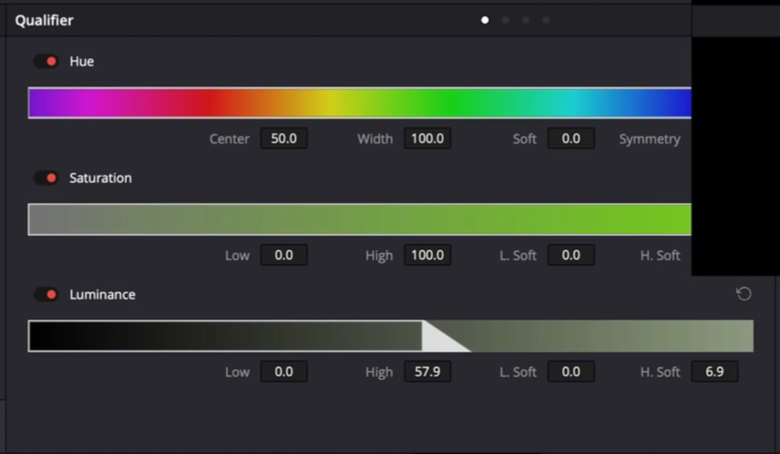
In this I want to bring my lift color wheel down, but bring the gamma up to the warm side just a bit.


And that’s it! Let’s go ahead and check out our look in full screen.

I hope you all learned something new today. Just remember to save these as power grades so you can use these on projects in the future!
MORE LIKE THIS


