
The Easiest Way to Create Split Toning in DaVinci Resolve 17 | Color Grading Tutorial

What’s going on everyone! Welcome back to yet another epic tutorial. Today we are going to be covering the easiest and fastest way to create split toning or color separation.
It’ll make a lot more sense when I explain it looking at our final image.

The yellow circle represents the warmer tones, while the red circle represents our cooler tones. If I were to make the warmer even more warm, and the cooler tones even cooler, that would be splitting the tones. We are going to implement that now.

You can see there that I split the tones and created more separation. So know that we understand that, let’s go ahead and get into our tutorial.
This is going to be a very straight forward node tree, so let’s build it out.

Now moving to our CST node, we are going to need to convert this to cineon film log because we are going to be using a Kodak 2383 lut. This was shot on Arri, so we will use that in our CST.
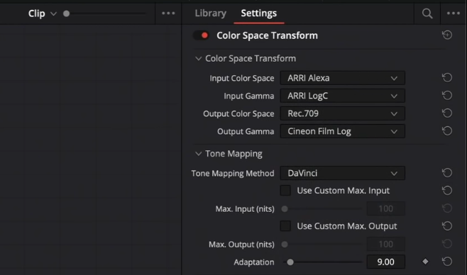

Now obviously that looks weird, but don’t worry, the next step we will fix it.
Moving to our lut node, we are going to go into the built in lut tab in Resolve and we will select the Kodak 2383 D60.


Now everything looks a lot better. It’s still pushed, but that’s just this lut. We will end up fixing it, but it’s a good starting point.
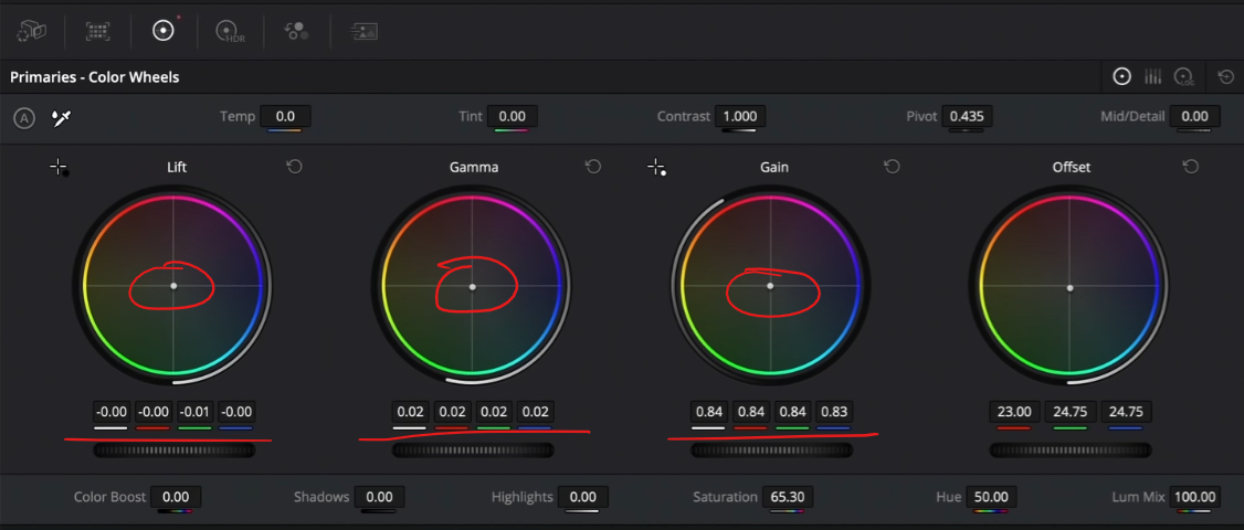
Now let’s move to our primary node. I want to open the image up, so we are going to bring our gain down and then bring up our gamma. This allows the image to breathe more.


Now moving to our HDR node, we are going to click on these three dots and set the color space and gamma to the right selection.


What that does is allows all of these wheels to work as though you are making changes inside the camera. Now I am going to use my HDR shadows and lift them up a bit.


Now what do we need to do. Well the image is way too red. So moving back to our primary node, I am going to use my printer lights (or offset wheel) to balance out the image. To do that I am going to take out red and add a bit of cyan back in.


These two nodes have already made a great change. But hear me out:
You need to do this first. This part is unavoidable. I will show you the easiest and fastest way to do the complimentary colors scheme thing, but this can not be minimized: the power of primaries.
Now what else does it need? I am going to move to our primary node again and use the bars to make adjustments. Starting in our gamma, we are going to subtract some of the green and yellow.


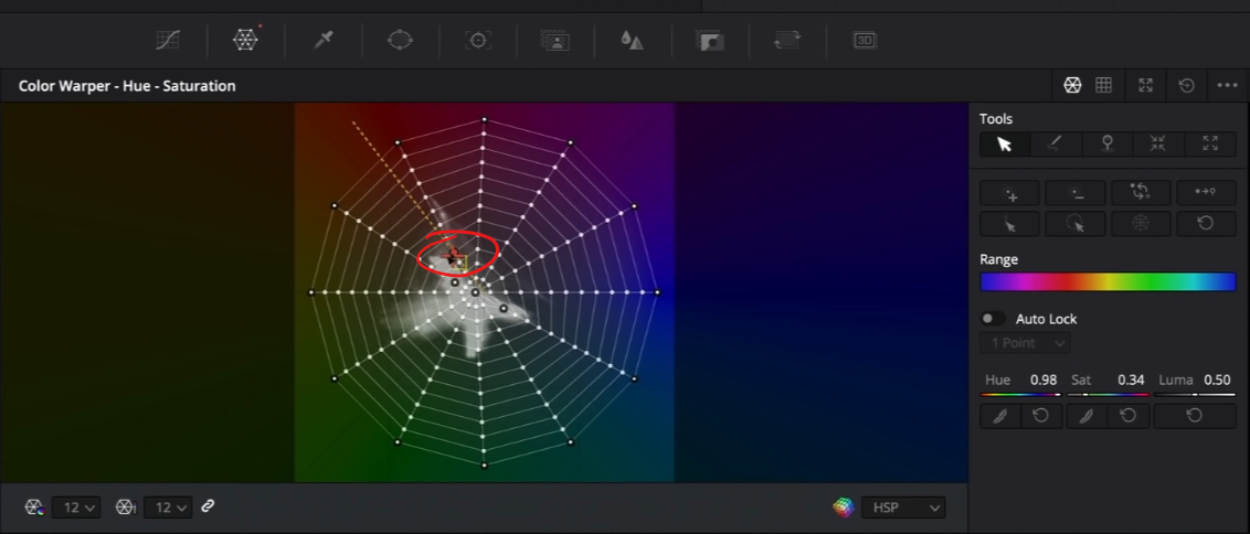
Now we are ready to jump into our sauce node. That is our color warper. Why this is awesome is you can control the hue and saturation of a single hue in one point whereas with our hue vs curves, you have to use many curves to get the same result. Then moving into the second tab of our color warper we have the chroma and luma tabs. This allows us to swing it from warm to cool, green to magenta but also work on the luminance value. But let’s put it to action so that it makes sense. The first thing is in the bottom left, change the drop down to 12. This gives you more points to work with. Another cool thing is that you can click on the screen and move around while on the image. But you can also click on the screen and the point will be highlighted. But enough explaining, let’s get into it. The first thing I am going to do is grab the sky and add a bit of color into it. Just a bit, I don’t want to overdo anything.

Then I want to add a bit more warmth into the image, so I am going to select the building and move towards the left.


This was done in two moves. That’s it. We split toned this in two moves. But we aren’t done yet. We are going to use our chroma - luma color warper next. Starting with the blue, I like the color, but I want to add some depth to it now. To do that, we are going to click on the blue and bring it down.

That affected the skin, so we are going to bring that back.

Then the green in the door is looking a bit teal, so we will swing that to the left and up a tiny bit.

But that dirtied up the beard area, so to counter that we are going to click on the beard and drag it to the right.

Then moving back to the hue - saturation, I want to click on the beard and clean it up a bit.


Now in order to see the separation, I am going to crank the saturation to 100 in my primary node.

Now moving back to our color warper node, we need to dial back our skin. I am going to click on the skin and dial it back.

Just look at the power of this tool.
Now some of you may be noticing that when you scroll into the trees in front of the far away building, there’s some ghosting.

Now this can be caused by many different things. It’s not the chroma - luma tab, its when we messed with our blues in our hue - saturation tab.

However, I want to exaggerate it because there is no artifacting and it’s hard to see it when zoomed out. But I do want to clean up his shirt and make it a bit more white.


Now I want to stay in the same node and use the chroma - luma tab to add some contrast. What I am going to do is start in the shadow on the road and pull it down.

Then I am going to select the shirt and crank it a bit to add a bit more contrast.


Just look at the changes we’ve done in one node. I do think his face needs a bit more saturation. Moving back into the hue - saturation tab, I am going to grab it from the red area and swing it.

Then pulling it from the middle we can change the overall feel of the whole image.


Now moving back to the primaries I am going to use our gamma to cool it off a bit. Then in the gain I want to add a bit more warmth and yellow. And then in our lift, I am going to add more teal.

Just look at the detail we brought into the sky, and the warmth added to the building and how we cleaned up the shirt, all in one node using the color warper. We are even bringing back detail in our shirt and skin. I believe that this tool is the future of color grading because when we make changes on screen, it’s more tactile. We have a different level of connection than just using these knobs.
To finish it off, I am going to drop on halation. When you first drop it on, it looks really weird. So I am going to go under my gamma and dial it back, and then set the grain settings to these.

Just like that, we separated the color and created a gorgeous look. Now let’s check this out in full screen.

Now this tool will open up endless possibilities for you and your grading, but you can see that you need to be careful because the artifacting will happen really quickly. Just know when you push it too far you will have to dial it back. Just remember, to learn and apply.
MORE LIKE THIS


