
You Must Upgrade to Resolve 17 for this

What’s going on everyone! Welcome back to yet another epic video. This time I am going to be showing you the ultimate look development tool. This is exclusive to resolve 17. This awesome tool is the color warper tool.
Now let’s get this show on the road! I’m super excited for this tutorial. Let’s start with the “how to” part. The first thing we are going to do is work with the Resolve Color Management because this tool needs that.

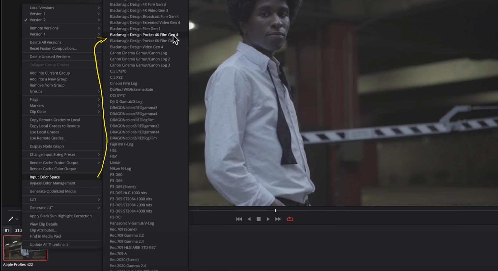
Now once I apply this, nothing happens because this was shot in ProRes 422. So I will need to right click on the clip, go to input color space and choose Blackmagic Design Pocket 4K Film Gen 4.

Now we are ready to go. So let’s get our node tree started.

The first thing I am going to do is use my primaries. I am going to just drop the gamma a hair.


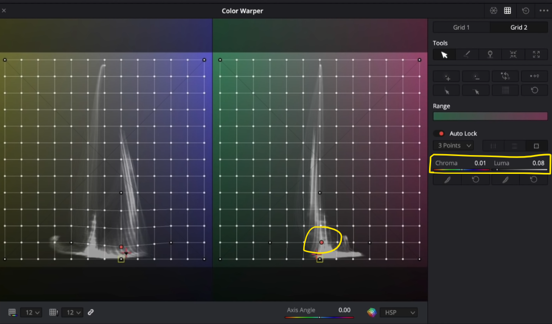
Okay now let’s get into this. The color warper is divided into two main areas. The main one is the hue vs saturation. You control the saturation by going left to right, and the hue by going up and down.

Then you have the chroma and luma control.
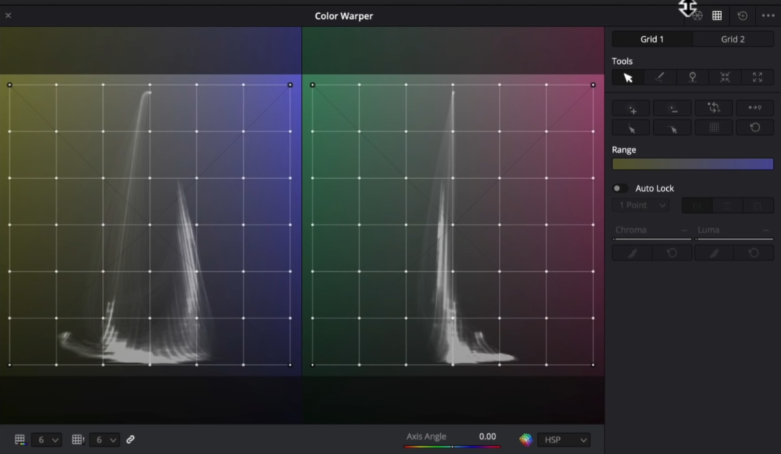
This is basically a temp and tint on steroids. The more interesting part is that when you move a dot up and down, you are actually messing with the luminance values, depending on where you are.
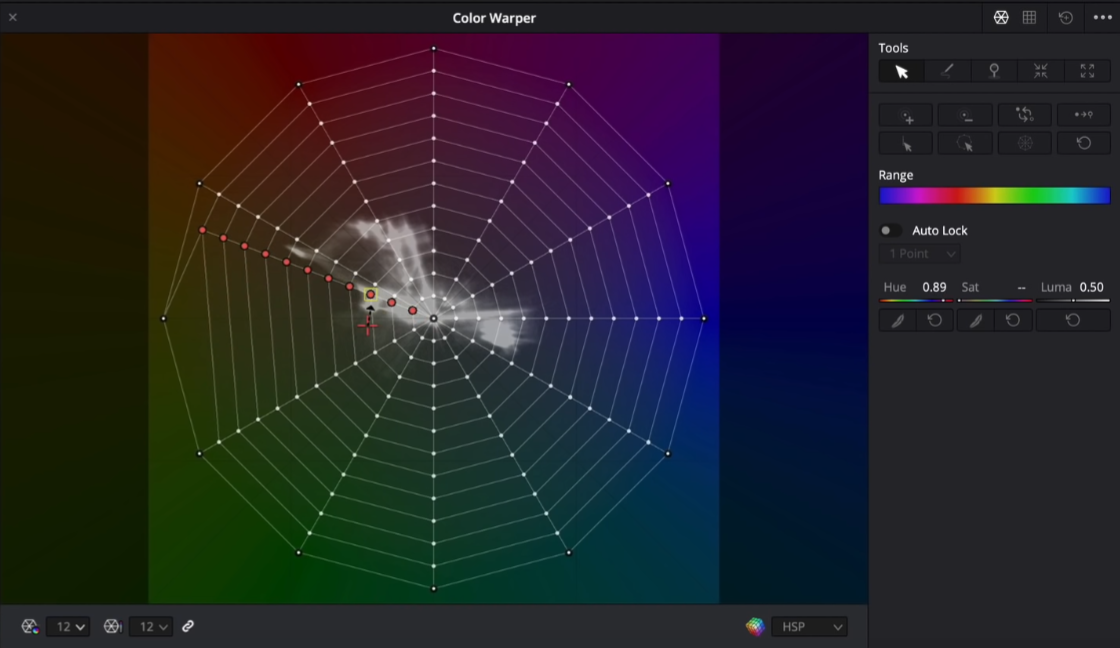
Now if you are working with footage that is 10-bit or more, you will want to select a higher dot option.

The higher number of dots, the more control we have over the whole image. I like to keep it around 12. 6 is good for 8-bit, but once you get into the better cameras, you will want to start using more to have more fine tuning ability over the colors in your image.
There are three ways to manipulate parameters in the color warper tool. The first is on the screen. When you hover over the image, a red cross will appear on the color warper showing you the saturation and hue value of that place on the screen.

If you click on the screen, you can drag around on the screen and it will change the parameters.
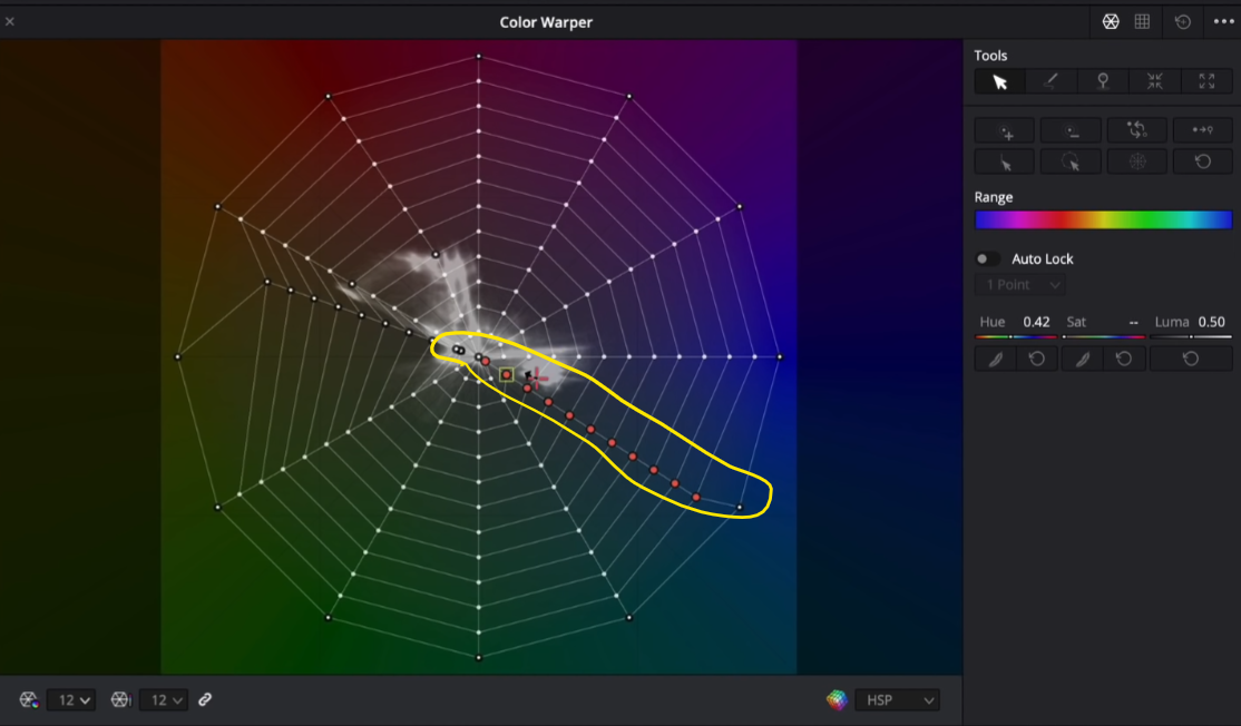
The next way is to move the actual dots on the spider web. You’d pick a dot and then you can start moving them around and changing the values until you dial in the color how you want it.
My personal favorite way is to pick what I change, then I go into the sliders section and move them around to fine tune them.

This way just helps me feel like I’m a bit more in control.
Now click on the three dots and make sure that scope is set to output.

This will make sure that the vectorscope in the middle moves with your changes.
Now there are so many tools, but I’m only going to bring you through the ones I use.

The first tool is just your basic selector tool. It is the main tool that you will use when using this color warper tool.
The second tool allows you to draw a pattern on the dots, and move multiple dots all at one time.

Now the next tool is the convert selected to pin.

This basically locks the dots you select (before clicking this), so that you can’t change them. So for example, if you wanted to lock the skin tone in, you could select the skin tone, then click this, and any changes made after would leave the skin tone alone.

Now two of my favorite tools live on the bottom.

The one on the right is very interesting because if I select one point, then click the button, it will select the entire ring of those dots.

The tool on the left from that image does a similar thing, but instead it selects the whole row of dots.

Now I can move that whole row at one time.
This next tool is basically a feathering tool.

When you click one point on the color warper, it grabs adjacent points to make the entire transition a bit more soft.

This tool really helps create a soft, subtle transition.
The next tool is this auto lock.

This basically gives you an x amount of point cushion. So if you select one dot (with 3 points selected), it gives you three more dots on either side cushion to play with, sort of feathering it a bit.
So those are my go-to tools in the color warper section.
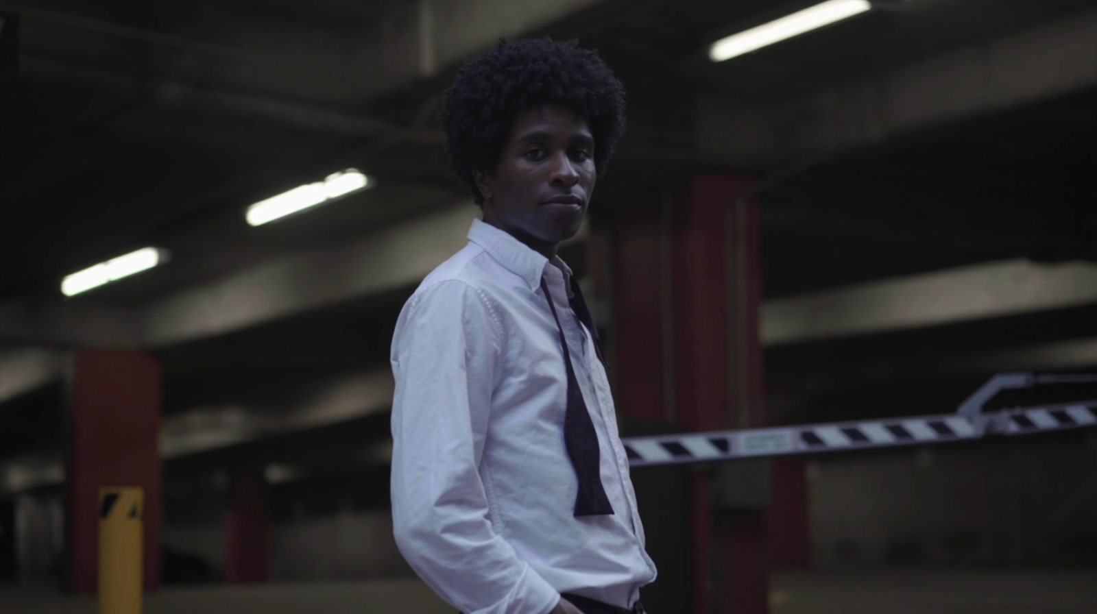
Now we are going to jump into the clip and show you how I would use this in a professional project.
Now starting in our look development node, and say we have the DOP right next to us guiding us how he wants this done. Say he doesn’t like the yellow hue on the cement walls and he wants to take out the green. I would then click on the part of the screen he doesn’t like, and then I would click on the “select entire row” tool.

Then I will warm it up.

That helped create a nice soft change without artifacting. However now it is a bit too saturated, drawing attention away from our subject. So for this I would then move to the saturation slider and pull it back.


Just look at how easily we are able to do this look with this tool.
Now the yellow pole in the back is a bit too saturated, so I can select the color and then pull down on the saturation slider.

We will also want to do a similar thing with the red in the background.


Now we need to fix his shirt. There is too much blue and it is over-saturated so we need to bring that down. So what I’ll do is click on the shirt, and now I want to grab the entire row, and swing the hue a bit and take down the saturation.

Now we are going to move into our chroma and luma and hover over his skin area and set the auto lock and take it to 3 points so that I can give myself a bit of a cushion. But I am also going to select the square icon so that it does the three points around in a square.

With this point, I want to bring down the luma which creates some contrast in his skin.


Now I can do the same thing in cement areas as well.
Now the next problem area is still the white. I am going to select it and move it around a bit to try and get that color out.

Now that we are done with this node, this is our look DNA. We can go into other nodes now and make changes. So we will go to our temperature and tint node and warm it up a bit, then add some green to give it a film look.


Now I am noticing some noise in his shirt, so I am going to go into my noise reduction and add a little bit.

Now we are going to add some film grain to the image. The preset we will use this time is 16mm archival print, and we will leave it on the stock settings.

The last thing is we need to add a look adjustment node to bring down the luminance in the highlighted areas. To do this, I am going to go into my luminance vs saturation curve and bring it down from the top.


There you have it! This is an ultimate game changer if you use it properly. If you don’t, it will destroy your image. This was just the tip of the iceberg for this tool. I think it’s an extremely powerful tool.
Now let’s check this look out in full screen!

As I mentioned, this specific tool makes resolve 17 so exciting. This is their first attempt and it’s not going anywhere. But use it carefully. It can easily break your image. With that, I will see you in the next video!
MORE LIKE THIS


