The Easiest Way to Create Blockbuster Movie Looks
What’s going on everyone. Welcome to yet another epic tutorial. Today I am going to show you how to recreate looks from Marvel, DC, and Disney. We are also going to learn what the differences and characteristics are. I challenged myself to create these three looks from one rec.709 shot. Here we will deconstruct the rec.709 baked in look, and then create our own look on top of that. All of this will be done in less than five nodes.
First thing we need to do is analyze these shots. We are going to start with Marvel.
What we inherently see in Marvel movies is this crazy blue that they use. There is a natural feel to their looks but they are still highly stylized.
Now moving onto Disney (Star Wars), it’s a pretty natural looking image.
It’s kind of muted, but not over the top. It almost feels natural, but it’s got that hint of the film look over top of it.
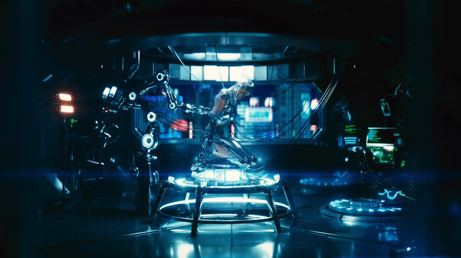
Now in DC comics, you can see this green bias, but also with the red channel being lower than the rest, you get that cyan color. They usually have a dominant color too, and in this shot it’s red.
So moving to the technical specs of the Avengers, the particular film stock that was used is included as a LUT in DaVinci Resolve. Or, rather, a sibling LUT with a bit less contrast is used.
Now moving onto Star Wars, you can see they used the Kodak 2383 that we have in DaVinci Resolve.
Moving onto DC comics, Justice League, again, we can see that Kodak 2383 was used.
Now that we have these technical things out of the way, we can now analyze our shot and see what is happening. You can see it’s a rec.709 image and it’s flattening out on the top and bottom so we don’t have much room to play with it.
Now in my project settings you can see that I’m in the DaVinci YRGB Color Managed profile.
Now I want to build out my simple node tree.
We are going to start off creating our Marvel look. We are going to start by using our film print emulation by going into our LUT tab -> film looks -> then picking our LUT (Fujifilm 3513DI D60).
I chose the D60 because it’s the most balanced one of the two.
You can see here everything is just gone after the LUT is applied. But don’t freak out because I am going to use my CST (color space transform) in my OFX tab and change the output gamma to Cineon Film Log. This opens it up and brings it back to normal and we are left with the actual film print emulation.
This is already so close, we don’t have to do much.
Once you use the right film print emulation and once you put in some work and do some research on what you need to do, it genuinely can be this simple to be in the ballpark.
I’m calling it here. We are so close, we aren’t going for a 1:1 match.
Moving onto the next shot, I am going to create another version, then reset the FPE node and add the Kodak 2383 LUT.
Once I drop it on, you’ll notice it’s got a bit more contrast than the Fujifilm one and we have to do some work to get it closer to the DC shot. You can see there is a pretty big difference between the two shots so it’ll need a lot of work.
The first thing I am going to do is use my temperature and tint to get into that world.
We created this look super fast.
Now we are going to add a new version and reset our temperature and tint node. This will be the most difficult look because we are going from a baked look, to this Star Wars shot.
I am going to start off by adding warmth to the image, then taking my tint towards magenta.
Now I am going to use my HSL curves and use hue vs saturation to remove the saturation from the blue and cyan.
The one thing is, especially in the Mandalorian, the looks are nice and clean. So I am almost happy with this look, despite the difference. I’m not going for a 1:1 match, so this is still looking great.
However, if we want to stay honest, we need to do more. I am going to use my luminance vs saturation, I am going to pull saturation out of the highlights.
Now I am going to go back into my temperature and tint node and I am going to warm it up a little bit.
Now if you think it’s too cool and clean, you can take your gamma and move it to the warm side.
Now we have to go back into luminance vs saturation and drop our image from the bottom.
Now we were just trying to capture the essence of the shot. The lighting was completely different and it was shot in two completely different environments. But let’s check this out in full screen.
It still looks really clean and natural. Very close, but obviously not an exact 1:1 match with our still. But that’s okay.
Now let’s take a look at all three versions.
It was so quick and simple to create these three looks. Remember too it was a baked in, rec.709 look. This wasn’t log.
Now, let’s check out the final looks in full screen.
Personally, these are my favorite types of videos because there are so many how-to videos, but not enough of how to develop the eye for this. With that, work hard, get obsessed and stay possessed.
MORE LIKE THIS


