
5 EASY Techniques for Better Color Grading

What’s going on everyone! Welcome back to another epic tutorial. Today we are going to be going over 5 easy techniques for better color grading. Ultimately your job is to make pretty images. That’s over simplifying it, but in this video I am going to break it down on what it takes to make pretty images.
Alright, let’s first build out our node tree.
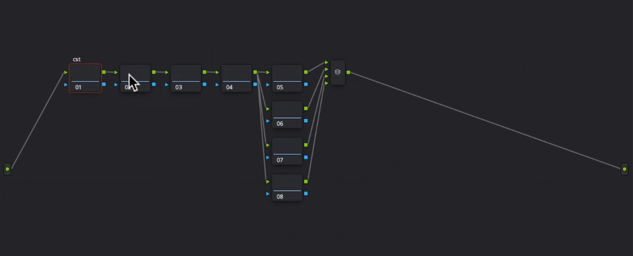
The first node will be our CST, converting RED LOG to rec.709. You will need to know on your project, all the camera specs before you can start.


Alright, let’s analyze what we’ve got going on. We’ve got this light hitting the window, so we can create a vignette and then everything outside of it we can pull down since it will feel natural.

We also need to bring out our guy and make him pop/stand out a bit more.

I also want to create a hot sunny day.
Now let’s attack it. I am going into my second node and using my primaries wheels. I am going to start by raising my gamma up to pop out the middle, then bringing my gain down to bring down those upper portions. Then I am going to add some contrast. Then I want to add that warmth I wanted to get in the image. Now to counteract some of that, I want to pull out some of those yellows by bringing the gamma down.


Now moving into our third node, we are going to use our log wheels. My goal is to make him look perfect with our log wheels. I am going to start by pulling back my high range. Then I want to bring up my highlights a bit to pop the highlights a bit. Now I am going to take my mid tone towards red/magenta to pop out his skin. Then I am going to add some blue/magenta in my shadows.


Now I want to move into my next node, HSL node, and I want to start with my hue vs hue. I want to take my cyan and green and pull them down to cool it off a bit. Then I want to select his skin and start swinging it towards magenta a bit.

Then I am going to go under my saturation vs saturation and I am going to take the most saturated areas in the image and pull them down a bit.


Alright, now onto our light shaping. In the top parallel node, I want to create a custom shape around the window and invert it and add softness.


Then I am going to go under my primaries and pull down on the gamma.


Just look at the difference we made. It’s all believable too because that’s the way the light was coming from. This looks natural.
Now moving into our second parallel, we are going to use this to focus on our subject. We are going to create a custom shape. I am a fan of custom shapes because they are organic and they blend in very nicely. Once this shape is done, I will add some softness.


Now I am going to go under my curves, turn on editable splines, then raise it up.

Then after all of this, I will need to track the shape. Then I want to add a bit of sharpening to his face too.


Now moving onto the next node, I am going to focus on bringing down some of the highlights. I am going to create a custom shape, feather it, and then drop the gain. Then we will want to track it.


Now I want to create another shape around the shoes, feather it, and then track it as well.


Now moving onto our last parallel node, we are going to focus on the door in the bottom right corner. The yellow color is distracting, so I am going to create a custom shape around the door, feather it, track it, then I am going to use my luminance vs saturation to get rid of that color softly.


Now I am going to create a global adjustment node, and bring the saturation vs saturation down.


Now that did take a bit of saturation out on our guy, so I am going to use my hue vs saturation in my hero node to pull up the saturation on our guy.


Now guys, this does it. Just look at this image. We’ve shaped light, created this warm sunny look. Now some of you may be thinking you can’t spend that much time on each frame, and that can be true but if you are working on a commercial or a movie with a big budget, or if you just have time, you will be expected to do these things.
This is what color grading is all about. The reason I take my time building these looks for you is for you to understand the concept that these are the thoughts that are going through a pro-colorists mind. Once you start thinking like that, you will start coming up with all these cool things without even thinking about it.
Now let’s go ahead and check this look out in full screen.

As I said in the beginning of this video, our job on a high level is to make pretty images, but hopefully this video was able to give you an insight on how to actually get from a to z. With that, work hard, get obsessed and stay possessed.
MORE LIKE THIS


