How to get Netflix's DARK look | DaVinci Resolve 16 Tutorial
Hello and welcome to yet another tutorial. In this one we are going to recreate the Netflix series Dark.
We are going to start by analyzing our shot by dropping in our color palette effect. This is a really good tool to get the base color story in the image.
Taking a look first at our highlights, they are this salmon color. There is really no pure white in this image. The skin tones are very saturated, while that background is desaturated, almost a greenish-grey. In the lower mids, there is this teal that compliments the skin. There is enough of a bleach bypass going on, but just very subtle.
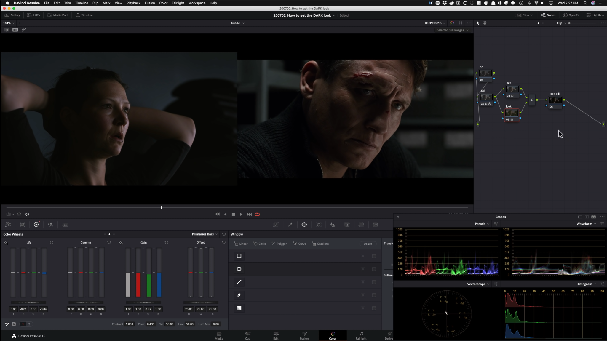
Now, let’s switch gears to our shot. One thing right away, is that the light is working in our favor. Let’s go ahead and create our node tree.
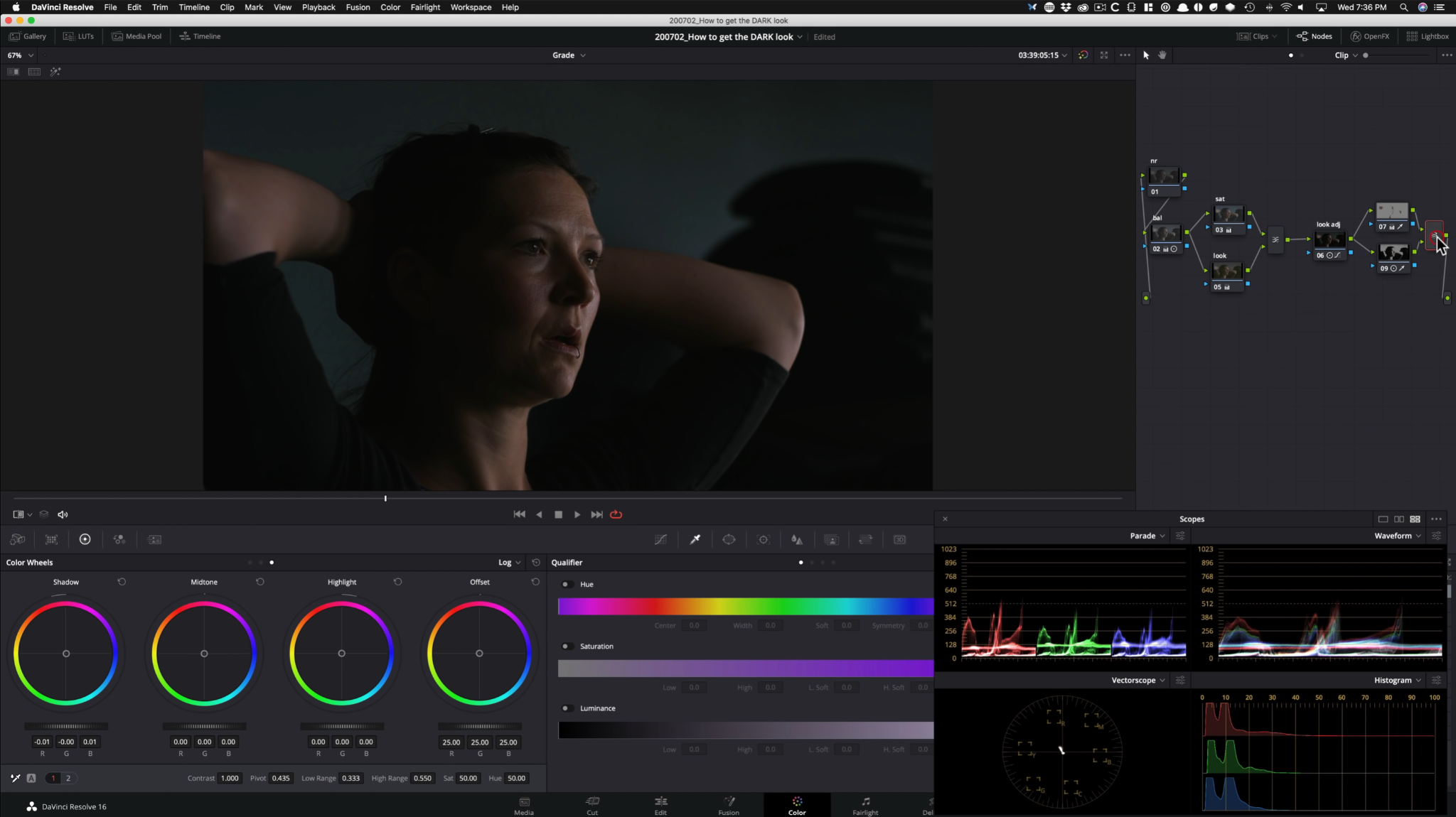
We are going to start with that, and build on as we go.
The first thing we are going to do is right click on our layer mixer, and change the composite mode to overlay.
This is where that bleach bypass look comes into play. That’s the beauty of this effect.
Starting in our balance node, I am going to start by raising up the gain to add some exposure to the image. Then I am going to add some contrast to add that punch.
Moving onto our saturation node, we are going to crank our saturation all the way. This adds that color separation that we need.
Moving into my look node, I am going to go into my primaries bars and take our luminance mix all the way down so we can affect each channel individually. Then we are going to go into our gain and subtract green to add magenta into the highlights. Now I am going to go into my lift and subtract blue and red to add the cyan/green color in the background.
Now moving into my look adjustment node, this is where we are going to do our hue vs hue options. I am going to select my yellow and move it around to get it in the ballpark of our reference. Now I am going into my cyan to match the backgrounds.
Now I am going to add parallel nodes and we are going to use one for highlights, and the other for shadows.
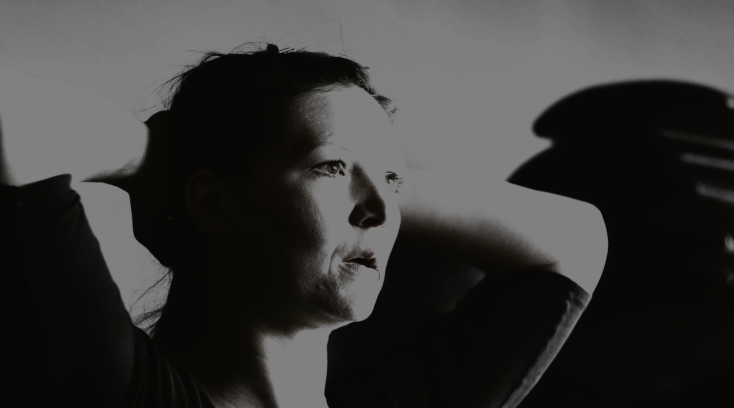
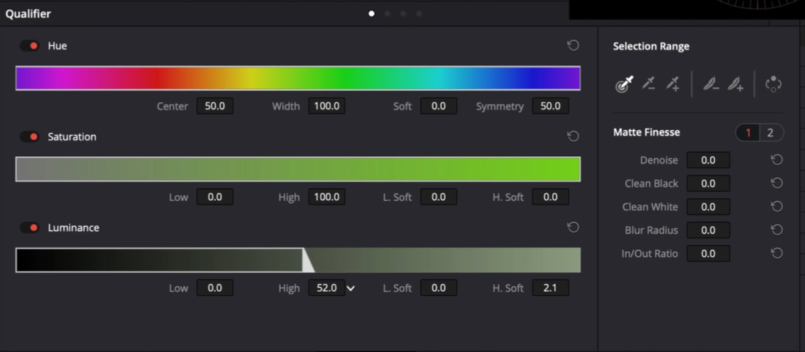
Starting in our seventh node, we are going to use our luminance to grab our highlights.
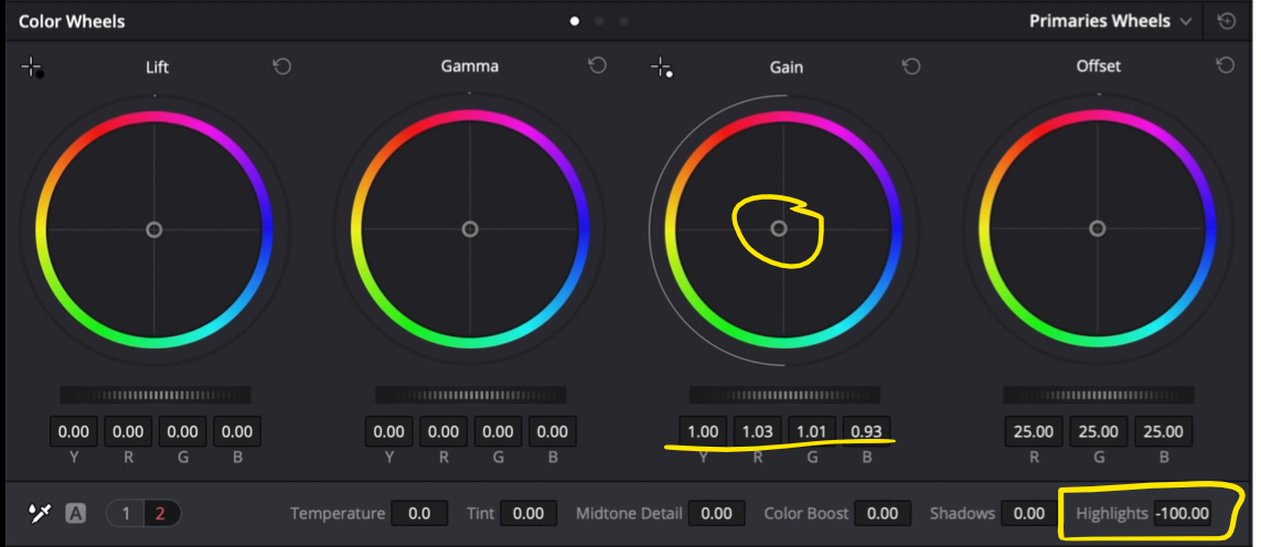
Now looking at our highlights versus theirs, ours are too hot so we are going to simply pull our highlight slider back. Then I want to go into my gain and start adding the warmth we see in that skin.
Moving into our eighth node, we are going to qualify just the shadows.
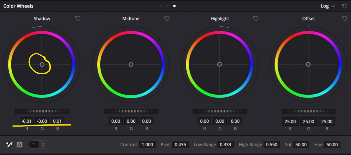
Now we are going to go into our log wheels and start moving our shadows around to try and match the color in the blacks.
I am going to create a global adjustment node and go into my luminance vs saturation and pull down to take out the sting in the image.
Then I am going into my log wheels and drop my low range, then drop my shadows.
Now we are going to create a node to add some sharpening.
Then I am going under my noise reduction and use these stats.
Then finally I am going to add some grain. I want to start with a 35mm 400T and push it.
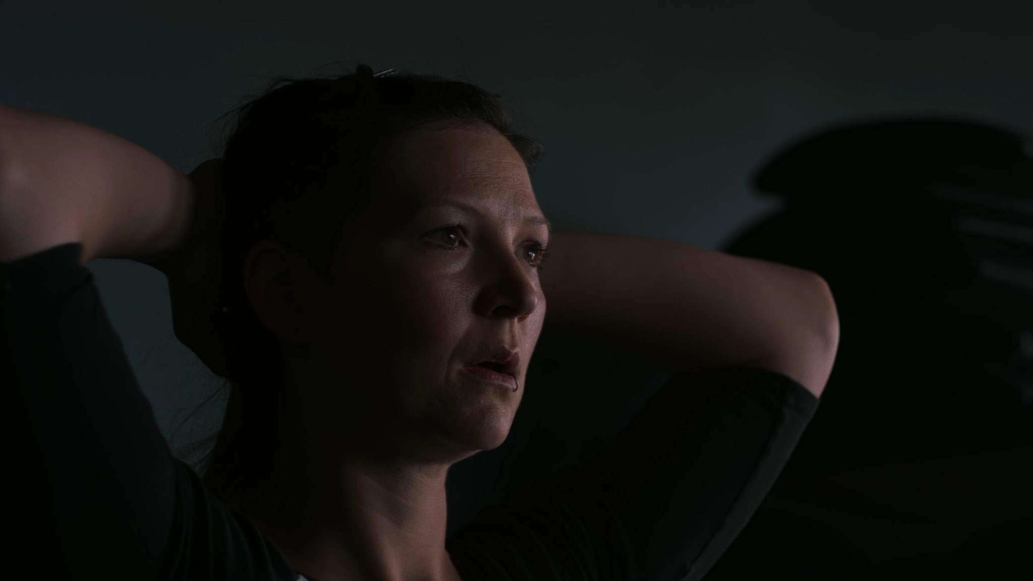
We are done! Let’s go ahead and check out everything in full screen.
Man, this is the golden age of TV. I hope you loved this and learned a lot!
MORE LIKE THIS


