How to get the NOCTURNAL ANIMALS look | DaVinci Resolve 16 Tutorial
What’s going on guys and welcome to another tutorial. This is probably one of the hardest looks I’ve had to recreate on this channel. This movie is so visually appealing too. So let’s jump right in.
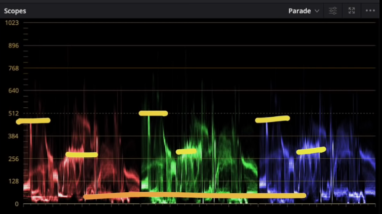
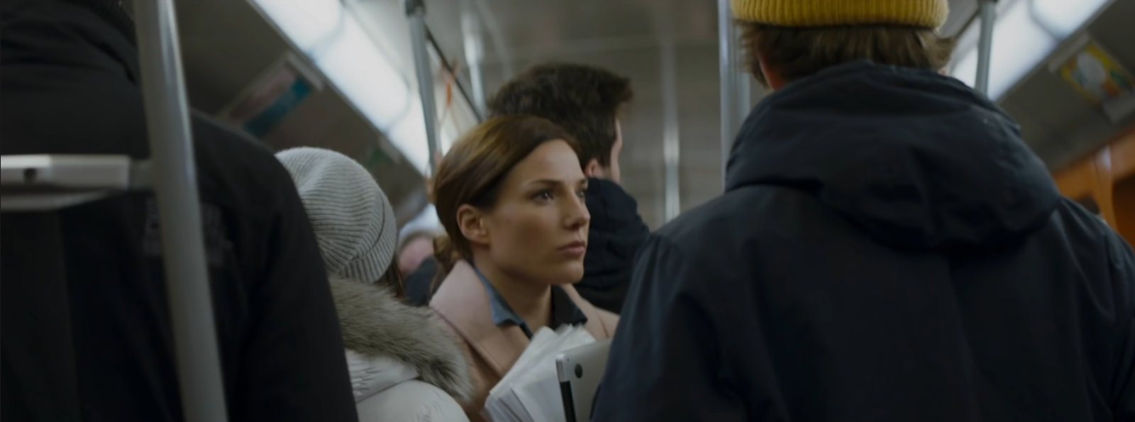
You can tell how hard this image would be. Let’s break it down. You can see that the black points are really proper. It has the pastel colors, so nothing has too much juice, it’s all subdued. These are the anchors that I want to keep in mind.
Now look at what we are working with.
There is a lot that is going to happen here to get it in this world. It’s not going to be easy. We also have to get creative. These are shot in completely different environments at different times. We are not going for a 1:1 match, so keep that in mind.
Let’s go ahead and build out our node tree.
Starting in our lut node, we are going to drop on a lut that comes with DaVinci resolve. It is the Kodak 2383 D55.
Now when you first drop it on, it’s too much, so we are going to go into our key mode and drop the output to around .750.
Then I am going to move over to my contrast and pull back on the contrast a little bit.
Next I am going into my balance node. The first thing I am going to do is take my saturation to about 70.
Then I am going to adjust my temperature and tint to balance the whole image. Then I am going to go into my offset to start taking some of the blue out.
Now I am noticing that there was more green in the top of our image, so I am going to use our gain to pull in some green. But then I am going to use my gamma to pull out some green.
Just look how important white balancing is. We took this shot from being dingy and warm, to being proper and beautiful.
Next we are going to go into our blacks node and go under our log wheels and pull down on our shadows. We also want to make them level too. It’s spilling a bit into stuff we don’t want, so we are going to use our low range to control the selection.
Now before I do anything else, I want to move to my glow because it is going to change a lot, and I want that done first before I make any other changes.
Now moving to our look adjustment node, we are going to try and match the overall mood and skin color in the image. I am going to pull down my gain just a bit.
Then I am going to go under my log wheels and raise my highlights to about .14 and then I am going to go into my high range and open it up.
Now I want to go into my girl node and create a window, to select just my girl. I will also want to track the window.
Then I am going to go under my curves and pull it up from the top and middle.
Now moving to my outside node, I am going to create another window to be more of a general vignette. I am also going to invert it.
Then I am going to pull down in my curves to darken around the circle.
Now we have a great base for our look, so we can start going in hard. First I am going to create a parallel node on my look node, because I know I am going to want to pull out her lips. In order to get it close to that world, we just really have to take out the yellow in the image. So we are going to take our gamma down towards cyan/blue. Now I am going to use my lift to get those black points back to perfect. Then I am going to use my gain and pull it down a bit to get the entire image in the world. I also need to pull down on the saturation because my image is overly saturated.
Next I want to move into my hue vs hue and move my yellow channel towards magenta, and then I want to do the same thing with my red channel as well.
Then under my hue vs saturation, I am going to individually control each channel.
Now moving under our lips node, we want to qualify her lips.
Then we are going to use our gamma wheel to put more red into her lips and give them a bit more life.
Now something just doesn’t feel right, so I am going to go back into my look adjustment node and bring the overall gain down.
Now something just doesn’t feel right, so I am going to go back into my look adjustment node and bring the overall gain down.
Then moving back into my lips node, I am going to use my hue vs luminance to pull down the red channel to give the lips more depth.
Then I am going to use hue vs hue and pull mess with the reds.
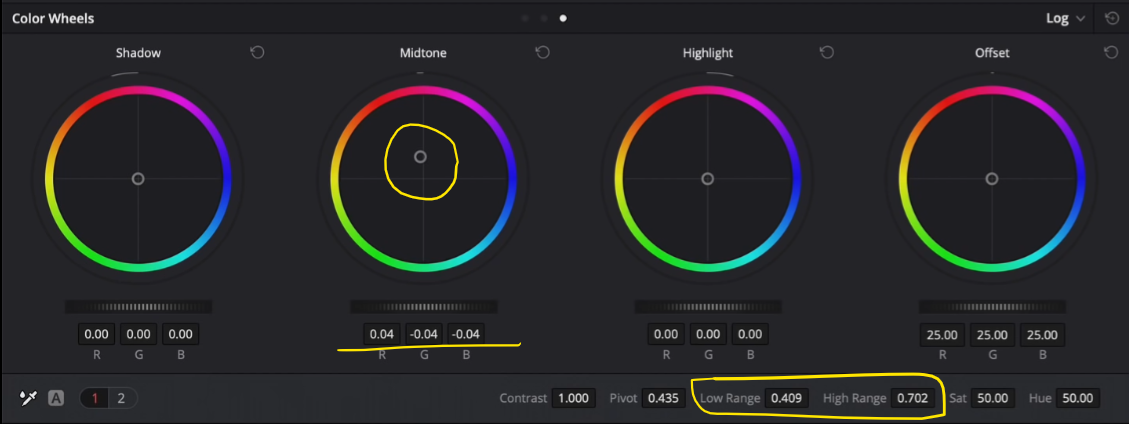
Now as I look at the image, her skin tones, or the highlights on her face, just looks dead. So I am going to create a parallel node on the lips and I am going to add warmth with my midtone and control it using the low and high range values.
Now I am going to add my grain. We are going to play with the preset 16mm 500T and then adjust the parameters.
This image we created is very close. Obviously it is different, but this is where I take creative liberty and say that we aren’t copy cats. We wanted to create a similar feel and look, and we got that. She’s in a completely different environment too, it wouldn’t work to match 1:1.
Now, let’s see this goodness in full screen!
Alright guys! I hope you learned a lot and can take away something from this process. Remember, not all looks have to be a 1:1. Some shots can’t get there because they are shot different and that’s okay. Be creative and have fun.
MORE LIKE THIS


