
How to get The Witcher look | DaVinci Resolve 16 Tutorial

Hello and welcome to this tutorial. Today we are going to be recreating the look from The Witcher. So, sit back, take some notes and let’s get started.
The first thing, as always, is to analyze the shot. First, we are going to drop in our color palette effect in. I am noticing in the highlights there is this salmon/off-white color, meaning no pure white. In our midtones there are these rich browns and this teal color. In our shadows we can see this teal color coming through. Also, the image is super contrasty that we can barely see the detail in what our subject is wearing. In our scopes we can see that most of the image is sitting in an orange color space, which is providing great skin tones.

We can also see a heavy vignette at the top, which would have been done in post.
Let’s get into it! Let’s build out my standard node tree.

Starting with our exposure, we are going to bring up our contrast a lot. This will help us match the contrast of the reference.
Going into our fine tune node, we will pull down on the gain to match the reference. We will also bring down our gamma and bring our lift up. We are going to go into our log wheels and light up the highlights to match. Next, we are going to pull down our shadows. Then we are going to give this image some saturation.
Moving into our parallel nodes, we will start to create our look. Starting with our top node, we are going to start pulling down on our lift wheel to bring in some of that cyan/blue color. We are going to then take our gamma towards green. Switching to our second parallel node we are going to use our LOG wheels and bring highlight color towards orange/red to bring that color into the image. Moving into our third parallel node, we are going to open hue vs saturation under our curves tab and lift our reds up to give them a bit more juice to match the references skin tones.

Next, we will go into our look adjustment and bring down our color boost just a tiny bit. It takes the sting off the entire image. We are also going to go into our RGB curves and bring down the highlights on the red channel, just to pull out some of that red in our image.

Our highlights have a bit too much luminance in them, so under our luminance vs saturation in the curves tab we are going to bring down the highlights knuckle.
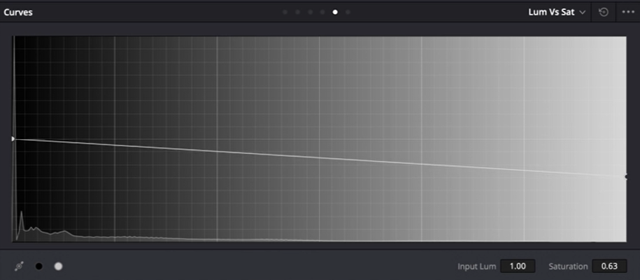
We should also bring up our high range so that we can control it.
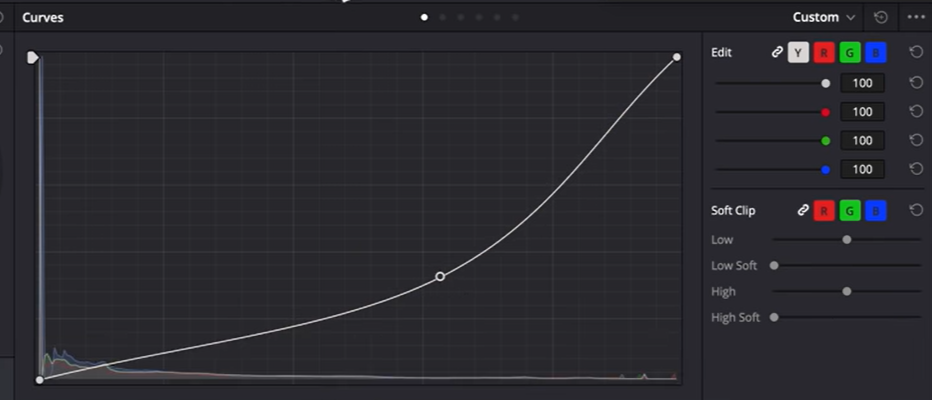
We are almost done. Now we just need to create a heavy vignette with not a ton of feathering, and really crank it down using curves.

Going into our light rays, we are going to use our glow at the settings in the picture below, but also under our key input, drop the output to half.


As always, we are going to add sharpening and film grain to the settings we always use.

Finally in our global adjustment we are going to use gain to bring everything down just a little bit and then take my LOG wheels and lift the highlights a bit. Even though our shot is a bit brighter in the area it was shot, we need to pull down our curves a lot to match our reference clip.

I do want to do one more thing. Create a parallel node. In this node, we want to qualify just the highlights.

Now, add a power window so we can select just the window.

Once that is selected, add that salmon color back into the window.
And just like that, we are done! I hope you enjoyed this tutorial and found it useful.
MORE LIKE THIS


